Photobucket Photobucket Photobucket Photobucket Photobucket Photobucket

Friday, April 25, 2014

Spring Flower Necklace

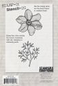
Hello everybody, it's Toni here. The project I want to share with you today is something which came to me as I was dropping off to sleep the other night ! Last month, I received one of Wendy Vecchi's Stamp It Stencil It flowers from the lovely Kim at eclectic Paperie. I've been pretty busy lately, but yesterday, I managed to grab an afternoon in my craft room. It didn't take long for me to get to grips with the stamping and stencilling method. It's so quick and easy! You know that Wendy, she's a genius! I went to bed thinking about my afternoon session and the idea for this necklace gradually evolved. So today, I couldn't wait to get started. This is how it began...
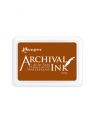
 I stamped out several flowers onto a piece of lightweight white card, with black Archival ink. I gave them a quick blast with my heat tool before overlaying the stencil and colouring the flowers with Archival inks, applied with a blending tool. I used some snippets of Post Its to hold the stencil in place.
Still using the stencil, I stamped over the flowers, with various background stamps from my stash, in true Wendy style. Once again I set the inks with my heat gun. My next task was to cut out each flower and adhere them to a piece Wendy's Clearly for Art modelling film. This was for me, totally experimental. I used Helmar-450 Clear adhesive, and wasn't at all sure what would happen when I applied heat!
 I adhered the Clearly For Art transparent film, to the back of each flower and cut them out. I then adhered another piece on the top and really pressed down to spread the glue and remove any air pockets, I used a soft cloth and a burnishing tool. This didn't seem to affect the Clearly For Art, I thought it might leave scratch marks but it's very resilient. After trimming around the flowers for a second time, I heated each one separately, and moulded the petals. I could see the glue bubbling slightly with the heat but I just pressed down on the surface to smooth it out. If you look very closely,you can see a feint patterning from the glue, but it looks like a bit of spritz and flick, intentional? of course it is!
I added some vintage pearls, studs and crystals to decorate the flower centres. I used a small hand punch to make holes in the flowers so that I could link them together with jump rings. The chain was salvaged from my stash of 'junk jewellry'. I often buy bits and bobs from second hand or cheap shops.
Here's a close up showing how the flowers are linked together. Well, this was a fun project to make and I must say I'm pretty pleased with the results. Even my son said he liked it when I was trying it on ! x
If you'd like to have a go at something like this, you can find many of the supplies I've used in Kim's Fabulous eclectic Paperie shop. Click on any of the thumbnails below to be transported straight there. Oh! and don't forget there's still time to join in with the ePlay Challenge the subject is 'Wood' and full details can be found on the eclectic Paperie blog. There are some wonderful entries!

Thursday, April 24, 2014

I is for Instinct ~ Altered Dictionary Spread


Hi there! It's Bonnie here today sharing the I spread in my altered dictionary which will soon need a bungee cord to keep it closed! It is so thick...good thing it's almost completed. It's fun to look back and see how my style has evolved as I learn or focus on new techniques. I in this dictionary is for instinct and it's amazing how many times in the past few days that word has come into my world. I started the pages in the usual fashion, adhering the pages to the adjacent ones for strength and gessoing the pages I was altering except for the definition. I used Neocolor II crayons for the background (orange, pinks, yellow) and activated them with water. I used the same colours of gelatos around the edges and blended them with a dry finger.

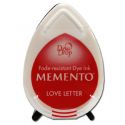
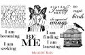
To add interest to the background, I sponged Wendy Vecchi Orange Blossom Archival ink through TCW's Mini Web Doily stencil...love that pattern. Second generation stamping was done with Memento Love letter ink on the Be Me stamp from Melody Ross's She Sprouted Wings set. White gesso was pounced through TCW's Mini Tiny Dots stencil and black gesso was spread over a flip flop bottom to get the cross hatch texture. It actually makes wavy lines so I stamp it in two directions to get that pattern.


The image is a digi from Oddball Art  Co. I absolutely adore these sweet characters that Lizzy Love creates. I coloured her with Prismacolor pencils, fussy cut her and matted her in black. Glossy Accents was applied to her expressive eyes, and she was popped up on foam tape. Washi tape was adhered to the background to give her grounding and then applied to the other page to create balance and flow.


The hearts were die cut from a scrap of pink DP. They were then stamped with a TH script using Rocket Red Gold. More of the same stamping was added to the two pages as well. The hearts were edged with Worn Lipstick Distress ink and matted in black. All but the medium sized one were popped up on foam tape.

The wording was computer generated with various fonts...love my fonts :) They were printed on white cardstock, edged with Worn Lipstick, and matted in black. Colour was added to the heart words with gelly Roll pen and doodling was done either on or around them. The word Instinct was printed with my Dymo.


At this point, I always take stock of the whole spread to see what finishing details are needed. I had some black off cuts from border dies which were added to either side. Black gesso rings were stamped with a bottle lid.


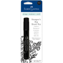
I had the remaining piece of black on my desk with the star punched out and I used a circle punch around it. It looked so cool that I did it again and added the punched star as well. orange enamel dots were added to the centers and black ones to the top right. The I letters are Idea-ology Ransom with white dots added. The little heart tiles are from my stash. More doodling to frame the pages and Black Big brush pen were added to the edges.

Thanks for visiting today. I always appreciate your fine company. I hope you get a chance to play with inks, paints, and paper soon!

Bonnie
These products can be found in the eP store:


Wednesday, April 23, 2014

Playing with Texture and Color


Hi everyone, it's Lisa S here as eP's April guest designer and my project for this week fits in with the current ePlay challenge-Wood!. I used a wood frame box that once held game pieces but now serves as a frame for my mixed media artwork. I started by playing with a 6x6 stencil by TCW-Live, Laugh, Love, Wendy Vecchi's white embossing paste and a trio of distress paints. 

Here's my process...
I used a 8.5 x 11 piece of white card stock as my base and applied a thin coat of white embossing paste over the stencil. 

This was a bit too loud for me so I toned the words down with Adirondack paint dabbers.   

That's better :)
I added distress paints-seedless preserves, spiced marmalade, mowed lawn-to my page and a black Faber-Castell Pitt Pen and black soot distress ink were used for shading. 

I decided to add checkered corners with Wendy Vecchi's embossing paste and her Checkmake stencil


Butterfly images were stamped on my background using the Butterfly Trio stamp by Crafty Individuals

which I inked it with Wendy Vecchi's Archival Dandelion ink

Additional color was added with Faber-Castell Pitt Pens in yellow, orange, purple and brown hues.  

The checkered border was altered with Adirondack Acrylic paint dabbers {Snow Cap, silver and gold} and Faber-Castell Pitt Pens. 

Texture in the form of Liquitex Glass Beads Texture Gel colored with a few drops of seedless preserves distress reinker was added to the flower bud. I mixed the ink and gel together and applied it with a brush then sprinkled silver micro beads over the mixture, repeated with another layer of glass beads and sprinkled that layer with black micro beads. 

I love the dimension and texture the glass beads add. 


Here's how I altered the wood frame...
Altering it was super easy with mustard seed distress stain and a purple Faber-Castell Pitt Pen.

 
I brushed a thin coat of Liquitex Acrylic Gesso, then a coat of mustard seed distress stain, more color with a purple Faber-Castell Pitt Pen and another layer of mustard seed. 

A numbers stamp inked in Staz On Jet Black was stamped in various places on the frame. To adhere my background, which I trimmed to fit, I used Scor Tape for a smooth finish. I can display it with an easel or add a hanger and use it for wall art. 

Here's my finished piece


Have to say I wasn't too sure how it would turn out but I had fun creating it. For me, that's what this art adventure is all about. :)

Key Supplies Used:

That's all for me today, thanks for looking! You still have time to join in this month's ePlay Challenge-Wood! and I'll be back next Wednesday with my last guest designer project.

Have a wonderful day,
Lisa xx