


Photobucket Photobucket Photobucket Photobucket Photobucket Photobucket
Showing posts with label brayer. Show all posts

Wednesday, May 6, 2015

Post Box Red Flowers for May

Hi, Ruby Craft here. I’m so excited that Kim has invited me to be guest designer for May. She asked me to share a little bit about myself. A little over 10 years ago I had taken early retirement but had a little too much time on my hands. I decided I needed a hobby so I started Scrapbooking. Then I took a part time job at a local scrapbook store and a co-worker showed me Tim Holtz and Alcohol Inks. When Tim started his blog with a tour of his workroom and then began posting 12 Tags of Christmas I was hooked on inky fingers and multi media. I began blogging so I could post my tags for Tim’s challenges. I still scrapbook from time to time but enjoy challenges, making tags, cards and the occasional 3 dimensional project. I'll be here every Wednesday this month with something new for you to see.

For my first project I looked through my stash and found a naked spiral book I had bought a while back. I used 3 different stencils along with paints, so I worked on a non-stick craft sheet. It made clean up easy and also made a great pallet. The first thing I did was to carefully open the spiral and take out the covers. I then laid them face up on my work surface and placed the first stencil, Weaving for Prima Finnabair Elementals, on the front cover. I used Prima's Color Bloom Spray Mist in Gold Foil. This was the first time I used it and I loved working with it. It has a trigger sprayer which allows you to get quick solid coverage but also allows you to get a spatter effect if you want. I sprayed through the stencil onto the cover front. Instead of wiping off the beautiful mist that had beaded up on the stencil, I flipped it over and placed it on the back cover. This gave me the same beautiful shimmery gold but a negative of the pattern on the front.

I used a fun stamp from Catherine Scanlon Designs called Catherine's Alphabet. This is a large one piece stamp that has open letters that would be perfect for water coloring. I thought it would make a terrific illustration for my cover. I used a brayer to "inked it up" with some Post Box Red Paint from Dylusions and stamped the front cover. I didn't get a perfect impression but it was perfect for the look I was going for.

I decided I wanted to add a Flower border along the sides and bottom of the front cover and along the bottom of the back one.  Tim Holtz Wildflower Stencil was perfect for this and the second stencil I used. I used a couple of mini blending tools to apply the Post Box Red Paint to the stencil flowers and then Cracked Pistachio Distress Paint for the stems and foliage. Distress Paints have a dauber top but the paint is very fluid and would run under the stencil if you tried to apply it directly from the bottle. The mini blending tool works great with the stencils and paints. The thin stems can be a little tricky with the blending tool. Once I removed the stencil I used a fine detail water brush to pick up some Cracked Pistachio from my craft sheet to touch up the stems. The water brush allow me to keep the color soft.

I also used the water brush to paint the inside of the  letters with Post Box Red at the top and Abandoned Coral Distress Paint from the bottom of the letters fading the color out before reaching the middle of the letters. This allows the Gold Foil Spray to peek through. Another thing I liked that the Gold Foil Spray as a background is that once it was dry it was not disturbed by the water or paint.

Along the very top and bottom of the front cover I used the third stencil, the hearts from the Love set of BoBunny Stickable Stencils. Again using the blending tool and Dylusion's Post Box Red. Once I finished the hearts I felt they needed something else. BoBunny Glitter Paste in Sugar! I used a palette knife and the stencil to apply it. These stencils are sticky and reposition-able making them easy to use. I finished off the edges using the blending tool and some Vintage Photo Distress Ink.


I decided I wanted to make a band to hold the book closed. I painted a piece of white elastic with Cracked Pistachio Distress Paint. Using the dauber top made it easy. Distress Paint does not effect the elasticity or stiffen the elastic. Once dry I attached the strip to the back cover with eyelets.

I die cut a flower from Wendy Vecchi's Clearly for Art Modeling Film from Tim Holtz's Tattered Floral die. Clearly for Art Modeling Film is NOT shrink film. When you heat it you can bend it to what ever shape you want and when it cools it will hold the shape. It comes in clear, white or black. Before you mold it you can paint it, stamp on it, or glue paper to it and then stamp on the paper if you like. If you don't like the shape you can reheat it flatten it and start all over again. I used clear and painted one side red by simple spreading the Post Box Red paint on with my fingertips. Once dry I flipped the flower over and used the spatter stamp from Wendy's Faux Graniteware starter kit and some Jet Black Archival ink to stamp the black spots. After the ink dried I attached the flower to the elastic band with a black eyelet. Then I was able to heat the flower with my heat tool and shape it. I just wanted the flower to have some subtle modeling since it was on the cover of the journal. I slipped a pencil under some spots while heating to get a little lift and did the rest of the modeling with my fingers.  You don't have to heat the whole flower, just a small section at a time. Once I had my flower shaped the way I wanted it, my cover was finished and I put everything back together.

I want to thank Kim for inviting me to be the May Guest Designer. She generously sent me quite a few fun products to use and she is wonderful to work with. She has designers for June, July and August, but if you are interested in being a guest designer in the future send her an email. I included a little information about myself and a few links to projects on my blog that I thought she might like and she got right back to me.

Here are a few quick links to some of the products I used from eclectic Paperie.
Dylusion Paint, Distress Paints, Stencils, BoBunny Glitter PastePrima Color Bloom Spray MistTim Holtz ProductsWendy Vecchi, Catherine Scanlon Designs 

I Hope you enjoyed seeing how I created my first project as guest designer and that you'll be back next Wednesday.

Saturday, July 19, 2014

Picasso

Hi eP friends, Micki here to share what may very well be my first Picasso inspired art piece!
PicassoFull
I can not take all the credit folks!  I have been in a creative slump, possibly because it’s summer and we have been fortunate here in eastern Kansas to have some wonderful summer weather with only a couple of days of hot and humid temperatures sprinkled in.  A couple of months ago, my oldest granddaughter spend a Saturday with me in my art room.  I showed her how to create background prints using just paint, brayer, some sprays and of course paper. 
(Gelli Plate is on the agenda next time Smile)
BackgroundPaperPlayIMG_1150
I just put all the paints on the table and let her have at it.  She amazed me with some of her color combos.  Of course several sheets were not as pretty, but still.  The background sheets have been hanging on my wall and I kept staring at this one:
BackgroundPaperPlay_20
I turned it every which way and brought it, along with my Stabilo All pencils downstairs in front of the TV.  It seems that in front of the TV I don’t put that subconscious pressure to create a masterpiece on myself because before I knew it (muse and mojo missing) the outline of this face appeared.  The next evening I ventured into my art room, intent on finishing the face. 
White gesso was added around the face.  Didn’t like it, stepped away for a little while and upon returning used a baby wipe to remove the now partially dry gesso.  (I’m so sorry about not taking “in process” photos – I was just ecstatic that I was creating.)  Surprisingly, most of the gesso came off.  Next I activated the black pencil outline and decided to go try Dina Wakley’s Black Gesso.  I liked it but I still wanted some of the under layer to show through.  Baby wipes to the rescue.  I dabbed or swiped with the baby wipe until I was happy.  Then using Ranger Inkssentials Craft Scrapper and Tonic Studio’s Retractable Craft Pick, I created doodles and marks into the still slightly wet black gesso.
PicassoFull2
PicassoFull
With the background finished, I concentrated on adding some features to my Picasso.  I used Faber-Castell Gelatos, distributing them with my fingers, then coming back with a brush and Dina Wakley’s Heavy Body Acrylic White paint to mix it in which gave everything a different tint.  The cheeks were really red before I mixed the white paint with the red gelato.  I liked that effect so much that I did it pretty much everywhere I had added paint (hat, bottom of nose, above lips and chin).
Picasso2Picasso3
I love how Emma’s brayered background still shows through, even through the black.  And I definitely love the different shading achieved by adding heavy body white paint to other paints and mediums.
PicassoFull
 I am sorry about not having step-out pictures, but I hope you were still inspired to create using minimal tools and to get your kids and or grandkids involved.  Watching Emma brayer and spritz paint and ink, not worrying about color combinations or creating "mudd", was truly liberating for me.
Emma came over last night.  After showing her my "Picasso" and asking what she thought (she loved it), I told her that I stole one of her backgrounds.  Her eyes went wide and she had to take another look.  Thankfully she wasn't to upset with her 'nana' for altering one of her background master pieces!
And as for my "Picasso", well, he is kind of growing on me!


Supplies Used:

Saturday, August 31, 2013

Gelli Prints, Stencils and a Lady in Red

Hi everyone and a Happy Labor Day weekend (here in the U.S. - 3 day weekend - yay!)  Micki here to share my Gelli Plate play using some old college ruled 3 hole punched regular papers, a kitchen tool and other odds and ends.  AND.......Julie Fei-Fan Balzer's new 12 x 12 Profile Stencil from the Crafter's Workshop.

I consider myself somewhat color challenged.  I tend to go with the same color palette so I tried to play with some other colors and color combinations as well.  To get me started, I had to go with teal!
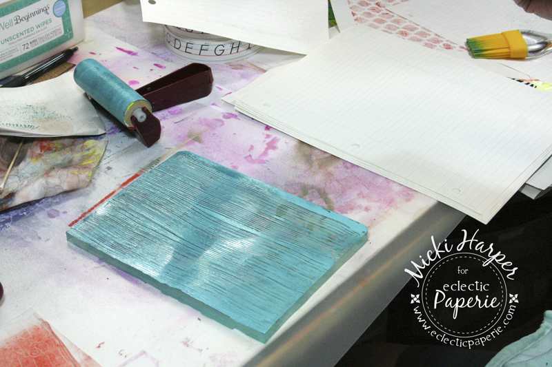
I squirted out a small amount of paint right onto the Gelli Plate, then rolling the brayer through it, in all directions, until I had an even coat of paint on the plate.  Then I grabbed the $1 Silicone Kitchen Baster tool and just ran it across the plate.  The first picture below almost looks like there's hardly any paint on it, but the first and second prints turned out pretty cool, I think.
The print on the upper left is the first print and the one in the lower right hand corner is the second print.


Kind of cool, don't you think?
Next I added some greens to the plate, distributing the paint as before with my brayer.  This time I used bubble wrap to pull some paint off and create the negative bubbles:

Now I grabbed some heart doilies which were obtained at a yard sale.  I laid these on the plate first, then adding paint:
 Again, using my brayer, rolling it in all directions to smooth out the paint, laid the paper on the plate and got the first print:


 When I pulled the paper, the doilies came off too.  The paint acted like a gluing agent, literally embedding them on to the paper.  LOVE it!!!!  Next came the second print:

I actually love the second prints or "ghost prints" as much as the first prints :-). Since I had the red paint out, I added some orange and Pink Paislee's She Art stencil.


 First print on bottom, ghost print on top:
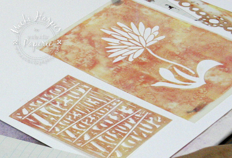
Really liking this color combo, I got out Studio 490's new Lovely Large Flower stencil and TCW's Balzer Days of the Week Bits Mask.  This time I used white card stock for my first print:
I used the notebook paper for the second print:

In the next picture,  I grabbed a baby wipe and a sheet of notebook paper and cleaned the stencils.  I laid the stencils with the paint smeared side facing up and wiped/rubbed the baby wipe across and this is the result.  I absolutely LOVE that effect.Remembering to snap a picture.  This is on white card stock.

Here are a couple more examples on the notebook paper:


And I love using these "cleaning" papers to layer prints:
I also love the look of laying my "cleaning":

The next couple of pictures are just different color combos - don't know why I have such a hard time with color combos!  On the print below, I used an empty Duct Tape roll, stamping it onto the painted gelli plate, then pulling a print:
I also used the end of my paint brush to try doodling: 

And sometimes, just pulling a print without any stencils, marks or stamps is pretty cool too.  Here I had just added dollops of white paint to the plate:
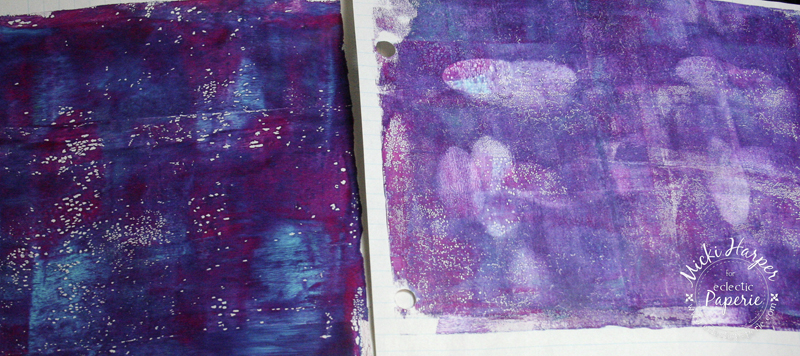
 Print on the left is the second print:
The print on the left is the first print.  See those white dots?  I was running out of work space and was moving stuff around (or more likely, looking for something) and the paint started to dry.  However, I think it's a pretty neat "texture" effect:

Playing with the Gelli Plate is a lot of fun.  There really is no wrong way and it's a great way to get all your paints out and just play.  One advice, lots of space.  Next time I think I'll take over the dinning room so that I can spread all the prints out.  And then of course, comes the hard part, choosing which print to use first.
I decided to go with the red/orange "She Art" stencil print and the heart doily print.  I tore the prints into sections and glued them to a sheet from my Strathmore Mixed Media pad, using gel medium.
I added more layers with Dylusions Ink Sprays, followed by using up the rest of that red paint that was on my Non-Stick Craft Sheet using my craft scraper to distribute.
 I also added some White Linen Ink Spray, using a brush to blend it in a bit. Once dry, I layed the 12 x 12 Profile Stencil on top and using my foam blending tool, dabbed black gesso through the openings. After I lifted the stencil, I used a brush to "connect" the lines.  Julie has a great video using her Profile and 3/4 Profile stencils, which I was watching as I was doing the "connecting".
 Next it was adding white gesso for the highlights - again, have such a hard time with highlights and shadows.  I think it's because I tend to get carried away.
 Fixed the eye, which was giving me a really, really hard time, added shadows and because I wanted the face to stand out from the background (I should have thought it out before I started), I ended up painting the background red.  Although it's hard to see, the doilies and prints do still show through that red paint.


And because I am notorious for "fiddling" with a project to a point of ruining it, I decided that I would stop here.  Because I used lots of wet media, the sheet does tend to warp a little but I just put it under my glass cutting mat and that straightened it out just fine.  And here she is framed:


I hope you enjoyed my journey of playing with color combos, paints, stencils and the Gelli Plate.  I had one of those "slap your forehead" moment watching Michelle's video for Inspiration Wednesday over at Donna Downey's blog.  She used Embossing Folders...... duh, why didn't I think of that?  Can't wait to play with those on the gelli plate.  As for those awesome Profile Stencils, they are awesome. Perfect to quickly create a face.  :-)


Supplies used for my Gelli Plate fun:


Supplies used for Lady in Red: