Photobucket Photobucket Photobucket Photobucket Photobucket Photobucket
Showing posts with label remnant rubs. Show all posts

Saturday, August 2, 2014

Finally - my Art Journal

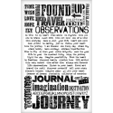
Hi eclectic Paperie friends!  Julia here to share my altered Art Journal.  I have been trying to muster the creative energy to make this for ages - I just wasn't confident in my skills to put it together in a pleasing (to me) design (!)
So I decided to bite the bullet and just jump in -  and here it is! My Journal that started out life as a plain black - spiral bound journal - I think I got it at Michaels.....I've had it for some time - gathering dust in my Craft Room!  
 
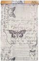
I decided to see how 
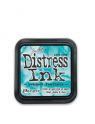
Distress Stains would look on Kraft Glassine Paper.  So I stamped the bird and window frame from Tim Holtz Classics #16 stamp set using Archival Jet Black Ink and let it dry.  Then I just dabbed Tumbled Glass and Picked Raspberries Distress Stains over the images - they kind of beaded up on the Glassine paper so I just kept dabbing and the color did soak in a 'blotchy' kind of way - and they did keep their bright colors!
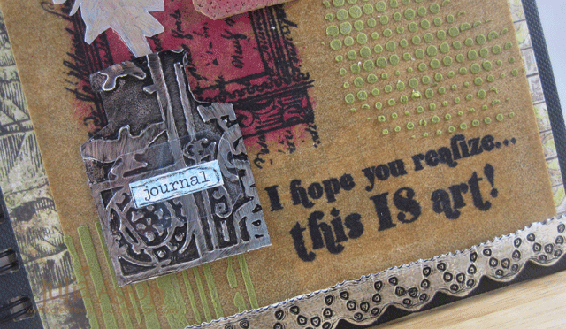
I die cut borders using Tim Holtz Vintage Lace Sizzlet die out of a Foil Tape Sheet that I had adhered to white card stock  and then inked it with Ranger Distress Black Paint.  I adhered the strips across the top and bottom of my cover .  I didn't pop out the little circles on the lacey cuts so the black distress paint would show up better. I also used this technique on the crown and ink bottle which I'll show close up below.
The sentiment stamps are from Destination Art by Wendy Vecchi/Studio 490 Stampers Anonymous.  Perfect for my Art Journal I think!
 
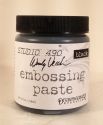
I added Forest Moss Distress Stain to some White Embossing Paste from Wendy Vecchi and applied it to both the Dot Fade and Stripes stencils.  I cut the label from the Apothecary Bottles die from cork, stained it with Picked Raspberries Distress Stain and added some Life Quotes Remnant Rubs to it.  I dabbed the edges with Frayed Burlap Distress Paint.
I stamped the feather from Tim Holtz  Bird Feather stamp set on vellum using Frayed Burlap Distress Paint (wash your stamp right after 'inking' it with paint!)  The paint on the vellum is very subtle but can be seen better IRL!  I added some Life Quotes Remnant Rubs over the feather  (note - Remnant Rubs will NOT stick to the Kraft Glassine but will stick to vellum- how do I know this??!!)
The ink bottle is a die cut Apothacary Bottle that I cut the bottom off of to look like an ink well - with the feather as the pen.


I die cut another  Apothecary Bottle labels out of Art Parts Clearly for Art Modeling film, added a Chit Chat sticker that I stained with Tumbled Glass Distress Stain and outlined with a black Stabilo Pencil and layered it over the bottle.  I used the clear film as I didn't want to hide any of the design on the inkwell!  I used the Sizzix Patchwork Embossing folder on this.
 
Here's a close up of the crown.  The curve of the crown fit nicely over the bird's head.  I used the Riveted Metal Embossing folder on the crown
You can see the Idea-ology Door Knob that I screwed into the cover better in this photo - you can actually open the Journal with the knob - so fun! and when the Journal is open on the table - the knob actually protects the popped up pieces on the cover since it keeps the cover from lying flat.  I looped a single piece of Linen Ribbon through one of the binder rings.
I wanted to keep the back flat - so there is nothing sticking up here. I used several Remnant Rubs here (Life Quotes and Botanicals).  I used the same papers on the front (under the Kraft Glassine) and the back - Paper Stash/Wallflowers.
I stained some Chit Chat stickers with Picked Raspberry Distress Stain and outlined them with a black Stabilo Pencil 
I die cut the Ornante Frame from Kraft Glassine and stained it by dabbing Tumbled Glass Distress Stain over it and framed the gentleman's face on the patterned paper.
 I used the same papers on the inside covers - I've just left them as they are for now - they have such wonderful imagery on them - maybe I'll put some sentiments or stampings on later.....I find I sometimes have to just STOP before I over do it - and go back later to see how I feel about it!


Now I just have to work up the nerve to actually do something on all of these clean white pages inside my Art Journal!!!   One step at a time - right??!!!
Thanks so much for sticking with me through all of these pics!
Stamps:  Stampers Anonymous - Classics #16 and Bird Feather/Tim Holtz, Destination Art/Wendy Vecchi,
Paper:  Kraft Glassine - Idea-ology; Foil Tape Sheet - Ranger, Vellum - Stampin' Up, Paper Stash Wallflowers - Tim Holtx, cork sheet - Michaels, Art Parts Clearly for Art Modeling Film - Wendy Vecchi/Studio 490.
Ink:  Archival Jet Black
Accessories:  Ranger Distress Stains - Tumbled Glass, Picked Raspberries, Forest  Moss; Ranger Distress Paint - Black Soot, Frayed Burlap; Alterations Dies - Apothecary Bottles, Heart and Wings, Ornate Frame, Vintage Lace Sizzlets; white embossing paste - Wendy Vecchi/Studio 490; stencils - Dot Fade and Stripes - Tim Holtz; Cropadile; Idea-ology Door knobs, Chit Chat Stickers, Live Quotes and Botanicals Remnant Rubs, Linen Ribbon; Black Stabilo Pencil.

Wednesday, July 23, 2014

Altered Bottle


Hey there! It's Bonnie here today with my take on the current ePlay Altered Bottle challenge. The bottle I chose is approximately 4" tall and 3" at its widest point. I decided to experiment with this challenge since the idea behind it is to push our boundaries.


I began by tearing remnants of melange Tissue Wrap into relatively small random pieces. I adhered these with Dina Wakley Gel Medium, overlapping and creasing/wrinkling it to create texture. This was left to dry thoroughly. The trick with adhering the tissue to the slick bottle was to put gel medium on both the bottle and the tissue and then tap more medium over the top rather than brushing it which just seemed to dislodge it.


Next two colours of Fresco Finish paint, Beach Hut and Antarctic, were sponged wet on wet using a piece of Cut n Dry foam over the tissue wrap still allowing the print and images from the tissue wrap to show through.

 Black Embossing paste was applied through TCW's Tiny Circles stencil in a few places on all sides. Once dry, the texture of the tissue and the embossing was accented with a layer of silver wax rubbed on with my finger.


Idea-ology Remnant Rub words were applied to the bottle on each side. A layer of cheesecloth which had been tapped with Peacock Feathers Distress ink to add random colour was adhered with Glossy Accents to the center of the bottle front behind a silver Idea-ology button with a turquoise center from the Accoutrements Classic Collection..


Silver wire was wrapped around the neck of the bottle and blue Swarovski crystal beads and silver star beads were threaded onto the wire to embellish the front of the neck.

I love the way this turned out and would not hesitate to repeat the process on a larger bottle. Experiment a success! Thanks for visiting today. You still have a week to enter our Altered Bottle ePlay challenge. Hope to see you there!

Bonnie

Here are links to the eclectic Paperie store for some of the products used above:

Wednesday, August 21, 2013

French Patisserie


Hi, Lucy here for my third post as Guest Designer. Today's wall hanging started life as a humble jam tart tin like this:-

 I wanted it to have a French Industrial theme using Tim's paper stash which you can get here, so this dictated my colour scheme and embellishments and I decided to paint the tin red, which is the boldest colour in the paper line, with crackle over the top and then a very industrial-looking grey so only a little red showed through:-


I used the Tim Holtz Sized Circles die to cut my favourite pieces from the papers and I wanted some sections to be plainer than others so I didn't over-egg the pudding (I have a tendency to overdo things!). I edged each piece with red paint as I had a dirty piece of cut n dry on my workdesk! I used the TH Memoirs stamps for the shrink plastic Eiffel Tower and Frenchman and 'grounded' them with some of the Remnant Rubs which I used in strategic places over the whole piece - this made such a difference to how it came together - loving these!

In this first row I have used a die cut Tim Holtz mini clock key, and cogs, which I rusted up with Distress EP, and on the right a shrink plastic hot air balloon from Tim Holtz Tiny Things stamp set - wow, you must get this stamp set!! I have used some charm frames from my stash throughout, rubbed with a little white paint for a shabby chic look, but you could use the Maya Road ones here, or the Tim Enamelled Tags here, which would be awesome. I chose the Tim Wordband which reads, 'The Journey Awakens the Soul' as I felt my Paris theme went with the idea of a journey, and again rubbed it with white paint. The twill to hang it up with is knotted through this and has been stamped with the Tim butterfly from Tiny Things and the harlequin from one of his old sets (you all have that one, right?!).


The industrial-looking valve embellishment was a bit of fun at my husband's expense! It operates our central heating boiler - but which is the real one and which is clay???? He was very shocked that I had stolen it and stuck it on my project! I told him Tim said it was ok.


In this photo you can see the Tiny Things stamped Eiffel Tower on Shrink Plastic (yes, I know, it wasn't small enough for me already!), and the globe from the same set stamped on the French Industrial paper and cut out, and the clock with a round Tim Holtz Fragment on it. The hot air ballon is a Remnant Rub.


The butterflies and crown are also Remnant Rubs. I used some Wendy Vecchi Embossing Paste mixed with the red paint through TCW Harlequin Stencil around the tin, and once it was dry, highlighted the raised areas with some watered-down Viva Ferro. I went slightly over the 'colour theory' ratio of the amount of red you should use on a project!


You can also see in this photo the birds from the Tiny Things set, again stamped on French Industrial paper and added to an oval frame and filled with Glossy Accents. And in the right hand section I have accented the cylist image with a bike charm from my stash, overlaid with a Penny Farthing charm on the back wheel, and rubbed with white paint.


In this photo some pen nibs from my collection to accent the vintage typewriter from the paper stash:-


Phew! Are you still with me?! I've still got loads of these gorgeous papers left for next week's project (my last one, boo hoo!) - and you'll be pleased to hear it's nice and short. Thank you so much for your kind comments so far.


Thursday, August 1, 2013

Game On ~ Get Altered Challenge

Welcome to eclectic Paperie's 'Get  Altered  Challenge!

The Get Altered Challenge is held on the first Thursday of each month and each challenge is an opportunity for you to be inspired by one of our eTeam’s creations. Today it's my (Bonnie) turn to host the challenge and I'd love to see you incorporate games in your project. You can use game pieces, game cards, or even use a game board as your substrate, like I did.


I began with an old and well loved Monopoly gameboard from a thrift store. It was cut into quarters with a box cutter and one section was given a coat of slightly watery white gesso. Once dry, Neocolor II watercolour crayons were used to apply colour to the opposite corners and sides: red, orange, and yellow on the bottom left and three shades of blue on the top right. The colour was spread with a wet brush, intensifying the colour by adding more crayon. Blue and red Big Brush pens were added along the outside edges of the board.  Gelatos were applied over top of the Neocolors and spread with a wet finger to strengthen the colour where it changed from one to another. 


White gesso was applied through TCW's Art Is stencil and Mini Punchinella. More gesso was pounced over the Dylusions Letter Jumble stencil. Black gesso was spritzed with water and loaded onto the rims of two different sized bottle tops to create the rings. I love the combination of white stencilling, bright background colour, and pops of black.


The black lines separating the center from the properties were emphasized with thin strips of black cardstock adhered to the board. Black and white washi tape was placed on white paper so that it was no longer transparent and then half circles were punched and adhered next to the black strips. 


Three "Chance" cards were edged with Black Soot Distress ink before being adhered to the rectangle on the game board. The dots between the question marks were covered with small black half pearls.


The sweet (to me) girl is one of my favourite Stampotique stamps called Girl With Heart Purse. I coloured her with Prismacolor pencils, cut her out with a narrow white border, and adhered her with her feet grounded on that black strip. A few (4) groups of Idea-ology Remnant Rubs which related to play were scattered around the board. They transfer so beautifully...love 'em.


Next came the addition of Monopoly game pieces which were Glossy Accented to the background. There are two houses, a hotel, an iron, and a horseman. The lettering is Idea-ology Ransom Alpha Parts dotted with white pen. A piece of punched scallop border was adhered below the letters and again at the top of the board. A thin strip of the washi tape was included under the word to bring the black and white stripes to the bottom and to emphasize the letters which seemed to be floating. A large clip art hand was added to the top right corner above the girl and pointing to the word Chance, again relating to the game theme.


The finishing touches on this project were the doodling with black pen, the outlining of the edges with black Big Brush pen, and the addition of bling to the ring on the Luxury Tax property. When I started this piece, I had no idea where it would end up. I knew I wanted to use the Monopoly board and maybe some of the pieces but that was as far as my thinking went. Don't you love it when a non-plan comes together :) I hope you feel inspired to play along with this challenge. I always get so excited to see what others do with a challenge I begin.

To recap ~
The Get Altered Challenge is about exploring your creative journey, about stepping outside of your comfort zone, experimenting with new products, and creating altered and mixed media art.  
We want to see your work and hear about your inspiration!  All of those who play along with our challenge will be entered into a prize drawing for a $15.00 gift certificate to the eclectic Paperie store.

So grab your supplies and play along!  Here are a few things to keep in mind for this challenge…

-You do not have to use products sold in the eP store…but we do love it when you do!

-Share a direct link to your creation, not just your blog, using the Linky Tools feature at the end of this post.  If, for any reason, the Linky Tools doesn’t cooperate, please add a link in the Comments section of the blog.

-When uploading to any online galleries, please use any of the following keywords; eP, eclectic Paperie or Get Altered Challenge. Link your creations to the eP blog.

-If you’d like to be considered as one of our featured projects and be entered into our prize drawing, please be sure to add your link before Midnight on  August 21.
.  The winner will be announced right before the eTeam Picks Challenge.
Have fun!!!!!!

Bonnie

Below are links to the eclectic Paperie store for some of the products I used on this piece: