Photobucket Photobucket Photobucket Photobucket Photobucket Photobucket
Showing posts with label dina wakley. Show all posts

Friday, June 19, 2015

Gelli Plate Printing Fun

Hi folks! Kim here today to share two project with you, both created with one Gelli Plate print. (All product links at the bottom of the post)

Now...let me start by sharing that I spent the majority of today creating a darling video for all of you, showcasing the new 6" round gelli plate and textured acrylic sheets. And...I spent the other half of the day trouble shooting said video, with zero success. My video is "stuck" on my phone and I have been unable to get it to upload to my computer or You Tube. (This is even with the help of my genius IT savvy brother-in-law!) Call me frustrated! So...I'm sorry that I don't have a lot of photos to share of the process, but I will let you know just as soon as I'm able to get the computer issue figured out...whether by hammer or some other means...LOL!...I'm kidding...kind of...

I started with the 6" round Gelli Plate, three Textured Acrylic Sheets, a non-stick craft sheet, a few stencils, a brayer, and some paper towels.  Here are the steps:

  1. Apply acrylic paint to gelli plate, use brayer to spread paint over entire plate.
  2. Press one of the Textured Acrylic Sheets into the wet paint, remove.
  3. Press all or a portion of your paper on to the gelli plate and smooth with your hand to create the print.
  4. Remove your paper, use another piece of paper is pick up any excess ink.
  5. You can see a great video, created by Gelli Arts, on using the new 4" and 6" round Gelli Plates here.
  6. Once I completed my 8.5x11" gelli print, shown below, I cut the paper into 2x2" and 1x1" squares.


Using the 1x1" squares, I created a card, shown at the top of today's post. I simply layered the 1" squares onto 1 1/8" black squares and then adhered them onto a piece of white, embossed cardstock. I'm giddy over how the colors pop against the stark white!

Next, I followed this video to created a book (I trimmed my book down to a 3" square...it's SO cute!) I used the Believe Script stencil, from The Crafters Workshop, and Wendy Vecchi's white embossing paste to add some design and texture to each page of my book. Here's the finished cover...
Once the paste was dry, I used foam tape to add a 2" square to each page. I stamped images from the Primitive Icons stamp set (see the bottom of the post for this week's special!!) to stamp images onto white cardstock. I cut out the images and words and added one to each book page...


I'm seriously so in love with these tiny books (my friend Godelieve was my inspiration!) that I'm going to make one for everyone I know...want one? :-)

If you've made it this far...hang on for this week's special and product links.

For one week only, purchase the 6" round Gelli Plate, Dina Wakley Primitive Icons, and/or Tim Holtz Mesh Texture Fade for a 25% discount! Use code GELLI when checking out!

Supply List:

Wednesday, May 27, 2015

Sprays, Paint, Baby Wipes and the last Wednesday in May

What do Sprays, Paint, Baby Wipes and the last Wednesday in May all have in common?
My last post as guest designer for May.


Hello again, Ruby Craft here. First thing I want to share is how much I have enjoyed this month on the eP blog. I enjoy challenges, they bring out my crafty, creative side. Kim has given me the opportunity to work with some new products that I have not used before has made this a fun challenge. When I started thinking about my final project, I knew I wanted to make a scrapbook page and try a few things I hadn't tried before. I've seen quite a few designers using baby wipes to apply product and decided it was time to give it a try. I usually don't use sprays and paints on scrapbook pages either, so I wanted to try them too. When I first saw the
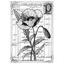
 Alphabet Stamp from Catherine Scanlon Designs,  I thought of my grandson, Jasper, and how much we enjoy reading together. So naturally I wanted to use the stamp again too because that is what my scrapbook page is about. Reading with my grandson, Jasper.

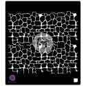
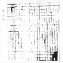
First I started with the P
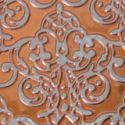
rima Finnabair Elemental Stencil  and 
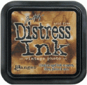
Color Bloom Spray. Always shake the spray well. The stencil I used is Weaving. I placed it randomly around the page and sprayed the Vintage Metal Gold Foil Color Bloom Spray through the stencil. This left some spray on the surface of the stencil. So I flipped the stencil over and pressed it down on the page. Then I removed the stencil and randomly spritzed the page. In a few more spots I pointed the sprayer down and just lightly squeezed the trigger repeatedly to get splatters instead of a spray. (You have to be very patent with the splatter part, if you squeeze too hard it sprays instead of splatters.) After the some of the splatters I tilted the page so I would have a few gold drips too.

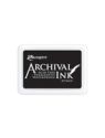
The next step was to use embossing ink to stamp part of the Catherine Scanlon alphabet stamp in the upper left corner of a cream color piece of 12"x12" cardstock. I used white embossing powder to heat emboss the letters. Then I stamped the letters in the lower right hand corner and heat embossed them too.

By barely dipping a baby wipe in the Dylusions paint I was able to get plenty of paint to make swipes of red across the page. I also place the stencil back on the page and used the baby wipe to make a patterned stripe across the bottom of the page then added two more patterned stripes on the right top of the page. It is amazing how much paint you can get from the baby wipe after just a tiny dip in this full bodied paint.


Working in small areas at a time I used a small pointed paint brush and painted the inside of the letters with Postbox Red Dylussions Paint.  I lightly misted the paint with just enough water to make it start to move on the page. After a few seconds I tilted the page and let the paint drip down the page. Working 3 or 4 letters at a time gave me a little more control.

I matted my photos and wanted to get an idea of where I would place them. Since I was using Red paint I decided that I would go with primary colors, using gold as my yellow that left blue for my mat. I used the gold foil spray again with the same spraying and flipping then printing effect with my stencil on a piece of 12"x12" blue cardstock. My main photo is 5"x7". The smaller photos were cut apart from a collage print. I moved the photos around on the altered cardstock, lining them up with the grid where I thought the pattern worked best, then trimmed out 1/2" from each side of the 5"x7" photo and 1/16" border for each of the smaller photos.  Once the photos were matted, I moved the photos around on my page until I found a layout that worked with the background I created, keeping in mind I would need a space for my title and an area for journaling. I didn't attach them to the page yet but knew where they were going. Now I had an idea of where my Title would go and how much room I had for my journaling.

Hand lettering is a popular trend right now and  Dina Wakely's fine tip applicators made it easy to add a handlettered title to my page. This was the first time I had one of her tips. It screwed right onto her paint tube and allowed me to write with her paints. The first thing I did was practice. I was amazed at how easy it was to get the look I was going for. Large loopy letters. When I drew faster it skipped like stitching. If I drew slower the lines were smooth. By slowing down more and the lines went from thin to thicker. After just a few practice tries I was feeling like a pro, so I went for it and wrote my title on my page. I loved it! After a little drying time I was ready to adhere my photos to my page, add my journaling and put captions under my photos. But I wasn't finished yet.

Where did those adorable little hearts come from?

If you saw my first guest post you might remember a little red flower I made for my journal cover. I had so much fun working with Wendy Vecchi's Clearly For Art Modeling Film, I had made quite a few extra flowers. So I took a large flower and cut it up into hearts. They were already painted with the Postbox Red Dylusions  Paint but I used Dina Wakely's fine tip applicators and paint to add the black outlines for a fun touch. Then I heated the hearts up with my heat tool and shaped them into little waves and sprinkled them around my layout, attaching them with pop dots.


Of course I was having so much fun with Dina's fine tip applicator I had to add a fine line dotted and dashed border around the sides and bottom of my page as a final touch.

Handwritten journaling is always a wonderful personal touch in scrapbooking. Jasper will always know how much I loved reading with him. My journaling reads:
{You and I Love to Read! We always have. Your favorite book right now is "Click, Clack, Moo: Cows That Type" When I point to the words "Moo", you read them for me. "Moo! Moo! Moo!"}
When working on my projects each week, I tried to use mostly what Kim sent me along with things from my stash that she carries in her store. This was for two reasons. First, I know that when you show someone a new product and they like it they want to be able to find it. Second, Kim was very generous and sent me products to use for my guest designer posts. She also encouraged me to create anything I wanted and is she is super easy to work with. So of course, if you don't already shop there, I want to encourage you to check out the eclectic Paperie store. If you like you can use the links above to make it easy to find the products I used.

Thanks Kim for giving me a shot and if you ever want me to be a guest designer again just let me know. It's been fun.

Wednesday, October 8, 2014

Step Off the Path ~ Mixed Media Canvas


Hi there! It's Bonnie here today sharing a little 5x7" mixed media I created to feature this sweet Dina Wakley Scribbly Birds. I stamped the birds onto white mixed media paper using Jet Black Archival ink. Then I spritzed my water colours and painted in some base colour and shading to give me that washy look I wanted. The birds were then fussy cut leaving a narrow white border for contrast. Foam tape was placed on the backs of the birds and they were set aside.


The pre-gessoed canvas board was sponged with three colours of Fresco Finish ( Claret, Cotton Candy, and Blush) working wet on wet and applying the paint with a piece of Cut n Dry foam. Once dry, white gesso was pounced through Prima's Stone Wall III stencil. Magenta Archival ink was sponged through Dina Wakley's plastic mesh stencil. Old book pages from Michelle Hill's Vintage Ephemera bundle was torn and  adhered to the canvas with gel medium. More white gesso was spread across the background including the text using both a brush and my finger.


Tangerine Gelato was used to edge the canvas and was spread with a dry finger. Black embossing paste was added to the canvas through TCW's Mini Texturized stencil. Extra texture and pattern were added by randomly and imperfectly stamping a TH script stamp using Jet Black Archival ink. Pieces of cork ribbon were added to the base to ground the birds and to the top left to carry the cork through the piece.


Party hats were cut from yellow scraps of designer paper and small colourful circles were punched and added to make them more fun. The sentiment, from Studio 490 Seriously Art set, was stamped with Jet Black onto mixed media paper, cut out with a Spellbinders die, and inked with Spiced Marmalade and Picked Raspberry Distress inks. The same inks were used on a chipboard heart. Punched semi-circles were adhered to both sides of the canvas and black enamel dots were added to the cork bits. To complete the piece, black doodling was added as well as Black Big Brush pen on the edges.

The party birds and I thank you for hanging out with us today. Hope we made you smile!
Bonnie

Wednesday, July 30, 2014

Specimen 2b ~ Poppy


Hi everyone! It's Bonnie here today with a tag I created using Studio 490 Art Parts as the substrate. Art Parts are thick durable paper board designed for altering. They are stronger than chipboard so can stand up to the weight of mixed media layering and wet medium. This tag has such a pretty shape at the top and also comes with scalloped trim which I chose not to use because I wanted a more linear look. I began by painting the tag on both sides with Dina Wakley black gesso and allowed it to dry completely.


Viva Decor's Mother of Pearl modeliing cream was applied through TCW's  Mini Sketch Grid stencil with a palette knife. Once that was dry, Golden's Iridescent Copper was pounced through TCW's Tiny Circles stencil with a brush. Lovely shimmer from both of those mediums. A piece of dictionary paper from Michelle Hill's Ephemera Bundles was torn into chunks and adhered to the tag with Dina Wakley Gel Medium. Once that was dry, Vintage Photo Distress ink was applied to the edges of the paper.


The gorgeous Pretty Poppy stamp from Crafty Individuals was stamped onto kraft paper using Coffee Archival ink. It was then coloured with Prismacolor pencils, trimmed out, and edged with Vintage Photo Distress ink before being popped up on foam tape. A rectangle of black cardstock cut as a mat was embossed and then brushed over with Viva Decor Inka Gold Copper. Another rectangle was cut from an  Add a Little Dazzle Brushed Copper metal sheet and scored near the edges to give it a border. This metal was then offset and adhered to the image and black layers as well as to the tag with Scor tape.


To complete the design, Specimen 2b, from Studio 490's A Form of Art, was inked with Coffee Archival onto kraft paper, edged with Vintage Photo, and matted with black cardstock. It was popped up with a double layer of foam tape on the bottom edge and just Scor tape on the top so it could be partially layered over the image stack. A sheer cream coloured ribbon wrapped and tied with hemp twine became the topper for the tag.

Thanks for popping by today. I appreciate that. Remember that you have only today and tomorrow left to enter our ePlay Altered Bottle Challenge. Wouldn't want you to miss out on a chance to win the $25 prize for the winning entry.

Bonnie

Here are links to the eP store for most of the products used in this project: