Photobucket Photobucket Photobucket Photobucket Photobucket Photobucket
Showing posts with label Alison Bomber. Show all posts

Saturday, May 18, 2013

Wondering how...

Hello all!  It's Alison here, back with a step-by-step of how the background to my recent Think and Wonder tag was created.  There have been several questions about it, so I thought I'd spill the beans!  (If you want to see more of the whole tag, you'll find it here.)
The background uses a technique I fell over by accident.  I made a tag - Wonderful Journey - which was basically the result of Gelli printing leftovers.  After one printing, I laid down the reverse of the stencil I'd been using onto a tag so that I got a nice painty print.  Then I inked over it, and absolutely loved the result!
This time around, I thought I would just eliminate the "middle-man", and go straight to getting the stencil all painty, so I got out one of the Crafter's Workshop 6x6-ers and set to work.  Of course, when stencils are involved, there will always be a "reverse" leftover, so I taped it to a decent piece of paper - knowing I'd have another background-starter once I was done.
I used Distress Paints - Peeled Paint, Broken China, and Salty Ocean, as far as I remember - and dabbed them over the stencil.  Since the DPs are water-reactive, a little spritz of paint started them blending right there on the stencil.  It's the stencil I'm concentrating on, so the image beneath is more roughly covered than you might otherwise go for.  (Round the edge you can see where I've "cleaned" my Broken China after it got a bit Peeled Paint-y.)
Once I had full coverage, I flipped the stencil over onto my waiting tag and pressed down gently. Even though I used a jumbo tag, it was both longer and narrower than my painty stencil, so I was able to rotate the stencil and use the "unpressed" part to cover the top part of the tag.
And rather than waste anything on the craft mat, I made sure my blank piece of paper was lined up next to the tag to catch any spare paint.
You can either let that dry, or help it along with a heat tool, and there you've got your opaque, resistant, painty surface.
Next step is to add some of the translucent inks to this opaque patterning.  I used a blending tool to ink co-ordinating colours of Distress Inks over the surface of the tag.  The inks grab on to the spaces in between the paint, glowing with translucent colour next to the opacity of the resisting paint.
And the next step is sort of the real magic for me... simple spritz and flick technique à la Tim Holtz.  Because the paints, once dry, are completely fast, they don't respond to the water droplets, but the inks do... so you get a wonderful extra texture within your pattern.
The whole point of this blue-green extravaganza was to provide a counterpoint to the vivid oranges and pinks of the smaller tag... but I loved the results so much that it was hard to cover it up... I suspect you'll find similar creations turning up in my craftwork pretty soon!
Thanks so much for stopping by today, and don't forget our new challenge to use Gel Medium has just started.  Come and play right here.

Happy Crafting!
Alison xx

Ingredients used:

Friday, April 26, 2013

Learn to pause

Hello everyone, Alison here to share a project using one of the fabulous Tim Holtz burlap panels with you.

I knew I would love playing with these panels the minute I saw them in the new releases earlier this year... and they are very yummy!  You get great texture, great dimension and a great shabby chic look before you've even done anything...
I've used one of the smaller sized 4x6 panels as the base "canvas" for this project, which also uses some of the new 8x8 TH Collage papers... very useful new sizing if you generally work smaller scale than a 12x12 page.
I started by tearing some of the papers into strips of various sizes... some music manuscript and some handwritten text - no surprises so far, then - and played around with their positions on the panel.
I used Distress Inks to stain the torn edges - makes such a difference to the overall look...
The little boy is from Nicecrane Designs, the Child's Garden of Verses V, beautiful vintage book illustrations all ready to be coloured, cut out, or whatever else takes your fancy.
I printed him out in a couple of different sizes, so that I could see what worked best, and then used Distress Stains to watercolour him in a neutral palette using a water brush.  A bit of simple fussy cutting, and he was ready to take his place on the layout.
A couple of Idea-ology metal embellishments take their place... some moulded corners and one of my favourite clocks, all shabbied up (down?) with some gesso and gilding wax.
Having decided where everything went, it was time to remove it all!  I wanted to add some gesso to the burlap to emphasise the texture, and now I knew whereabouts it would have the most effect.
(You'll notice things have moved around just a little by the time we get stuck down... for instance, the clock worked much better above the boy - as though it might be on the wall behind him - rather than by his left knee!)
The gesso emphasises the burlap by drawing a bit of extra attention to it, like a highlight.  Once the papers were stuck, I decided to experiment with adding an extra touch of texture using some of the fabulous Liquid Platinum embossing powder by Ranger.
Love how the effect is different according to whether it landed on the burlap or the paper!
The sentiment, by Tim Holtz, is stamped in Coffee Archival with some Vintage Photo and Walnut Stain DIs also blended onto the stamp, and then embossed with the SuperFine Clear embossing powder from Ranger.

So that was the straightforward view of the piece, but if you'd like a whole "different angle" on things, check out the photographs over at Words and Pictures today!

Thanks so much for taking the time to stop by today, and I'll see you again soon.
Alison x

If there's something that's tempted you amongst the ingredients, you'll find it in the eclectic Paperie store by clicking on the links below.


Monday, April 8, 2013

Distress Paint Games

Hello everyone, Alison here.  Hope you all had a great weekend, and are ready for whatever the new week brings.

I wanted to share some of what I've been getting up to with the Tim Holtz Distress Paints, so I'm offering up a step-by-step through the backgrounds of my set of tags "What We Hold On To", which you may have seen over at Words and Pictures.  If you'd like to see more details of the finished pieces, you'll find them here.

Warning: it's a process post, so there are lots of pictures - maybe a cup of tea to help you through?!

First, here's a reminder of the finished trio of tags:


They all started from using the paints to do Tim's wrinkle-free distress technique, and all three are from one painty splurge on the craft mat.  Here's the first one after the first swipe... just look at that marbleising (that's what Sir Tim calls it, so that's good enough for me!).


And here it is after several dabbings and daubings more.  You have to dry between each layer to set the effect you've achieved.  And, once dry, it's perfectly true: the paint doesn't react to moisture any longer, so you can do whatever you like over the top of it, without disturbing your work so far...


By the way, it's Seedless Preserves, Weathered Wood and Picket Fence I'm playing with here.  Sorry, my lovely photo of the paint on the mat itself came out all blurry - I was photographing in the evening, so some of the pictures are slightly suspect, I'm afraid!

Once you've added water, the paint goes a long way, so I was able to get three progressively paler versions out of the delicious smooshy mess on the table!


Next step was to try out stamping with Archival ink on top of the paint: it works brilliantly!  The dry surface is smooth, yet somehow toothy at the same time, and takes the ink beautifully for a really sharp image.


Next I had to try stamping with the paints themselves... I used a texture stamp (these are all Artistic Outpost stamps by the way) which is like tiny bubble wrap, and I love the effect of it bubbling all over the place like little clusters of grapes or wisteria!


Of course, you get a slightly different look on each colour combination... but I love how the layers are building up.


Even though the paints are so fluid, you can still get great added texture when you stamp with them.  


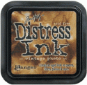
And of course you know if I'm anywhere near a tag, there's probably going to be some edging with Vintage Photo Distress Ink going on too... and wow, I love how this works.  There's sort of a resist effect from the paints - so again, they hold their own - but they also respond really well to the ink, warming up, and gaining great depth from it.  


And I really enjoyed the next stage too... playing with the Flourish Texture Fade embossing folder to add some texture.  


Once embossed, I highlighted each of the flourishes with some Distress Paint, smoothed on with my fingertips - different colours for different tags.


Then, what else but a bit more Vintage Photo DI for added oomph!


The photographs of these are being done outside in daylight now, so the colours are slightly truer than some of the stages.


By now, I really didn't want to cover up my beautiful backgrounds, so the composition of the tags was dictated by making sure as much as possible could still be seen!


I love that you still have that clarity of all the layers still visible.


But that's not all the Distress Paints were involved in on these tags.  I also used the Weathered Wood to alter the embellishments - two Wendy Vecchi pieces, and a metal clock from my stash.


And they're also involved in dyeing the crinkle ribbon.  If you use solely DPs on the ribbon you get a very matte, opaque look; fabulously shabby, but not quite what I wanted for these tags.  So I had a little go at mixing Distress Paint and Distress Stains on the mat for the ribbons, and I love the result.  


Some of the matte effect of the paints, plus some of the brilliant translucent colour of the stains: adds up to pretty cool ribbons, I reckon!

I've got lots more DP experiments to share with you, but I think that's more than enough for now... it'll just have to wait for another day!  

Thanks so much for stopping by today, and I look forward to seeing you again soon, either here or elsewhere in Craftyblogland...

Designer: Alison Bomber
Click on the link to go straight to the product:


Monday, March 18, 2013

A little bit of inspiration

Hello all, Alison here... Very happy to be back at eclectic Paperie to share another project with you.


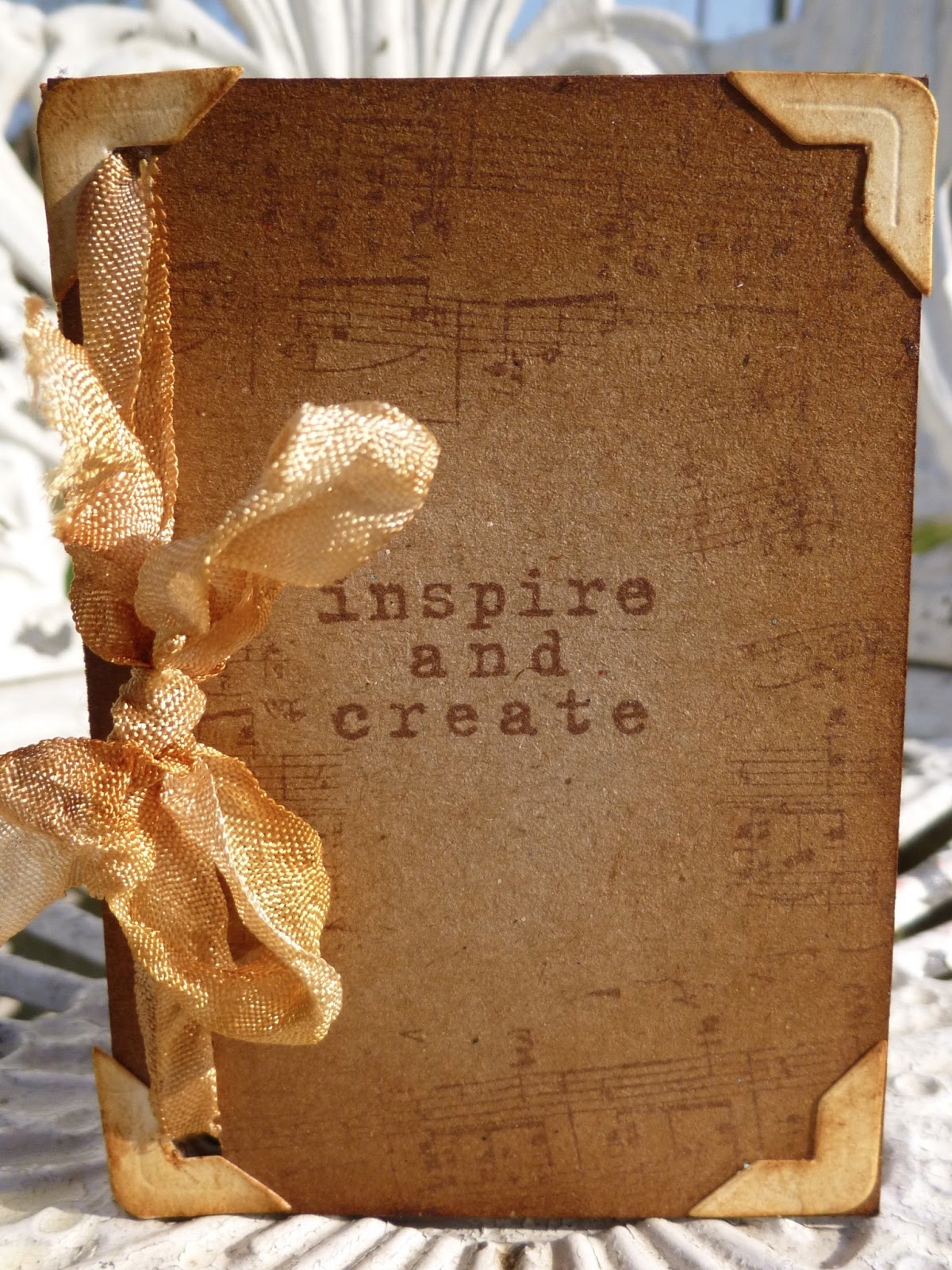
This one is a very simple little ATC book (I seem to have a thing about handmade books), with lots of little pockets - brilliant for using up paper scraps when you really want to make the most of every last little bit of your favourite papers!


It's a tiny book of uplifting and thought-provoking words and phrases, so that you can turn to it for a little bit of inspiration when in need.  And of course you can add more phrases, or other memorabilia, pictures and ephemera as time goes on... plenty of room in those pockets.


I started with six of the Inkssentials natural canvas ATCs.  One of the great things about these is that they are sticky-backed, so you get all the great canvas texture and you can apply it really easily to cardstock or chipboard to create a really sturdy, dimensional ATC.


I adhered my six ATCs to some kraft cardstock, and then started juggling with my papers.  These are from the Basic Grey Serenade set.  I worked out I had enough to do a couple of ATC-sized pages and a couple of "pockets" out of each of my selected papers.


I wanted to leave plenty of the canvas on display, and also to keep things pretty minimalist, so I kept my pockets nice and simple: a plain rectangle, alternating (mostly) between vertical and horizontal positioning.
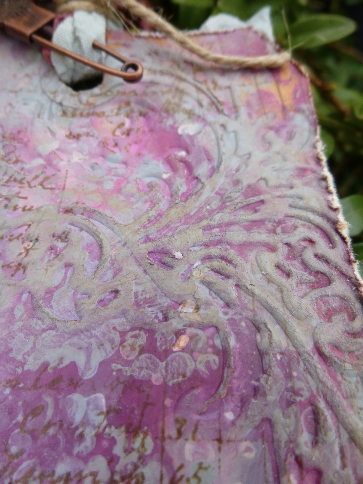

And I gave the canvas a good going over with the Vintage Photo Distress Ink to really highlight all that lovely texture.


I thought about doing some stamping on the canvas, which I always love the look of, but I was quite enjoying the clean lines of the whole thing (couldn't bear to leave out the distressing though!)... it's probably the nearest I'll ever get to a CAS project!


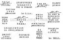
All the sentiments - from the fabulous Donna Downey sets, Empowered Words and Art and Possibility - are also stamped onto paper scraps, so they look pretty cute either way up, and they've also had a touch of the Vintage Photo DI of course.


On each facing page, the design paper side, I've added one of the larger sentiments, stamped on plain white cardstock and inked to tone in with the rest of the look.


I particularly love this Picasso quote... and I've tried to match the quotes in the pockets with my "main" quotes each time - I've tried to create satisfying groupings that "speak" to each other.


Another sentiment stamp serves as the title on the front cover (in the picture at the top of the post), and I've stamped some of the Hero Arts Serenade Music Background to surround the title, and all over the back cover.  This stamp is designed to coordinate with the Serenade music paper that I've used on the inside, so it fits in with the overall look beautifully.  (Sorry, I think it may now be sold out at eP!)


Finally I added the little corner pieces cut with the ATC and Corners die by Tim Holtz onto the front and back covers.  I love the "finished" look it gives.


The binding is incredibly simple too (seriously, you can knock up a whole little album in well under an hour) - just some crinkle ribbon dyed with Vintage Photo Distress Stain, and tied through the punched holes to give a pretty bow at the front.


I had to do a little bit of retying to get the tension right, so that the pages would turn easily without the whole thing flopping about uncontrollably, but that was about the hardest thing in the whole project - and, really, what's so hard about tying a bow a couple of times!?


Thanks so much for stopping by today.  I do hope my ATC inspiration album has given you a little bit of inspiration to go off and create something yourself.  See you again soon...

Alison xx
Words and Pictures

Ingredients (click on the link to go straight to the product):