Photobucket Photobucket Photobucket Photobucket Photobucket Photobucket
Showing posts with label Wendy Vecchi embossing paste. Show all posts

Wednesday, June 10, 2015

'It's important who you travel with'.... Journal Page

Hello Everyone,
Shilpa here,

Today, I am back with Journal page.
If you have missed my mixed media canvas post..here is the link..

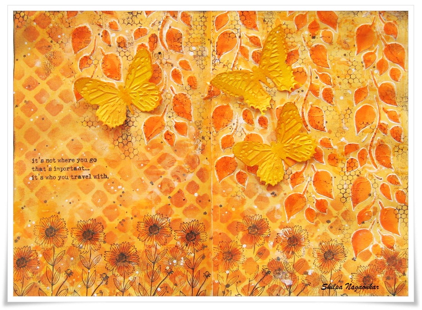
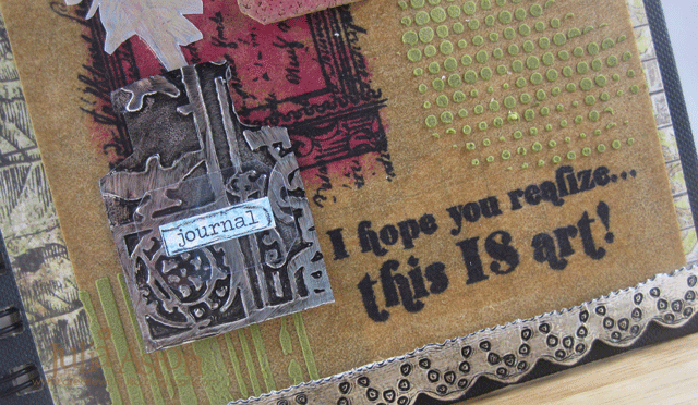
You may recognize, I've used Dylusion colors on my page.
yes, I've tried latest Dylusion paint - Squeezed Orange....and I'll say I need to add all colors in my collection. They are perfect for Art Journaling.


Its very easy to apply colors on pages with Baby wipes...Dyan has shown this technique during CHA. It dried immediately.


 Another unique feature of Dylusion paint is, we can create another layer on it with spray inks.....thats awesome for someone like me who loves to create layers after layers.
I used Finnabair stencil and Dylusion inks sprays- White linen and Pure sunshine for my next layer.


For texture, I applied Wendy Vecchi White embossing paste through Dyan's falling leaves stencil.


Here is one more fun part,
I cut out lovely butterflies from Tim's Butterfly duo die, heat embossed them with 
Wendy Vecchi Buttercup embossing powder. Next I used coordinating
embossing pads (sorry for glare on it) to create texture on them...applied Archival inks on raised area..they look awesome.


I colored leaves with dylusion paint and outlined them with white gel pen.


I stenciled more with Finnabair Netting stencil and archival ink.


And this beautiful flower stamp and quote is from Wendy Vecchi's - Art and You stamp set
 - "Its not where you go that's important ..its who you travel with."

Thanks so much for stopping by.
I'll be here again next week with new creation.

Products used from Eclectic Paperie:
Dylusion Paints


Friday, August 29, 2014

Happy Anniversary ~ Early!

Hi Everyone!  It's Sue Lelli here and I made an anniversary card for my DH early because I just received some new products from eclectic Paperie in the mail and I was itching to try them out!  I'll just save it until our anniversary in November!  LOL!
Here's My card:
What I WANTED to do was have a starfish in the center cut out with text underneath.  It would have been easier if the Tim Holtz alterations sand and sea die cuts had been separate but the weren't. So I improvised!  I ended up stacking fat chipboard over the images I didn't want to cut out and running it through my die cut machine.  They cut out anyway but there was so much texture and color and product on my Tim Holtz distress watercolor cardstock top page that when I pieced it back together like a puzzle, you really couldn't see it!  And I got the look I wanted!
I also wanted the seahorse floating in the water surrounded by bubbles (Tim Holtz texture fades - bubbles and waves) with it's tail wrapped around a plant.  That's how they REALLY look when you dive, hiding in plants and blending in to the surroundings.  For the plant I die cut a branch from the Tim Holtz spring greenery decorative strip.   I put wet glue on it and sprinkled Tim Holtz Distress Glitter on top.  LOVE the glimmer it adds!

I LOVE this seahorse and I puposely had the word MEMORY show through.  (I wanted to remind my DH of all of the FAB memories we have together.)  The text is Tim Holtz melange tissue wrap stained with tea dye Distress ink.
Here you can see the Wendy Vecchi translucent embossing paste.  I LOVE that it dries clear and looks wet on your project!

Here you can see the Prima seaweed flower and the Prima resin shells I added.  The idea-ology word band sentiment was perfect since this IS an anniversary card and we are living the life we have imagined!  Literally!  I tied it on with idea-ology jute.
The kraft paper behind the watercolor and text layers is my new FAB Tim Holtz idea-ology resist paper.  It is so cool with a design embossed on it so when you add ink, the embossing shows through.  This one I used has mini distressed dots ~ going with the bubble theme!

And on the inside, I put a photograph of last year when we renewed our vows for our 25th anniversary.  It was a dream!  Look at the color of that water and how it is mimicked by the distress paint colors on the outside of my card.

 Process Photos:
I squished some Tim Holtz Distress Paint on to an inksenssitials craft sheet I have cut to 8x8.  (I found it's easier to have several layers of craft sheets so your entire work surface doesn't get dirty ~ just small bits!)  Then I spritzed it with a mini mister filled with water.

I swiped Tim Holtz distress watercolor card stock through the paint once,

Then twice and this is what I had.  What I LOVE about these Distress Paints is that they react to water when they are wet and you can make them move around but when they are dry, they are permanent and you can add more layers and colors without creating mud.
So:
 I added some darker Tim Holtz Distress paints and swiped again.  Then it was too dark for me so I made two rows of two lighter blue shades of Distress Paints (in colors I already used):
 
And laid the cardstock straight down on top of the paint:
Then I sprayed it again with water from the mini mister.
 
I was happy with the colors but turned it upside down so the drip lines went up.  Then I embossed it with my new Tim Holtz texture fades bubble embossing folder.  I used the Tim Holtz sanding grip block on top of it to make the bubbles look white and stand out.

Here I added Wendy Vecchi's Studio 490 translucent embossing paste through the Dina Wakely plastic canvas stencil.  This dries completely clear and made the card front look wet.  LOVE that WV translucent embossing paste AND that DW Stencil!
Those are all the photos I remembered to take.  I got caught up in the creative moment!
 
I hope you like my card!
THX for stopping by!


Saturday, August 2, 2014

Finally - my Art Journal

Hi eclectic Paperie friends!  Julia here to share my altered Art Journal.  I have been trying to muster the creative energy to make this for ages - I just wasn't confident in my skills to put it together in a pleasing (to me) design (!)
So I decided to bite the bullet and just jump in -  and here it is! My Journal that started out life as a plain black - spiral bound journal - I think I got it at Michaels.....I've had it for some time - gathering dust in my Craft Room!  
 
I decided to see how Distress Stains would look on Kraft Glassine Paper.  So I stamped the bird and window frame from Tim Holtz Classics #16 stamp set using Archival Jet Black Ink and let it dry.  Then I just dabbed Tumbled Glass and Picked Raspberries Distress Stains over the images - they kind of beaded up on the Glassine paper so I just kept dabbing and the color did soak in a 'blotchy' kind of way - and they did keep their bright colors!
I die cut borders using Tim Holtz Vintage Lace Sizzlet die out of a Foil Tape Sheet that I had adhered to white card stock  and then inked it with Ranger Distress Black Paint.  I adhered the strips across the top and bottom of my cover .  I didn't pop out the little circles on the lacey cuts so the black distress paint would show up better. I also used this technique on the crown and ink bottle which I'll show close up below.
The sentiment stamps are from Destination Art by Wendy Vecchi/Studio 490 Stampers Anonymous.  Perfect for my Art Journal I think!
 
I added Forest Moss Distress Stain to some White Embossing Paste from Wendy Vecchi and applied it to both the Dot Fade and Stripes stencils.  I cut the label from the Apothecary Bottles die from cork, stained it with Picked Raspberries Distress Stain and added some Life Quotes Remnant Rubs to it.  I dabbed the edges with Frayed Burlap Distress Paint.
I stamped the feather from Tim Holtz  Bird Feather stamp set on vellum using Frayed Burlap Distress Paint (wash your stamp right after 'inking' it with paint!)  The paint on the vellum is very subtle but can be seen better IRL!  I added some Life Quotes Remnant Rubs over the feather  (note - Remnant Rubs will NOT stick to the Kraft Glassine but will stick to vellum- how do I know this??!!)
The ink bottle is a die cut Apothacary Bottle that I cut the bottom off of to look like an ink well - with the feather as the pen.


I die cut another  Apothecary Bottle labels out of Art Parts Clearly for Art Modeling film, added a Chit Chat sticker that I stained with Tumbled Glass Distress Stain and outlined with a black Stabilo Pencil and layered it over the bottle.  I used the clear film as I didn't want to hide any of the design on the inkwell!  I used the Sizzix Patchwork Embossing folder on this.
 
Here's a close up of the crown.  The curve of the crown fit nicely over the bird's head.  I used the Riveted Metal Embossing folder on the crown
You can see the Idea-ology Door Knob that I screwed into the cover better in this photo - you can actually open the Journal with the knob - so fun! and when the Journal is open on the table - the knob actually protects the popped up pieces on the cover since it keeps the cover from lying flat.  I looped a single piece of Linen Ribbon through one of the binder rings.
I wanted to keep the back flat - so there is nothing sticking up here. I used several Remnant Rubs here (Life Quotes and Botanicals).  I used the same papers on the front (under the Kraft Glassine) and the back - Paper Stash/Wallflowers.
I stained some Chit Chat stickers with Picked Raspberry Distress Stain and outlined them with a black Stabilo Pencil 
I die cut the Ornante Frame from Kraft Glassine and stained it by dabbing Tumbled Glass Distress Stain over it and framed the gentleman's face on the patterned paper.
 I used the same papers on the inside covers - I've just left them as they are for now - they have such wonderful imagery on them - maybe I'll put some sentiments or stampings on later.....I find I sometimes have to just STOP before I over do it - and go back later to see how I feel about it!


Now I just have to work up the nerve to actually do something on all of these clean white pages inside my Art Journal!!!   One step at a time - right??!!!
Thanks so much for sticking with me through all of these pics!
Stamps:  Stampers Anonymous - Classics #16 and Bird Feather/Tim Holtz, Destination Art/Wendy Vecchi,
Paper:  Kraft Glassine - Idea-ology; Foil Tape Sheet - Ranger, Vellum - Stampin' Up, Paper Stash Wallflowers - Tim Holtx, cork sheet - Michaels, Art Parts Clearly for Art Modeling Film - Wendy Vecchi/Studio 490.
Ink:  Archival Jet Black
Accessories:  Ranger Distress Stains - Tumbled Glass, Picked Raspberries, Forest  Moss; Ranger Distress Paint - Black Soot, Frayed Burlap; Alterations Dies - Apothecary Bottles, Heart and Wings, Ornate Frame, Vintage Lace Sizzlets; white embossing paste - Wendy Vecchi/Studio 490; stencils - Dot Fade and Stripes - Tim Holtz; Cropadile; Idea-ology Door knobs, Chit Chat Stickers, Live Quotes and Botanicals Remnant Rubs, Linen Ribbon; Black Stabilo Pencil.

Monday, July 7, 2014

this makes me happy

Hi Everyone!  It's Sue L. here today to show you a 6x6 canvas I made using TH Distress Paints and
Inka Gold.  I have named it:


This sentiment is from Tim Holtz Life Remnant Rub Ons.  It just sums up how I felt when the canvas was done!

To make the sun and the rays, I first applied Wendy Vecchi embossing paste through a Viva Decor stencil, turning it to look like the sun.  The embossed image  so much texture and interest to the canvas!

In this photo, I angled the frame and washed light over it so you could see the shine the Inka Gold added!  That was my last step and I applied it with a tiny paintbrush to get in the fine lines.  I think it adds the warmth of sunshine to the canvas!  I also have a vivid imagination!

Process Photos:
Here you can see the Wendy Vecchi embossing paste pattern left by the stencil.  You can also see how I applied green and yellow and white TH Distress Paints along the bottom, turned the canvas upside down, and spritzed it with a Inkssentials Mister bottle until the paints marbled how I liked them.  You can also see how I started adding paint splats with more TH Distress Paints to make flowers.

I used the same technique for the sky base.

The water sprayed on it did the trick, and I kept adding more colors and paint until the color looked right to me.  Then I painted the sun bigger and splattered and splatted different colors of TH Distress paints until I was happy.  And in case you forgot, here is the end result:
I hope you like it and are inspired to try something new to you like I did!


Thursday, July 3, 2014

July ePlay Challenge - Altered Bottles

 
Hi everyone, Julia here - for my first time hosting the 1st Thursday of the month ePlay Challenge -  and I challenge you to Alter a Bottle!  It can be glass, plastic, big or small -  I just want to see how you will take it from plain to WOW!

I started my project with a triangle shaped, clear glass bottle with a cork stopper in it from Michaels that cost $1.00.  It measures about 2 1/2"x 2 1/2" x 2 1/2" x 4 1/4" high.
And here is how I turned it into 'WOW'!
I learned this crackling technique from Wendy Vecchi, when I took her class at Kim's brick and mortar eclectic Paperie shop in Exeter, NH.  We didn't make one that day - but Wendy had two on display and she explained her technique to me.  You start by covering the bottle with a paste -  I used Wendy's Silver Embossing paste.
After that's dry - you cover it with Wendy's Crackled Texture Paste (if you don't use the embossing paste first - the crackle will peel right off after it drys!)
After the crackle dried - I sponged over the whole bottle with 3 Ranger Distress ink colors - Salty Ocean, Mustard Seed and Gathered Twigs.
I took the floral border from Industrious Stickers/Borders and inked it with 3 Adirondack Alcohol Inks - Stonewashed, Rust and Lettuce.  I dried it with my heat tool and adhered it along the base of the bottle.  I added ScorTape to it even though it already has adhesive just to give it a sticking boost against the inked crackled surface!
I wanted to hang something around the neck of my bottle and I had just purchased some Idea-ology Fragments/Charms.  I thought I remembered that Tim Holtz had a technique for using them in one of his Compendium of Curiosities - and sure enough, I found it on page 55 of his first book.
First you pounce ink on the charm using the felt applicator and some Adirondack Alcohol inks.  I used the same ones I used on my Industrious Border above -  Stonewashed, Rust and Lettuce.
Then you put some Alcohol Blending Solution on a corner of the felt applicator and touch it to the center of the charm - that makes the ink flow away - so you want to blow on it once it clears out just the center area to stop it from clearing all the way to the edges.  You can add more color to the edges if you want after this step.
Next I ran a thin line of Glossy Accents around the edges of the inked side of the charm and laid it over the image I wanted to frame.  Once it was dry I cut around the edges.  The butterfly is on a sheet of paper from the Tim Holtz Ideology Paper Stash 8x8" Collage pad.
Look how beautiful it looks - and it's such a simple technique!  I looped a piece of Linen Ribbon through the hole and tied it around the neck of the bottle.  I knotted a shorter piece of Linen Ribbon just above the charm and spread out the ends - I love the wonderful texture that gives to the ribbon!
I used Glossy Accents to adhere the Charm to the bottle - I didn't want it swinging around or loosening the ribbon.
Here's a close up of the inking on the Border Sticker - and you can see the Silver Embossing paste showing through the cracks of the paste better on the next two photos.
Here's a close up of the lovely Linen Ribbon with it's pulled apart ends.
A side view of the bottle -  I left the two sides plain - wanting to show off the wonderful crackle and also to appreciate the beauty of the charm on the front!
And here is my pretty little bottle in use as a vase -  as soon as I finished my bottle - I rushed out to my front garden and cut a few things that were blooming to see how they would look - here are a few pics!  Here it is filled with a stem from Solomon's Seal and Goldenstar blooms.
Here's my vase with a big orange marigold and a Solomon's Seal stem.
And a final variation of blooms - Goldenstar and Dianthus.
My little flower filled bottle is now proudly sitting on my kitchen windowsill where I can enjoy it each morning before I leave for work!
I can't wait to see what kind of bottle you choose to alter and what techniques you use to take it from plain to WOW! 

If you would like to "Alter a Bottle" we would love to see your creations. There is a generous $25 gift certificate for Kim's fabulous eclectic Paperie Shop, for one lucky winner.  You have the whole month of July to get your project done and add it to Mr. Linky at the end of this post!

Thanks so much for stopping by the eclectic Paperie Blog today -  where every day a member of the Design Team posts something inspirational!

Paper:  Idea-ology Paper Stash 8"x8" Collage
Ink:  Ranger Distress Salty Ocean, Mustard Seed, Gathered Twigs, Adirondack Alcohol Inks Stonewashed, Rust, Lettuce and Alcohol Blending Solution
Accessories:  Studio 490 Wendy Vecchi Silver Embossing Paste and Crackle Texture Paste.  Idea-ology Fragments/Charms, Linen Ribbon, Industrious Stickers/Borders; Glossy Accents, ScorTape.