Photobucket Photobucket Photobucket Photobucket Photobucket Photobucket
Showing posts with label Basic Grey. Show all posts

Wednesday, May 28, 2014

Thank You cards with Gelli Plate and Art Anthology

Hi everyone, Steph Ackerman here with my final post as the guest designed for eP for this month.  Big thanks to Kim and Bonnie for inviting me to participate. 

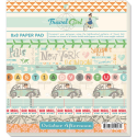
Today I've got some cards to share.

Have you played with the Gelli Plate yet?  Well, if you haven't, you should. It is so much fun.  I love mix'd media and I know so many people are using the Gelli Plate for mix'd media projects such as canvas and journals, but how about we switch it up a bit and create some mix'd media cards?  Oh so much fun!!!!


I began by placing Art Anthology paints on the Gelli Plate.  I used  Kenyon Copper Sorbet, for the first print, then placed The Crafter's Workshop Gathered Flowers stencil in the paint and placed a sheet of white paper on top.  For the second generation print, I added the Mini Chicken Wire Reverse Stencil.  This is the result.  It may not look like much, but read on.....


I cut the print to fit a 5" x 6 1/2" card, then wanted to add some other color.   I realigned the stencil back over the print.  I then inked it with VersaMark watermark ink then moved the stencil to get that missing spot on the left side. 


Then I poured Ranger Seafoam White Embossing Powder on top and heat set.  I wasn't sure what the outcome would be, but hey, that's what creating with mix'd media is all about, isn't it? 


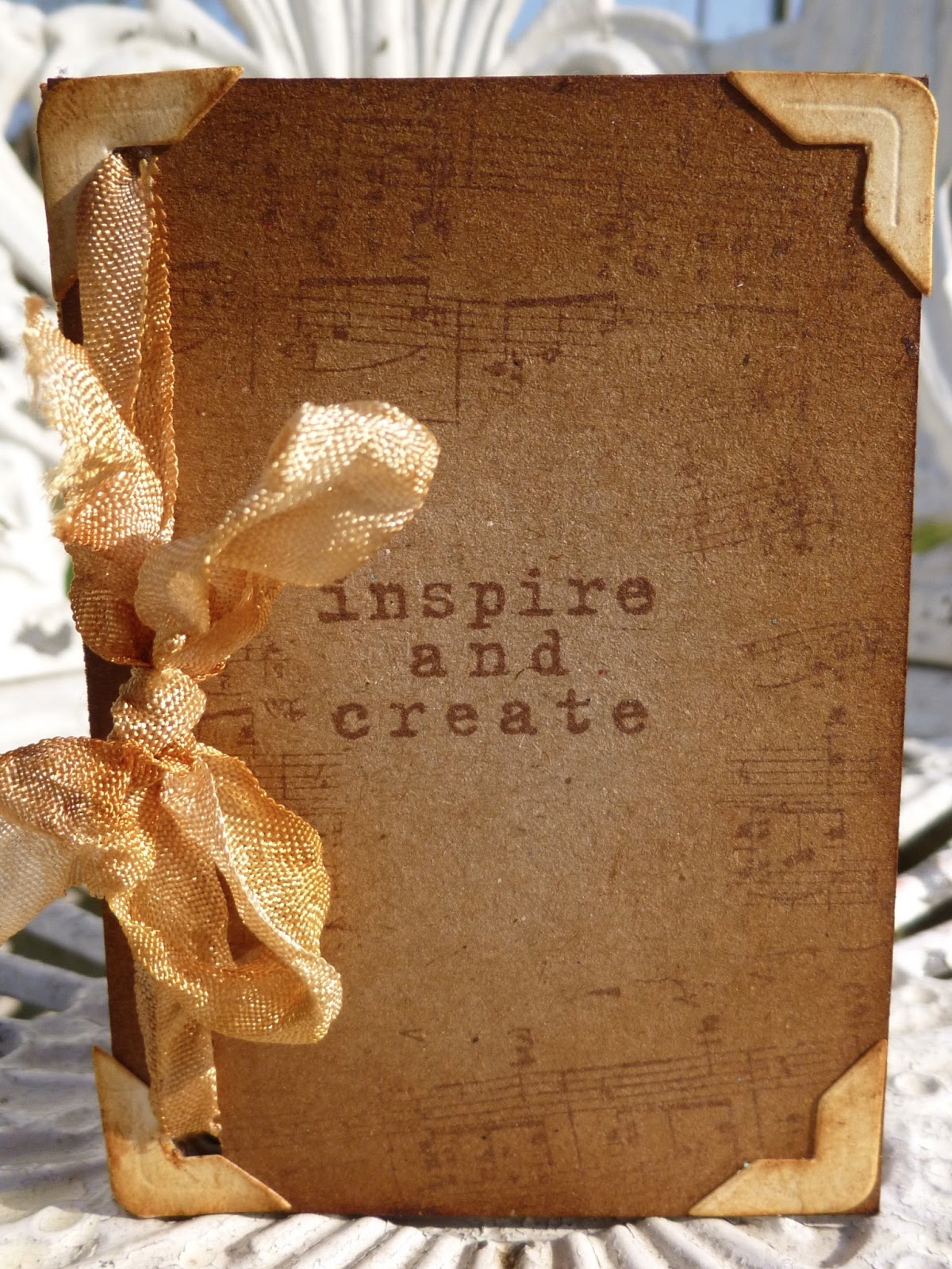
I stamped the sentiment in VersaMark ink and embossed it with Seafoam Embossing Powder.  I also inked and embossed the edges for a little more dramatic effect before matting with black cardstock.  And the final card looks amazing!


Since I was having so much fun, I created another Gelli print using Kenyon Copper Sorbet with Velvet Aloha, and Honolulu Blue Sorbet.  I again placed the Garden Flowers stencil on the painted Gelli Plate and placed white cardstock on top.


After removing the white cardstock, I found the result wasn't very pretty at this stage.

 
But tear it up, mat it with some cardstock and a wonderful couple of cards are created.


Use the Scor-Pal to create the scored lines above and below the Gelli printed paper.


Stamp the sentiment in VersaMark and emboss with Seafoam White Embossing Powder.

Don't they look amazing!  Why not pull out your Gelli Plate and get creating today!

Thanks for stopping by. 

Please visit my blog for more inspiration.

Steph


Tuesday, October 8, 2013

US

Ever have those times when you start and finish a project and what you had in mind does not translate to paper?  Then, you tear it apart and start all over again?  That happened to me on this layout.  Sometimes things come naturally, other times, its forced.  Well, you should have see the "dirty" part of my layout before.  NOT pretty!  This rendition is much better and I would love to share it with you.  So, it's Mary-Ann here, about to share my labor intensive layout:o)


I sprayed three different color inks to get my desired look on my cardstock base.


Then I totally stole an idea from a fellow blogger Ashli Oliver and spread Gesso over my patterned paper at the bottom of my layout.  It helped soften the darker colors.  I hand drew in some of the arrows that I wanted to stand out.  


Layered my October Afternoon papers, stickers, A Flair for Buttons flair, My Mind's Eye enamels and October Afternoon brads.  You will see below on the completed layout that I used the same spray ink to add color to my title from Fancy Pants and wood veneers from Basic Grey.


This end result is a much more pulled together layout than the last!  Blue, gray and pink make me happy when they are together.  This photo is celebrating my 8th Mother's day because of that beautiful boy with me.  I am blessed.

Thank you for stopping in.  Below you will find a link to all the items you can purchase over at Eclectic Paperie.  


Monday, June 17, 2013

My Chalk Family!

Hello "REAL" people, it is Mary-Ann here today to share "My Chalk Family!" layout with you.  Just recently I attended an open house at Eclectic Paperie's new store front location and got my hands dirty with some really cool product.  I felt like that really clean girl in a fancy fluffy dress, not wanting to play in the mud puddle with all her friends.  But, with much encouragement from my mixed media friends, I jumped in....with only one foot!  I enjoyed seeing the creations of others and decided I would buy Gesso.  What?  I am still not sure what it is but I like it.  I tried my hand at what I thought was reaching WAY outside the box, for me!  This is what I started with.


Then I thought that the white Gesso was to stark on my choice of blue paper, so I dug deep and found some old blue embossing powder when I dug out my heat gun to help dry my Gesso.  Maybe that is why I am not hard-core mixed-media, I have not patience when allowing things to dry.  I like instant gratification folks and my heat gun helped.  So did the powder!  LOOK!


After I changed the  Maya Road- You've Been Framed Wood Embellishments with Distress Stain - Pumice Stone, I added Gesso and embossing powder to the bottom.  Which I actually turned on its side.   I added stitching to help hold some of my embellishments in place.  I layered papers, tucked tags and added random chipboard pieces.  I also added the perfect color flair from A Flair For Buttons.


I added some more little touches of My Mind's Eye enamels, Jillibean Soup Sugar Picks and The Twinery - Platinum Shimmer twine.


Here you can see that I changed the Basic Grey - Hipster - Wood Veneer banners with Pumice Stone like before and the word "awesome" with Forest Moss Distress Stain.  I added another flair and a Wendy Vecchi - Blossom Bucket - Red Heart


Ta-da, a Mary-Ann style layout with a mixed media twist!  Thanks for getting a "little" dirty with me!


Monday, March 18, 2013

A little bit of inspiration

Hello all, Alison here... Very happy to be back at eclectic Paperie to share another project with you.


This one is a very simple little ATC book (I seem to have a thing about handmade books), with lots of little pockets - brilliant for using up paper scraps when you really want to make the most of every last little bit of your favourite papers!


It's a tiny book of uplifting and thought-provoking words and phrases, so that you can turn to it for a little bit of inspiration when in need.  And of course you can add more phrases, or other memorabilia, pictures and ephemera as time goes on... plenty of room in those pockets.


I started with six of the Inkssentials natural canvas ATCs.  One of the great things about these is that they are sticky-backed, so you get all the great canvas texture and you can apply it really easily to cardstock or chipboard to create a really sturdy, dimensional ATC.


I adhered my six ATCs to some kraft cardstock, and then started juggling with my papers.  These are from the Basic Grey Serenade set.  I worked out I had enough to do a couple of ATC-sized pages and a couple of "pockets" out of each of my selected papers.


I wanted to leave plenty of the canvas on display, and also to keep things pretty minimalist, so I kept my pockets nice and simple: a plain rectangle, alternating (mostly) between vertical and horizontal positioning.


And I gave the canvas a good going over with the Vintage Photo Distress Ink to really highlight all that lovely texture.


I thought about doing some stamping on the canvas, which I always love the look of, but I was quite enjoying the clean lines of the whole thing (couldn't bear to leave out the distressing though!)... it's probably the nearest I'll ever get to a CAS project!


All the sentiments - from the fabulous Donna Downey sets, Empowered Words and Art and Possibility - are also stamped onto paper scraps, so they look pretty cute either way up, and they've also had a touch of the Vintage Photo DI of course.


On each facing page, the design paper side, I've added one of the larger sentiments, stamped on plain white cardstock and inked to tone in with the rest of the look.


I particularly love this Picasso quote... and I've tried to match the quotes in the pockets with my "main" quotes each time - I've tried to create satisfying groupings that "speak" to each other.


Another sentiment stamp serves as the title on the front cover (in the picture at the top of the post), and I've stamped some of the Hero Arts Serenade Music Background to surround the title, and all over the back cover.  This stamp is designed to coordinate with the Serenade music paper that I've used on the inside, so it fits in with the overall look beautifully.  (Sorry, I think it may now be sold out at eP!)


Finally I added the little corner pieces cut with the ATC and Corners die by Tim Holtz onto the front and back covers.  I love the "finished" look it gives.


The binding is incredibly simple too (seriously, you can knock up a whole little album in well under an hour) - just some crinkle ribbon dyed with Vintage Photo Distress Stain, and tied through the punched holes to give a pretty bow at the front.


I had to do a little bit of retying to get the tension right, so that the pages would turn easily without the whole thing flopping about uncontrollably, but that was about the hardest thing in the whole project - and, really, what's so hard about tying a bow a couple of times!?


Thanks so much for stopping by today.  I do hope my ATC inspiration album has given you a little bit of inspiration to go off and create something yourself.  See you again soon...

Alison xx
Words and Pictures

Ingredients (click on the link to go straight to the product):