Photobucket Photobucket Photobucket Photobucket Photobucket Photobucket

Saturday, May 31, 2014

Always Take the Scenic Route ~ Altered Canvases


Hello, friends. It's Bonnie here today. I was totally in the mood for beachy colours and scenery when I decided to have a play with these four canvases. I thought it would be fun to create one scene treating the four as one...an experiment. I started with four pre-gessoed 4x4" canvases. To get some initial colour down, I scribbled over the sand part with gold and brown watercolour crayon and over the sky area with two shades of blue and spread the colour with a wet brush. I intensified the colours with gelatos, spreading their colour with a dry finger (or two).


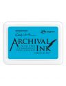
Next I stencilled with white gesso through TCW's Tiny Circles and stamped some text using Wendy Vecchi's Forget-Me-Not Archival ink, both in the sky area. The same ink was used to stamp Wendy Vecchi's Vintage Mesh randomly rolling the pattern on the canvases so as not to get any harsh edges.


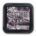
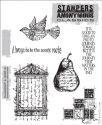
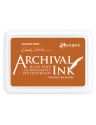
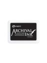
The same text stamp was applied to the sand areas using WV orange Blossom Archival ink and white gesso stencilling was also applied to the sand, although it doesn't show much. It just adds another layer and a bit of change in the colour here and there. The birds and the sentiment are stamps from Tim Holtz's Classics 16 set using Jet Black Archival ink. The birds were stamped onto some paper used to catch the excess spray so they are a mix of colours but were both shaded with Barn Door Distress marker. I leave paper in the bottom of a box that I use for spraying and then use the paper for mixed media bits when I like what I have, The two birds are actually the same stamp but I surgically removed the wings from the one and reattached one to his side so he would be walking on the beach. The sentiment piece was torn around and edged with Black Soot Distress ink before being popped up on foam tape.


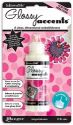
The beach grass and flowers were stamped onto the canvases using Jet Black Archival ink and a stamp from Wendy Vecchi's Art Comforts set...love that set! The two flowers were coloured in with Spiced Marmalade and Barn Door Distress markers. Enamel candy was added to the centers and a few of the leaves were darkened and emphasized with the Black Soot Distress marker. Two torn scraps of green paper were adhered to the bottom of the canvases and edged with Green Tea gelato. Some Mudd Puddles Mini Beach pieces were adhered to the sand with Glossy Accents.


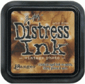
The sun was punched from more spritzed left over scraps but these have some Gold Tattered Angels sprayed on which creates quite a shimmer IRL.. The purple whad been sprayed onto a stencil and then cleaned off on this same piece which is why it's not crisp...I love that. I layered the two circles with black ones to create more dimension and contrast and then cut triangle rays to tuck underneath the larger circle layer. The clouds were die cut from vintage music paper, edged in Vintage Photo Distress ink, and popped up on foam with a little scrap of cheesecloth tucked behind them.

That's it for my experiment. These would be cute hung on a wall with spaces between or stacked on a shelf without the spaces. I would definitely do this again. It was fun! Hope you enjoyed it, too.

Thanks for visiting.
Bonnie

Here are links to the eP store for some of the products I used.


Thursday, May 29, 2014

Pinterest Inspiration

Today my post will be a tad bit different. Today my post is based on Pinterest inspiration.

"Whatchu talkin' bout Willis?"

Ok...so how much time do we spend on Pinterest? Ok now add 3 hours a day to make it in real time right? 

You in the back stop glaring like you don't know what I'm talking about.

We are constantly browsing through Pinterest for ideas and inspiration for whatever we do in our lives right? Where would we be without Pinterest?!
*ahead on housecleaning and caught up on laundry*
but seriously gals. This is a wonderful resource for numerous aspects of our lives...including...mixed media art. 

So as an example, today I'm going to show you how I took this image from Pinterest


as inspiration to alter some wood pieces I had lying around.


Here's a quick little video on how I made this lovely piece


I also wanted to share with you the new Cold Country Line from 7Dots


I just adore these papers!!! I also used flowers from the cartographer line and used my Tim Holtz stencil for some of the background. I adore the cool colors of this line and can't wait to use more.
  

Until next time...
{{hugs}}
Andiepants

House of Cards

Hi everyone, Micki here to share another one of my art journaling adventures using every single one of those yummy Dina Wakley paints, lots of stencils and some playing cards.
I began by opening up my art journal, found a couple of somewhat empty pages and covered both pages with some color.  One side was painted yellow and the other blue using Faber-Castell Gelatos and my waterbrush during my lunch hour at work or more appropriately called, my therapy session!  My initial idea was to sketch a tower of cards, the way one would built them on a table but I couldn't figure out how to incorporate real playing cards.  I thought about cutting the cards up and paper piecing my sketch but instead I glued whole cards sort of crooked to my pages (yes, I also brought glue in my traveling art sack).
Later that evening, I grabbed several stencils and like I mentioned at the beginning, used every single color of Dina Wakley paints.  I threw a lock on my analytical mind and just played with those awesome paints, adding lots of stencil layers.  Before adding the stencils over the playing cards, I lightly sanded the cards and covered the cards with a layer of Clear Gesso to ensure that the paint wouldn't chip off.  Those playing cards are pretty slick since they were brand new.
I thought the lines from the bridge in the Cityscape stencil from The Crafter's Workshop would make great journaling lines as well as a neat background behind my "tumbling houses".  I use a blending tool to dab paint through stencils, which seems to work for me.  I seem to get the best impressions with no over spill using the foam blending tool. After stenciling the bridge, I continued dabbing my tool around to get the night sky.  I liked the variation in the black paint.  (Complete listing of stencils and supplies used is below).  Then it was time for me to step away.  When I came back to the journal the next evening, I decided to tone it down a bit with watered down white gesso.  I still wanted the stencil layers to show through but didn't like the background color - not enough contrast.
This time as I was adding paint colors I paid a little more attention to my color wheel and placement of color.  While the other side was drying, I focused on the face.  I initially was going to sketch a side-view face, but ended up using TCW's Profile Stencil designed by Julie Fei-Fan Balzer (who is teaching a class at the eP Shop this fall!!!!).  Instead of dabbing paint through the stencil, I lightly traced the face with a pencil so I could make the end result sort of my own and make it look more painterly.
Boy, the trouble I had with the lips and eye almost caused me to start over and just stencil the face with paint, but persistence won out.  I kept at it.
Still not happy with the eye, but trust me, a lot better than the previous layers.  To help cover up some of those mistakes, I used some bleeding tissue paper piece under her eye.  It covered the black lines even if I could not get the skin color to match the rest of the face.  I used a blue watercolor pencil for some eye make-up, which was blended with a wet brush.  

For shading I used a combination of Stabilo All Pencil and some watered down paint that was left over on my craft sheet.  Once that was done, I used my Fude Liquid Ink Roller Pen to doodle around the houses.  To spell the title of this spread, I used Tim Holtz Idea-ology Alpha Cards which were cut apart and glued to the cards with Beacon 3-in-1 Glue to make sure they stay put.  Then I started journaling with with my Uni-Ball White Gel Pen, starting at the bridge but I had quite a bit to say and ended up journaling around each of the houses too.
I added some random stamping using some old, but much loved, Wendy Vecchi Studio 490 stamps.  Lastly I darkened the edges using Vintage Photo Distress Ink and blending tool.


I love how this turned out.  Dina Wakley's paints are AWESOME!!!!! And I do like how the side profile face turned out, if you didn't know you might think I painted her from scratch.  On a side note, the blurry part in the picture was done on purpose. In the journal it's the name of the "house of cards", which is just for me :-).  I'm telling ya, the best therapy!
I hope you enjoyed this trip through my art therapy session and came away inspired.  Oh and if you haven't tried Dina Wakley's AWESOME paints yet, what are you waiting for!!!!


Supplies Used: