


Photobucket Photobucket Photobucket Photobucket Photobucket Photobucket
Showing posts with label Ranger Distress Paints. Show all posts

Wednesday, May 6, 2015

Post Box Red Flowers for May

Hi, Ruby Craft here. I’m so excited that Kim has invited me to be guest designer for May. She asked me to share a little bit about myself. A little over 10 years ago I had taken early retirement but had a little too much time on my hands. I decided I needed a hobby so I started Scrapbooking. Then I took a part time job at a local scrapbook store and a co-worker showed me Tim Holtz and Alcohol Inks. When Tim started his blog with a tour of his workroom and then began posting 12 Tags of Christmas I was hooked on inky fingers and multi media. I began blogging so I could post my tags for Tim’s challenges. I still scrapbook from time to time but enjoy challenges, making tags, cards and the occasional 3 dimensional project. I'll be here every Wednesday this month with something new for you to see.

For my first project I looked through my stash and found a naked spiral book I had bought a while back. I used 3 different stencils along with paints, so I worked on a non-stick craft sheet. It made clean up easy and also made a great pallet. The first thing I did was to carefully open the spiral and take out the covers. I then laid them face up on my work surface and placed the first stencil, Weaving for Prima Finnabair Elementals, on the front cover. I used Prima's Color Bloom Spray Mist in Gold Foil. This was the first time I used it and I loved working with it. It has a trigger sprayer which allows you to get quick solid coverage but also allows you to get a spatter effect if you want. I sprayed through the stencil onto the cover front. Instead of wiping off the beautiful mist that had beaded up on the stencil, I flipped it over and placed it on the back cover. This gave me the same beautiful shimmery gold but a negative of the pattern on the front.

I used a fun stamp from Catherine Scanlon Designs called Catherine's Alphabet. This is a large one piece stamp that has open letters that would be perfect for water coloring. I thought it would make a terrific illustration for my cover. I used a brayer to "inked it up" with some Post Box Red Paint from Dylusions and stamped the front cover. I didn't get a perfect impression but it was perfect for the look I was going for.

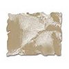
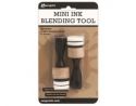
I decided I wanted to add a Flower border along the sides and bottom of the front cover and along the bottom of the back one.  Tim Holtz Wildflower Stencil was perfect for this and the second stencil I used. I used a couple of mini blending tools to apply the Post Box Red Paint to the stencil flowers and then Cracked Pistachio Distress Paint for the stems and foliage. Distress Paints have a dauber top but the paint is very fluid and would run under the stencil if you tried to apply it directly from the bottle. The mini blending tool works great with the stencils and paints. The thin stems can be a little tricky with the blending tool. Once I removed the stencil I used a fine detail water brush to pick up some Cracked Pistachio from my craft sheet to touch up the stems. The water brush allow me to keep the color soft.

I also used the water brush to paint the inside of the  letters with Post Box Red at the top and Abandoned Coral Distress Paint from the bottom of the letters fading the color out before reaching the middle of the letters. This allows the Gold Foil Spray to peek through. Another thing I liked that the Gold Foil Spray as a background is that once it was dry it was not disturbed by the water or paint.

Along the very top and bottom of the front cover I used the third stencil, the hearts from the Love set of BoBunny Stickable Stencils. Again using the blending tool and Dylusion's Post Box Red. Once I finished the hearts I felt they needed something else. BoBunny Glitter Paste in Sugar! I used a palette knife and the stencil to apply it. These stencils are sticky and reposition-able making them easy to use. I finished off the edges using the blending tool and some Vintage Photo Distress Ink.


I decided I wanted to make a band to hold the book closed. I painted a piece of white elastic with Cracked Pistachio Distress Paint. Using the dauber top made it easy. Distress Paint does not effect the elasticity or stiffen the elastic. Once dry I attached the strip to the back cover with eyelets.

I die cut a flower from Wendy Vecchi's Clearly for Art Modeling Film from Tim Holtz's Tattered Floral die. Clearly for Art Modeling Film is NOT shrink film. When you heat it you can bend it to what ever shape you want and when it cools it will hold the shape. It comes in clear, white or black. Before you mold it you can paint it, stamp on it, or glue paper to it and then stamp on the paper if you like. If you don't like the shape you can reheat it flatten it and start all over again. I used clear and painted one side red by simple spreading the Post Box Red paint on with my fingertips. Once dry I flipped the flower over and used the spatter stamp from Wendy's Faux Graniteware starter kit and some Jet Black Archival ink to stamp the black spots. After the ink dried I attached the flower to the elastic band with a black eyelet. Then I was able to heat the flower with my heat tool and shape it. I just wanted the flower to have some subtle modeling since it was on the cover of the journal. I slipped a pencil under some spots while heating to get a little lift and did the rest of the modeling with my fingers.  You don't have to heat the whole flower, just a small section at a time. Once I had my flower shaped the way I wanted it, my cover was finished and I put everything back together.

I want to thank Kim for inviting me to be the May Guest Designer. She generously sent me quite a few fun products to use and she is wonderful to work with. She has designers for June, July and August, but if you are interested in being a guest designer in the future send her an email. I included a little information about myself and a few links to projects on my blog that I thought she might like and she got right back to me.

Here are a few quick links to some of the products I used from eclectic Paperie.
Dylusion Paint, Distress Paints, Stencils, BoBunny Glitter PastePrima Color Bloom Spray MistTim Holtz ProductsWendy Vecchi, Catherine Scanlon Designs 

I Hope you enjoyed seeing how I created my first project as guest designer and that you'll be back next Wednesday.

Tuesday, September 16, 2014

Inspired by.....

Hello, it's Sue Lelli here today to show you how I was inspired by none other than Donna Downey!  I took a class from her not knowing we would be working with faces ~ NOT my thing!  I spent most of the class frustrated because I couldn't even do the first step which was a new technique (for me) called image transferring.  So what did I do?  I followed all of the rest of her steps, learned as much about technique as I could, ended up with something I was sort of pleased with - but only honestly because Donna was kind enough to help me plus give me encouragement.  That might have been the end of the story but I was determined to try it again.  My artist friend, Maria, drew a face for me to keep and use and I tried the image transfer again.
 
Tah!  Dah!  Here is my canvas ~ inspired by Donna Downey!
Isn't she Pretty?!
 
I used words from the TCW mini Art is stencil to create my message.  Wendy Vecchi's black embossing paste did the trick.  "Art is just color and shape, feelings and experiences"
 
 
At the bottom I added "release and surrender" to remind myself to just let go and try new things with my art, even if it's uncomfortable!
 
Some process photos:
This shows the image transfer with the face my friend drew.  You will probably be seeing this face again!
 
Next I used gelatos in several colors and sprayed it with water from a mini Mister, and then mixed it around with my fingers.    I used gelatos to color her face, neck and hair.  I then added definition with Prisma watercolor pencils.  Thanks, Donna, for literally showing me how to on my class piece!  I colored the eyes and lips with the Prisma pencils as well.
 
Next I made a background using my FAV TCW confetti stencil and Tim Holtz Distress paints in shades of pink, orange and yellow.
 
Then I used the Dina Wakely plastic canvas stencil ~ LOVE ~ to add some more color to the background.  I pounced  Tim Holtz distress ink in mustard seed with the mini ink blending tool.
I rubbed golden paint around the outside edges, added a Prima resin butterfly, a little lace, and considered it done!
I hope you like her!


Wednesday, September 10, 2014

Wallflower Assemblage Clock.

Hi Guys, Karen here with you again on this wonderful Wednesday to share with you my second guest DT project.
This week I have a Tim Holtz Assemblage clock to share with you.
  I started off by altering my clock base using Antique Linen distress paint. I painted the whole of the clock, and allowed it to nearly dry all the way, and the rubbed the clock with a soft dry cloth to remove the small amounts of still damp paint  to achieve a distressed finish.. have to say I love how it turned out!

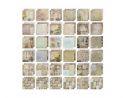
Next I chose my papers that I was going to use from the Tim Holtz Wallflower paper stash.. I have to say I absolutely adore this paper pad, and have a hard time choosing which papers to use, as I think they are all awesome!  After I chose my papers, I cut a strip approx. 2  1/2 inches wide to line the inside of the clock and traced around the back of the clock onto my chosen background piece, cut it out and inked the edges, to form the background base for the face of my clock. I then added in some remnant rubs, a distress ink reinker coloured woodlands tree and a couple of fussy cut butterflies to finished of my background. I cut some of the bristles off the back of the woodlands tree to flatten it  and kept these aside to add in later.  


I then die cut some glassine paper and a piece of the wallflower paper with the Tim Holtz Tattered floral die ( using the two smallest flowers)  and made some flowers to add into my clock. I also fussy cut a bird from another piece of wallflower paper, I adhered these to the left hand side of the inside of the clock and added in some of the pieces I had cut off the back of my woodlands tree.


 As a final touch I added a bow made of coloured crinkle ribbon and some baubles and trinkets to the top of the clock. and I was done.


There are so many possibilities that come to mind when I look at these assemblage clocks I hope you find a little inspiration in mine.
Thanks so much for stopping by today, Until next week.. Happy Creating!!
Karen xx


Wednesday, September 3, 2014

Configurations Book

Hi It's Karen Knight here with you today to share with you my very first project as your Guest Designer here at eclectic Paperie for the month of September.
I want to say a huge thank you to Kim and Bonnie for inviting me to hare some projects with you this month. I appreciate this opportunity and hope that I can leave you feeling a little inspired.  For those of you who don't know me, I love all things vintage, grungy and Tim Holtz.. So lets jump on in..
My first project that I have is a Tim Holtz Mini Configurations Book..
 I adore these, and have used this one to create a little keepsake using some things that are important to me.. A feather from my son's feather collection, and some of the dried flowers that I've kept that he picks for me as we take a walk sometimes.


 I started off by painting all the parts of the mini configurations book with Frayed Burlap Distress paint, and letting it dry. 


I then sanded the edges of the book and each compartment and inked the edges using Walnut Stain Distress ink.
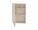

Next came the fun part...cutting various pieces of Tim Holtz Wallflower Paper to size to fit each of the included compartments, and the spine, front and back covers.


I then inked all the cut to size pieces and machine stitched around a few of the pieces as well.


Then I used double sided tape to adhere all my pieces, and started to fill each compartment with some of my chosen trinkets and treasures.. (this is the part where I do lots of changing of my mind..) and I was done..


 This is my finished keepsake..


And you really can't go past a few close ups.. 

Remnent Rubs are perfect to mix and match using various sets to add your chosen phrase or sentiment!


Inside the Wishes jar ( my empty Tim Holtz Wishbones  jar ) I have  a little bit of spanish moss, some Tim Holtz Baubles, and two little tiny feathers from my son's feather collection.


On the cover I have used one of my dried flowers. I  sealed these after drying with some Ranger Multi Medium to give them a little bit of extra strength.


Sigh.. I adore the Tim Holtz Ruler Bindings teamed with a photo, another dried flower,  some hitch fasteners and Tim Holtz Ephemera...


 I love how this has turned out, and the fact that's it's made just that little bit more special and personal with the little added extras from adding in found things that are special to me.

 I hope I've inspired you.. Thanks for stopping by. Have a wonderfully creative week.. and see you all next Wednesday!
Karen xx