Greetings!
(Click on photos to enlarge and enhance)
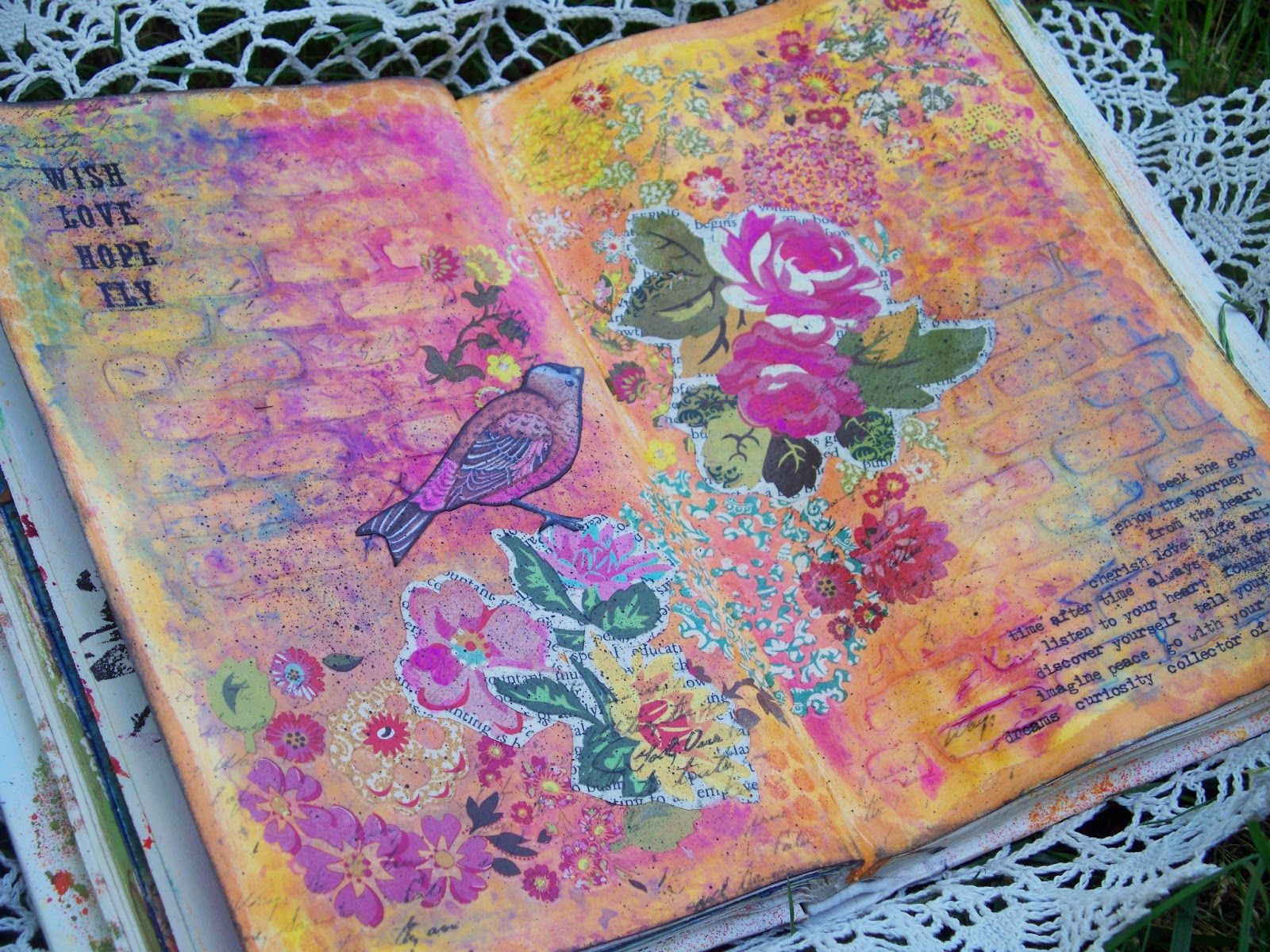
Today I am sharing a spread in my art journal with you. The paints I've used throughout the page are
Tim Holtz Distress Paints. The base layer is "wild honey" and "spiced marmalade". (In addition to being really yummy paint, the names Tim has given his colors are so yummy too!) After the paint dried I applied gel medium through a
Wendy Vecchi Studio 490 brick wall stencil and let it dry to create a resist.
The next layer of paints is "broken china" and "picked raspberry".
I
sprayed them with water and where they ran together they made a
gorgeous purple. Because the oranges were all ready dry underneath, they
didn't mix with them - awesome paint! I blotted and moved the paint around with a piece of bubble wrap until I was happy with how it looked.
Once it dried I added some texture with (my favorite) Unity Stamp Company "She Script" stamp and Staz-On ink applied through punchenella. Next I got out a couple of packs of Basic Grey rub-ons that have been in my stash for-e-ver and just piled them on the page from bottom left to top right in the area left blank between the brick resist. I reserved two of the larger rub ons and applied them to book paper and cut them out. I placed those on top of the others to create another layer.
The bird is cut from a greeting card by Current. I enhanced it with Faber Castell Pitt Pens and colored the edges with black Staz-On.
At this point the page sat for a few days, I knew it needed something in the top left and bottom right but didn't know what. Sometimes it's best to just let things sit, then when you are going through your stash a light bulb goes off and you find the right product to add to your page. In this case it was Tim Holtz Remnant Rubs - perfect!
The final unifiying step was to flick a fine layer of "black soot" distress paint across the whole spread with a stippling brush.
I hope you enjoy my spread and are inspired to create something pretty yourself.
for your shopping convenience.
If you have time I'd love for you to stop by my blog and see what other fun I've been up to!


.JPG)


11 comments:
Beautiful, Teresa! I love your mixed media projects...they're so bright and cheery! Love this!!
This is beautiful. The colors are indeed yummy and the textures are too. Thanks for the inspiration. Sharing as a favorite.
Wow!!! This page is right up my alley full of flowers, color and fun!!!Thanks for reminding me about the gel being used as a resist...perfect summertime page :-)LOVE
Beautiful!!!!
Fondly, Tami
Beautiful!!!!
Fondly, Tami
Absolutely stunning pages, Teresa! Love that colour combination over the resist brick wall - wow!
Alison x
Gorgeous pages Teresa ! The colours are stunning ! Sue C x
Stunning Teresa and thanks for the tip about the gel medium!! Just got myself some paints and looking forward to playing soon.
Big hugs
Tracy
xoxo
Love this, the bright colors and the way your flowers are spread over the two pages.
I would LOVE to see these pages in person Teresa. They are so unbelievably pretty in your photos, I know they are to-die-for in person. I love everything about them: the colors, then stamps you chose, the images. So lovely!
Gorgeous! I think I just found my new favorite colors!!
sandy
Post a Comment