Photobucket Photobucket Photobucket Photobucket Photobucket Photobucket
Showing posts with label TCW stencil. Show all posts

Monday, August 11, 2014

ePlay Embossing Challenge ~ hello friend

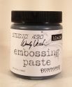
Hi, it's Sue Lelli here today to show you a card I made using my FAV Wendy Vecchi Studio 490 embossing pastes!
 
WARNING ~ LOTS of photos!
This is my first card.  The base is TH Distress Watercolor Cardstock.  LOVE this product!  It's heavyweight paper card sized and great for any product you put on it, holding up incredibly well to all the paints and waters and gel medium and embossing pastes I used.  Did I say LOVE?!!!

Here is a close up so you can see the leaves stenciled with Wendy Vecchi's Translucent embossing paste and painted with Dina Wakely's heavy body paint and TH Distress paint.  The flower is from Prima's Seashore Collection.  I ripped the top layers of the flower off and added that Beautiful face from Prima's Cartographer Collection.  I thought she looked pretty with the ADORNit wood frame and the hello friend sentiment which is a Tim Holtz Remnant Rub.  It fit perfectly on the frame.
 
Then I HAD to do it!  When I first started thinking about this card, I had green and pink in mind but the creative process took me elsewhere.  So I took the cream flower off and added this Beautiful Prima flower with some green highlights!
I not sure which one I like the best!  Do YOU have a FAV?

In this close up you can see the gold speckles I added with the Prima Floral Rose stencil and Metallic Gold Wendy Vecchi Studio 490 Embossing Paste.  I could use these two on everything I make!
 
Now for some process and product info:
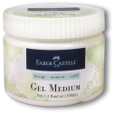
I used Dina Wakely's Gel Medium to attach the tissue.


Close up of painted BG and leaves once the embossing paste dried completely
 
 The two paints I used ~ TH Distress Paint in mowed lawn and Dina Wakely's Heavy Body Acryllic paint in Lime.
 
 On a piece of white paper, I made more leaves with the WV translucent embossing paste which I then painted and cut out to add to the flowers.

I outlined the leaves with a black stabilo pencil to create some definition.  The frame is from ADORNit wood shapes and the sentiment is a Tim Holtz remnant rub.  You can really see the WV metallic gold embossing paste in this photo.
 
That's it!  I hope you like my cards and I also hope you come play with us at the ePlay Embossing Challenge!


Saturday, September 14, 2013

2 pages, 2 very different themes!

Hi there ePers!  I hope you're all doing well!  Did everyone have a blast at the PaperHaus Blog Hop?!  What a fun hop that was!!!  Such talent!

Well, today I'm up, and I would like to share w/ you 2 very different scrapbook layouts!  One using NO mixed media, and one w/ a little bit, but just to add contrast to an otherwise boring page!  More about that later!

First up: A Secret Garden in Williamsburg!

I am trying to get through my envelopes of pictures from the latter half of 2012.  I came across the picture in the scrapbook page, along w/ some others, and decided that I wanted to use them in a page, and NOT scrap my kids!  I'm sure you're thinking, who does that?!  Well, I do!  I LOVE taking photographs of gardens, flowers, landscape ideas, beautiful urns, the American flag on a house, creeks, rivers, just nature in general!  I have to tell this one little story!  My town is very old, and was founded by the Allegheny River, in PA.  I love taking pictures of it!  One day, we were driving home and I noticed the fog that was settled over the river.  It looked rather eerie, so I went home and grabbed my camera, and drove back down to the river and took pictures!  I was talking to my mom later that evening, who lives about 10 minutes away in the country, and she said that she went down to the river and took pictures too!  Haha!  I obviously get my photographic skills from my mother!  :D

Ok, seriously, I talk way too much!  On to the project!
Sad news: The Secret Garden paper pad is no longer with us.  New and exciting Graphic45 paper is now in the store!  You can check it all out here!  Even though I LOVE LOVE LOVE Fall, I can't loosen my grip on SUMMER!  So, one more page from our vacation last summer!

As I was saying above, I was taking pictures of everything when we were in Williamsburg, and several landscape pictures found their way onto my camera!  I decided to use just one picture.


To create this page, I used a piece of chocolate 12" x 12" cardstock, and some SU! 12" x 12" and some other paper that I had in my stash.  I just needed to build layers.  The purple panels behind the picture are Secret Garden paper, as well as the leaves on the tree and below the fence and in the corners of the pictures.  I cut out a couple ATC size frames from the Secret Garden pad, along w/ the top journaling frame.  I cut two lavender frames and cut them w/ stamp edge scissors.  I distressed ALL the edges, and inked them w/ Walnut Stain Distress Ink (Ranger).

I placed burlap behind the pictures for some garden contrast.  The tree base is just a piece of chocolate cardstock that I scored and inked the edges.  To make it rounded, I folded the edges under and with the help of the end of a paint brush, I was able to make the middle of the tree stand up.  I wanted to mimic the tree in the picture.

W/ my cricut, I cut each leaf.  I inked the edges in Mowed Lawn Distress Ink (Ranger).  I fussy cut the lavender and planted it among the bottom leaves.

The fence is actually a Tim Holtz Rosette Die that is fairly old.  W/ my exacto knife, I cut away the middle portions of the fence to make it look like a picket fence.  To distress it, I first used my score tool and just made marks on each fence post.  Then, I inked in an upward motion and downward motion only, with Weathered Wood Distress Ink (Ranger).  I followed up w/ Walnut Stain to match the rest of the page.

I fussy cut the birds on the branch with the key hanging down.  I felt like that corner needed something, and after flipping through the pad several times, I decided that it would be the perfect touch!  I add a few leaves to the end of the branch and that completed it!

Here's the top of the page. The page looks one-dimensional, but I popped up several leaves, the birds on the branch and key, and the fence.


This is the bottom of the page.


And a close up of the fence and the lavender.


Ok, let's switch gears and head into FALL!
This page came together fairly quickly!  Again, I used Graphic45, but reached for the Steampunk Spells pad instead!  I really wanted to go steampunk, as I've never delved into that genre before!  This is a good start!

Sorry for the bad flash!  But, I wanted to show the page in the best light first.  The next few pictures are without my flash. Of course, these were all taken at night in my kitchen w/ bad lighting!  SORRY!!!!!


Ok, so mixed media.  What did I do?  Well, a few things!  I took the Giraffe stencil (TCW) and applied Black Gesso w/ a palette knife for a very thin layer.  I wanted to create a cracked glass background.  Once it was dry, I sprayed it with Squeezed Orange Dylusions Spray.  Obviously, w/ the background being black, the orange didn't show up.  Or did it???!!!  Once it was dry, the gesso took on a more metallic look!  COOL!  I flipped through my stencils and came upon the Spinning Top stencil (TCW) and I spied my bottle of white Crackle Paint (Picket Fence, Ranger).  I painted a few places w/ the stencil, and as it was drying, I noticed that the orange that I sprayed was coming through!  LOVE IT!  


Another cool thing I did was take my Patterned Leaves stencil (TCW) and placed it on a piece of white tissue paper.  I sprayed through the full leaf stencil in several places to create 3 leaves with Black Marble Dylusions Spray.  I cut them out and scrunched them up. I added some silver glitter which I just rubbed onto the leaves.


So, the steampunk!  Well, for the steampunk look, I added gears (Tim Holtz from my stash) in different places.  For the pumpkin stems, I cut out an ow and a black cat from the paper pad.  At the top of the page, I cut out two scrolls, one of which allowed me to journal a bit!


Products: The Secret Garden of Williamsburg:
Paper: Secret Garden 6" x 6" (Graphic45)
Ink: Mowed Lawn, Weathered Wood, Walnut Stain (Ranger)

Products: Halloween 2012
Paper: Steampunk Spells 8" x 8" (Graphic45)
Ink: Black Marble, Squeezed Orange Dylusions Sprays, Rusty Hinge Distress Ink (sponged around the pumpkins)
Accessories: Black Gesso, Giraffe Stencil, Spinning Top Stencil, Falling Leaves Stencil, Palette Knife


And that's it crafty folks!  I hope that you have been inspired!  Have a lovely day!
Erin

Thursday, April 11, 2013

Collect Happiness ~ Altered book pages


Hi all, it's Bonnie Irvine here today. Way back in February, the theme of the Get Altered challenge was books. At that time, I altered the front cover of a child's board book and have continued with the process of completing the rest of the pages. Today I'm excited to share the fifth and final double page spread in that same "Take Flight" altered book. All that remains is to complete the back cover, and this little baby is done like dinner :) I started out with the gessoed page having a bit of extra texture. Somehow, some kraft cardstock got stuck to the still wet gesso and when I tore it off, it left chunks behind. Rather than sand it off, I decided to embrace it and even expand upon it. I added some pieces of narrow washi tape and some drywall mesh tape to the background and gessoed over them. 

Next I took blobs of Fresco Finish paint in Mermaid, Beach Hut, and Baltic Blue and scraped the paint across the background with an old gift card, leaving it thicker in some places and very thin in others. To darken the edges and a few places in the middle, Blueberry and Cotton Candy gelatos were rubbed on and spread with water on my finger. Extra Blueberry was rubbed over the mesh tape and a brush was used to help work it inside the squares. I haven't bought the green gelatos yet (I will because I love gelatos!) so I sponged a little Avocado and Hey Pesto Fresco paint on the pages and then topped that up with Neocolor II crayons in order to bring the green tones I wanted into the background.


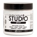
White Studio 490 Embossing paste was applied through a  The Crafter's Workshop harlequin stencil and once dry was shaded on the left side with a charcoal pencil using a blending stump to soften it.


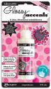
The flowers were fussy cut (and I mean fussy) from Tim Coffey paper from K & Company and adhered to the background with gel medium. The petals were roughly doodled around with a Sepia Micron pen to lend more of a sketchy, hand drawn feel to them. Brown Big Brush pen was smudged on the flowers for shading. Tiny beads were glued to the centers with Glossy Accents and Icicle Glimmer Glaze was painted over the centers for shine.


The bees are Little Yellow Bicycle stickers coloured with Distress markers: Scattered Straw, Wild Honey, Black Soot, and a Gray Copic on the wings. A tiny dash of white paint pen highlighted the centers of their bodies.

Memento Bamboo ink was applied to the background randomly using a stamp from Paper Artsy JOFY 10 to make the crosshatched lines. White gesso was pounced through TCW's Mini Chevron Arrows stencil. Once dry, Pan Pastel and Distress marker altered the colour of the arrows before they were outlined.


The Idea-ology lettering for Collect Happiness (like bees collect pollen) was adhered over the flowers spanning the two pages to better connect them. Black Embossing paste also from Wendy Vecchi was spread through the Dylusions Letter Jumble stamp to spread the black around the page causing the eye to travel and take more in. Two fishtail banners were cut from beehive printed ribbon and adhered to the top of the left page. Vintage buttons (love how checked the smaller one has become over the years) were adhered over the ribbon.


At this point, I always leave the project where I can see it often and live with it for a while to determine if it's complete. I ended up going back and adding black cardstock semi-circles to the top right and bottom left corner again to move the eye through the piece and to add greater weight to the outside. Black Big Brush pen was added to the outside edge to darken the framing.

This book altering has been such fun that I'll have to start looking for another board book so I can play again. Thanks so much for stopping by and reading this marathon post. I so appreciate that. If you are interested in more detail about some of the products  I used, just click on the thumbnails below and you will arrive at the correct spot in the eP store. Hope you get a chance to get messy today!

Bonnie