Hello, it's Sue C here and today I'm sharing a journal page on which I've used the gorgeous Donna Downey stamp from the Colliope set.
I started by painting my journal page with Nougat Fresco Finish paint as this is a good base colour for faces. I then stamped the main image with black Archival ink on to the page.
I made a mask using the stamp and held it over the original image and started to build up colour on the rest of the page. I wanted a vintage feel to the page so worked with shades of brown Fresco Finish paint and a piece of cut 'n' dry foam. I added the darker colour close to the edge of the image to create depth.
I then started to stencil, still keeping the mask in place. I used the TCW Mini Specimens stencil with Plum Fresco Finish paint. Then used the TCW Mini Kaleidoscope and Mini Quatrefoil Reversed stencils. The numbers are created using the Wendy Vecchi Classic Words stencil with Chocolate Pudding Fresco Finish paint. I've also done some stamping using the Tim Holtz Fabulous Flourishes stamp and Plum Fresco Finish paint and the scripty type stamp from the Tim Holtz Merchantile set.
At this point my camera died ! So apologies for the last couple of photos which I've had to take on my phone.
I used a black Fude Ball pen and drew around some of the Kaleidoscope stencilled shapes and then used a white Sharpie pen and added some dots to the centre.
I've painted the main image with Fresco Finish paints and the text is stamped onto card also painted with the same colours.
I hope you've enjoyed today's project.
Sue
x
Showing posts with label Art Journal. Show all posts
Monday, September 15, 2014
Find your Balance
Labels:
Art Journal,
Sue Carrington
Wednesday, August 20, 2014
Wait and See ~ Art Journal page
Hi Everyone. It's Bonnie here today with an art journal page to share. I've been playing around lately with leaving white on my art journal spreads because it's something that really stretches my comfort zone. I am a colour gal through and through so I tend to feel uncomfortable leaving large expanses of white on the background. Just to shake things up, I've been consciously trying to do that now and again.
I began by spraying Patience and Glorious Art Anthology Colorations Sprays onto my ungessoed page, spritzing water on top. I added more water with a brush and began to splash, flick, and drip from the puddles. I love how the pink and yellow created a third colour, orange...so pretty.
Out came the stencils! I used Studio 490 Black Embossing Paste through TCW Mini Harlequin Circles and Bingo stencils. Fresco Finish Beach Hut and Inky pool were pounced through TCW's Tile Texture stencil. White gesso was pounced through TCW's Mini Texturized stencil over the more solid sprayed area. Black gesso was used to create lines with the edge of a gift card and more was scraped onto the page edges.
Some torn dictionary paper from the Michelle Hill Ephemera Pack was layered onto the page using matte medium. White gesso was spread over the text with my finger to knock it back. Beach Hut was spread over the top of the dried gesso. Washi tape was torn and layered over the text as well, More Beach Hut was pounced through the circles from the Harlequin stencil. Once dry, black doodling and white dots were doodled onto those.
A flower was cut from designer paper, matted in black, and given a center created with Crafty Individuals Imagine stamp. A little colour was added to the sweet face with Prismacolor pencils.Doodling was added to the flower to separate the petals. White gesso and Autumn Fire Fresco Finish were scuffed onto a few petals to bring in more of the other colours from the background and add my own mark to the flower. To create the stem, Art Anthology Pesto spray was spritzed onto the craft sheet, picked up with a wet brush, and dripped onto the page where the flower would sit.
The page was finished black doodling, edging the pages with Black Soot Distress ink, and Black Big Brush pen. Three black cardstock inchies were punched and given white doodled words before being popped up on foam tape. The flower was also popped up on foam tape and a sliver of a punched black circle was added to the top text along with small punched circles.
Thanks for dropping by today. This is another project which would fit the current ePlay Challenge, Embossing. Have you entered yet? You still have twelve days to play along...hope to see you there.
Bonnie
Here are links to products used from the eclectic Paperie store:
Friday, August 15, 2014
Art With Your Heart Out
Hi there eP land! Greetings from the deep south.
Wow has this been a whirlwind for me! I won't get into gory details but suffice to say that the pants have not settled yet. (Andiepants that is ;)
With all that is going on I decided a little art journal therapy was in order.
Remember the book I made for the fabric challenge?
Well this was my first page. It was just painty, inky, stenciley, good fun and some journal therapy thrown in for good measure. In fact, my friend Patty has a blog called "Art with your Heart out" so that's what I did...art with my heart out.
I started with some distress paint in Antique Linen
I covered both pages and a little on the backside of my small insert piece.
Next I used some matte medium to add some Timmy tissue-Melange
I used my Ranger heat gun to dry in between each layer.
Next I sprayed both pages with water and added a couple of drops of reinker in walnut stain.
Then I used my Prima mask and Distress ink pad in Wild Honey to add another layer.
Then I played with my Wendy stencils. I used Flourishes and Fancy Flowers to add interest to the background. With the fancy flowers on the small insert I first used Rusty Hinge distress ink and then layered Ferro Metallic effect paint in Amber gold through the smaller flower on top to create a layered effect. I LOVE the way it turned out.
A simple Sharpie for the journaling and poof...I was done. The whole thing was so therapeutic. I started my journaling and realized how negative I was. So I finished getting all the negative out on the left side. When I went to the right side I focused on positives. What are all the positive things about our move. I named it New Adventures because my hubby has started a Facebook page titled New Adventures where he posts things that are all about Louisiana.
I hope you enjoyed my little adventure into arting with my heart out. Maybe try some art therapy of your own and see what happens.
Til next time
{{hugs}}
Andiepants
Saturday, August 9, 2014
Embossed Butterfly page
Hello, it's Sue C here and today I'm sharing a journal page which is also my piece for the current ePlay challenge which is Embossing.
I loved one of Wendy Vecchi's recent journal pages and it prompted me to have a play with the Tim Holtz Layered Butterfly die and embossing folder.
I started by die cutting the butterfly from white card and then using the embossing folder that comes with the die.
I used a mixtue of Dandelion, Orange Blossom, Red Geranium and Potting Soil Archival inks to colour the butterfly. I then put it to one side as I wasn't sure where I was going yet but getting ink onto card is always a good first step !
I then cut a piece of white card to the size of my journal and used my brayer with Fresco Finish paints.
I felt it was a little too orange so I added some London Bus Fresco Finish and a little Tikka too.
I then took the negative of the die cut and taped it onto my journal page. I don't usually tape my stencils down but card can start to warp when it gets damp and this helps to keep it flat to the surface your stencilling on. I used Chutney and French Roast Fresco Finish paints but only around the edge of the butterfly.
This is what you're left with !
I then stuck 2 Post-it Notes together and die cut the butterfly again, this made the perfect mask for me to stencil over. I layered up the colours of the stencilling in the corners of the page, starting with white as the colour that followed was translucent and stencilling onto white lets the true colour show.
I then went back to my original butterfly and rubbed some Treasure Gold around the lower wings and on the top half I used Sticky Embossing Powder with Distress Rock Candy glitter.
Before I stuck the butterfly down I added a little more stencilling using the numbers from Wendy Vecchi's Classic Words stencil. The sentiment is from the Purpose of Art set and is stamped using Potting Soil Archival ink onto a piece of card that's been brayered with Fresco Finish paint.
You can see the Distress Glitter a little more on the above photo.
I hope you've enjoyed today's journal page.
Sue
x
Labels:
Art Journal,
Fresco Finish paint,
Tim Holtz,
wendy vecchi
Thursday, June 5, 2014
ePlay Challenge - Fabric!
Welcome to the June ePlay challenge!! This month we are inviting you to play with fabric!
If you are anything like me I have TONS of scrap fabric laying around. Everything from silk to denim to brocade. I was actually inspired by denim to create this challenge but when it came time to do the project I found this fabulous brocade scrap the my mother in law had recently given to me for my scrappy purposes and it was perfect.
I have been wanting to have an art journal but I want one big enough to really play in. I decided I needed to make my own and this is what came of it.
The cover needed a little something so I used some Wendy Vecchi embossing paste in black through a Prima stencil and highlighted with some inka gold.
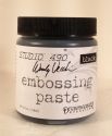
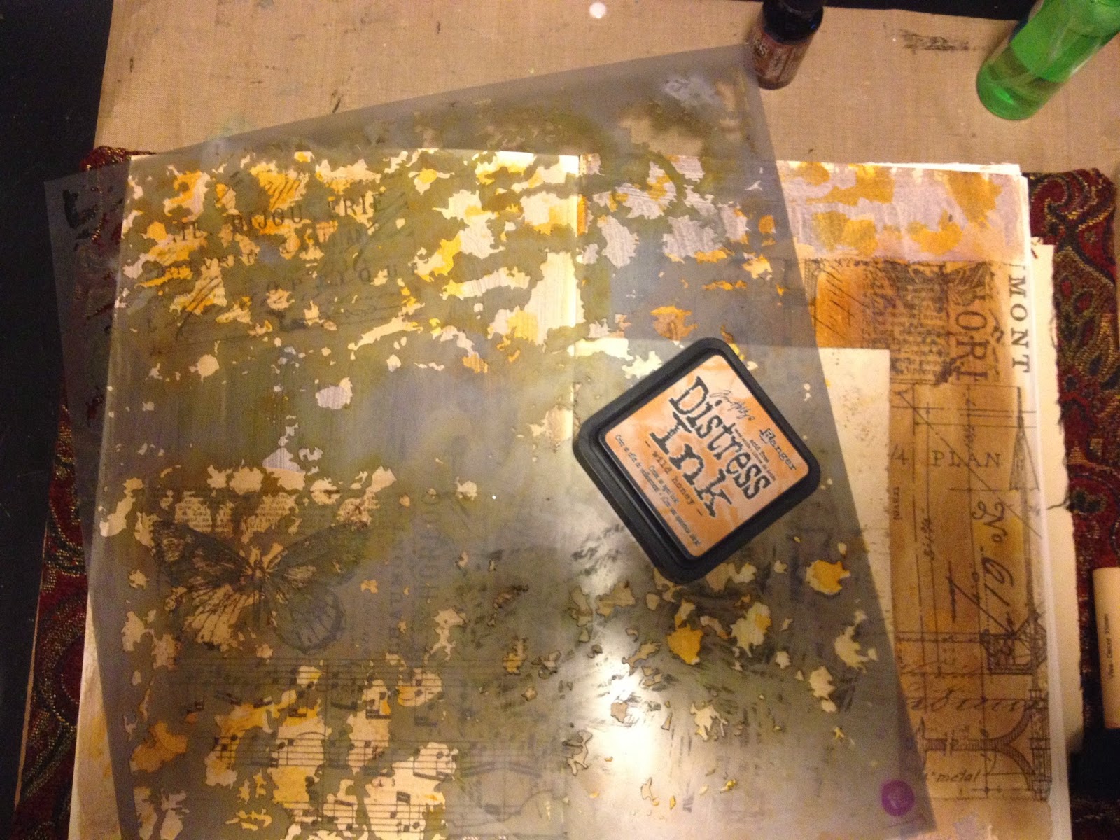
This is the silver metallic Wendy paste with quite a few drops of forrest moss Distress ink and a drop of peeled paint. I should have added more green as the green is very pale...but this was my first attempt at mixing so I learn.
Here is my step by step tutorial for creating my art journal (total cost $6.40):
1. Take a pad of Bristol or Water color paper and carefully remove all of the sheets. (I used a 40% off coupon and spent $6.40)
2.Add a few pieces of artistic paper, tags, smaller papers...anything you want for interest.
3. Gather no more than 4 pieces of paper together and fold in half. Crease with a bone folder. These are called your signatures. Your book will be made up of multiple signatures.
4. Use a centering ruler to make marks at the center and one at each end...about 1/2 inch in from the edge. These will be for your holes.
5. Using an awl and a squishy pad (this is the technical term) punch holes in your signature at the marks. Make sure they are right along your creased fold.
6. Using a large needle (mine is a leather working needle) and waxed thread to sew, sew your individual signatures at the binding.
7. Then sew the signatures together and clip the book together.
(visual of clips)
8.Take your glue and paint a thick coat along the binding of the signatures.
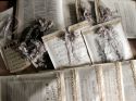
9. While that dries, take your book covers (I repurposed an old dictionary that I bought at a flea market) and measure out the fabric leave enough room in between for your book innards. This will depend on how many signatures you have.
10. Use your glue and adhere the fabric to the flat surface first being sure to burnish as you go.
11. Adhere the edges around the inside of the covers.
12. Use a piece of your paper to attach the signatures to the cover. If you look close you can see the yellow...I used the cover to the paper pad. Adhere one side to the signature and the other side to the cover. Burnish well and leave something heavy overnight for the entire thing to dry. Do the same for the back cover.
and voila! I wanted to keep it somewhat flat so it was easy to open so I didn't add a whole bunch to the front. Also, the fabric I chose is very busy too.
So what can you do with fabric? Let's see! Add your blog to the linky tool at the bottom and show us what you can do with fabric. You may just win a little something to spend in the eP store!!
Good luck!
{{hugs}}
Andiepants
Subscribe to:
Posts (Atom)


