Guess how old I turned this year?
Mary-Ann here, divulging information that should totally be kept a secret:o) This year was hard for me. If I am 43 then my boy is turning 10, I am full of gray hair and I just noticed wrinkles. Lots of them. So, I refuse to celebrate any more birthdays until next year. hehe
I decided, for a change, to focus on a "me" layout. I am hardly in the photos we take unless I insist on a "groupie" picture. Even then, one of us is usually making an inappropriate face and the entire event becomes a battle. I'm yelling, telling them to pretend to have fun, or "take another, my hair didn't look good" or "you can see my waddle!"
I promise, I did have fun creating this layout and I hope you enjoy the journey with me.
I promise not to get all weepy.
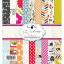
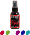
FYI, this entire layout, except the white base is made from a 6x6 paper pad. No 12x12 paper was harmed in the making of this page:0) After I decided on my colors, I decided to spray paint a couple wood veneer numbers that I had on hand. (A great big fat reminder of how old I am!) You could color these with Dylusions. A paint brush will do the trick or even just spraying.
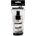
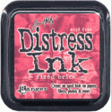
The white base you see, is actually a little creamy once I started taking pictures, it is a big piece of watercolor paper. I sprayed Dylusions ink (red, small amounts of black, and white) onto my craft sheet. I added a few squirts of water from my Ranger Mister bottle and squished my paper face down on my craft sheet. When I lifted it, this is what I got.
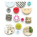
I started layering Fancy Pants Me-ology papers under my photo. Painted a clothespin with the same black Dylusions spray. I also tucked some of the banner buttons under my papers, clumped coordinating Me-ology buttons to the side with matching enamel dots.
You can see here that I utilized some Tim Holtz Index labels. Just so happens, they come in black and red! Perfect for this layout. I wanted them to be a little sturdier, so I took the packaging from the Fancy Pants Buttons and backed the stickers. See photo below.
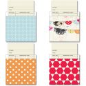
Added a cool title, more enamels and my journaling, which is neatly tucked inside one of the Fancy Pants Library Card envelopes. I didn't want my journaling card to stick out too far, so I trimmed down the existing library card and turned it over to utilize the white side.
It is pretty simple. Just some fun coloring and painting, paper layering and story telling. I hope you have enjoyed my layout today. Keep checking back daily for more design team inspiration.
Supplies used:







6 comments:
What a wonderful picture. Love your fun layout, embellishments and color combo. Congrats on celebrating 43.
What a great page celebrating you Mary-Ann! Love the little journaling tucked in there... You're a spring chick from my viewpoint!!
Great page! And welcome to the 43 club- I beat you here by a few months. :)
oh girl, i love your pages and this one is one of my favorites. love all that white space and the splashes of color. it's a great picture of you!!!! 43 isn't so bad - i actually think it was my prime (health wise, etc.) and it's just a number.
xoxo
LOVE your page. The white space really accentuates the colors.
I absolutely adore your simple style and use of white space. Your pages are so inspirational. {{hugs}}
Post a Comment