Hi everybody ! Toni here to share a layout with you today. A couple of weeks ago 25 members of our family met up for a camping weekend at a place in North Wales called 'Shell Island'. It's a wonderful place and we all have happy memories from the numerous visits we've made there over the years. There were three generations of us for this particular trip and it was great to see all the little ones enjoying the shell covered beaches, rock pools and sand dunes. Needless to say we were all taking photos and I couldn't resist using this one of my beautiful great niece Evie . She is sitting among the rock pools, looking very intently at a tiny pebble caught between her toes. I love her windswept hair !
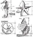
I used Tim Holtz's July Tag as my inspiration for this piece. He showcased some very clever ideas for adding texture to his Sand and Sea die cuts and I was keen to have another go at these techniques. I started this layout with a piece of card board that measures around 7" x 9". I ripped off some of the surface to reveal the corrugations, and painted it with Fresco Paint in a colour called Stone.
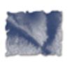
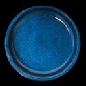
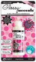
I added a bit of stenciling using a Layering Stencil called Dot Fade and Chipped Sapphire Distress Paint. I then used Tim's idea for making sand, with Distress Embossing Powder, UTEE, and Distress Glitter all mixed together with a good splodge of Glossy Accents. I applied this all around the edges with a spatula and left it to dry while I worked on the die cuts.
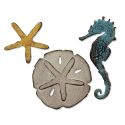
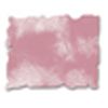
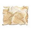
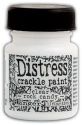
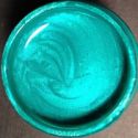
I followed Tim's instructions for adding a crackle finish to the two seahorses with Clear Rock Candy Distress Crackle paint. Once this was dry, I lightly brushed the surfaces with Luminarte Silk Paint. The sand dollar was painted with Antique Linen Distress Paint and then heat embossed with Old Paper Distress Embossing Powder. The starfish were treated similarly but after embossing, I painted them with Victorian velvet Distress Paint.
I couldn't resist adding this quote which is a rather irreverent parody of John Masefield's beautiful poem Sea Fever, written by Spike Milligan. It seemed more appropriate for this picture and I think Evie will enjoy it !
For your inspiration, here's a picture of some of the shells the children collected. So now you can see why it's called Shell Island ! x
Here are some of the products I've used that Kim stocks in the wonderful
eclectic Paperie Shop. She has also taken delivery of loads of Tim Holtz's newly released products so it's well worth hopping over there, especially if you want to get ahead with your Christmas crafting !


10 comments:
What a beautiful photograph and just the perfect way to capture it Toni. Shell Island has really caught your imagination and taken you with it here. Love it! Jenny x
Toni, what a wonderful layout! I am positively smitten with that photo and your background gives it the perfect setting. great texture, sparkle, and composition. Sweet!
What a wonderful remembrence of your families gathering at the beach Toni! Evie is the perfect model - at first I thought you had used a vintage photo there! I too loved Tim's 'sand' for his tag and the seahorse and sand dollar - I keep trying to resist buying them!!!
Forgot to say - the poem cracked me up!!
Beautiful work.
Julie x
What a FAB LO with that poem! WOW! LOVE the real shels and your version of them! Gorgeous, Toni!
This is so lovely, Toni, and I love the image you have created of your happy family holidays,
Lucy x
Ooh love it. Love the photo and how you added "sand". gorgeous.
Wow Toni! You really rocked this one out. It's awesome!!!
I just love this and anything related to the sea! Except sharks:o)
Post a Comment