Photobucket Photobucket Photobucket Photobucket Photobucket Photobucket

Thursday, February 6, 2014

Get Altered Challenge - Altered Playing Cards


Hello there, everyone!  It's Broni here today with this month's eP Get Altered Challenge.  This month I'd like for us all to play with~
Altered Playing Cards


I'm sad to say I haven't tried this before, but after this fun little adventure I'm sure I'll be going back to pull from my deck again and again!

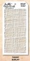
Since it's February, the month of Valentines, I decided to make Valentine altered playing cards for all my grandchildren.   There are 8 altogether between George and myself.  Whew!  So it literally took days for this all to come together.

I'm going to try to take you through a few of the steps….the ones I can remember and that I photographed!  The first thing I did was sand all my cards using a sanding grip block.

 I used my Gelli plate to apply some aqua and lime acrylic paints to the cards, then I added some purple dots.  Instead of using a brayer, I just used a paint brush.  It gave more texture to the surface of the cards.  It also took longer to dry between layers.  I did this with 4 of the cards.


 I painted over them with white acrylic paint and then wiped it off with a baby wipe.  This helped the texture of the paint to show up better.  I cut a heart from a scrap of paper and used it to draw hearts onto the cards.  Then I painted them with red acrylic paint.

 For the other 4 cards, I decided to try painting directly on the cards as opposed to using the Gelli plate.  I used the same colors and also painted on the purple dots.  I spread some Studio 490 white embossing paste on 2 of the cards and let it dry to add some texture.


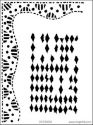
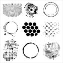
Then I put on some more embossing paste using my Mini Hexagons stencil and my palette knife.  After it dried, I sprayed on several different bright Dylusions ink sprays.  When they dried I sprayed just a little of the White Linen ink spray.


I sprayed the first 4 altered playing cards with White Linen ink spray as well.


Here are all the cards.  (You can see I experimented a little with the bottom right one.)

I used both pieces of my cut-out heart (the positive and the negative) as masks to stamp either onto the hearts or around the hearts.

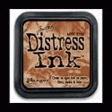
I did some more stamping on the cards using the Catherine Scanlon Random Shapes images and Archival jet black ink.  This second photo is taken from a different angle so that you can see the texture even under the Glossy Accents that I added to all the hearts.


And here are some closeups:

Ok then!  That's my take on Altered Playing Cards.  I hope you'll decide to play along with us for a chance to win a $15 gift certificate to the eclectic Paperie store!  Be sure to link up below so we can all check out what you come up with!

Thanks for visiting!


Wednesday, February 5, 2014

Valentine's Day Wall Decor


Welcome to my first post as February's Guest Design Team Member for eclectic Paperie.  I'm Paulette Akagi and am so honored to be able to share my creations here on the eclectic Paperie blog.  Thank you Bonnie and Kim for providing me with this opportunity.


My project began with a metal heart that I purchased in a gift shop in Sheridan, Wyoming, many years ago.  The heart already had somewhat of a distressed appearance---I loved the rusty old key hanging from the wire.  The antique handkerchief came from my mom...she was a waitress and this was probably one of those decorative hankies that waitresses back in the 50's wore in their blouse pockets.  The "LOVE" hanging from the key is a wooden laser cut icon from Prima.  I painted it with a gold leaf Krylon pen and then distressed it with Brushed Corduroy TH Distress Ink.  It hangs from a piece of gold cording.


Above is a close-up of the Valentine images I used.  They are from the Graphic 45 Sweet Sentiments 8x8 Paper Pad.  After cutting out the images I distressed the edges with Victorian Velvet TH Distress Ink with an Inkssentials Blending Foam Replacement Pad.  The small images on the left are edged with a gold Krylon pen.  The large image was matted on a dark pink and then on a lighter pink mat that was cut with a scalloped die by Nellie Snellen ( it's a square die but I cut it twice and created a rectangle).

The flowers on the bottom border of this main image are a strip of silk embroidery trim from my stash.  The pink roses and tiny white flowers on the main image were fashioned with punches from the Punch Bunch---after punching I formed the flowers on a mousepad with an embossing stylus.  Centers of the flowers are Stickles.  The tiny butterfly was made from two of the waste butterflies created when cutting out the large circle die of Spellbinders Butterflies Circles die set.  It also has Stickles as embellishment.  To add a bit of a background and fill in the heart pocket, I added some squares of glittered tulle ribbon.  White, cream and several shades of pink paper roses complete the design.

Other items that you can find in the eclectic Paperie store that I used to create my project are my favorite scissors by Cutter Bee, Zip-Dry paper glue, Scotch Foam Mounting Tape (pops up and adds dimension to some of the paper images), Glue Dots Mini Clear to adhere the hankie and the large image to the metal heart.  The Sakura Quikie Glue Pen is also great for teeny tiny flowers and the butterfly.

Thanks for stopping by and come back next week to see my next project.
Paulette


Tuesday, February 4, 2014

Let a Smile Be Your Umbrella


Hello everyone. It's Bonnie Irvine here today with the U pages in my altered dictionary. The poor thing is getting so thick, I'll soon need a bungee cord to keep it closed! I started the two page spread by gessoing the pages I wanted, keeping the word and definition gesso-free. The two pages were adhered to the adjacent pages with Matte Medium to give them strength so they could better hold up to wet media. Next I took my water brush and watercolour palette and applied some greens, oranges, and blues to the background.


Mowed Lawn Distress ink was applied through the Dylusions Diamond of a Border stencil to frame the bottom and sides of the spread and provide an outline for the images. I chose this stencil because the shapes in the border look like umbrellas to me. Doodling with a black pen above and below the stencilling emphasized the curvy shape. Lime, Tangerine, and Metallic Blueberry gelato were placed next to the inside black line and blended with a dry finger.


The drips at the top and the raindrops were created by applying Salty Ocean Distress ink through another stencil and then outlining them with black pen. Using TCW's Well Rounded stencil, gesso was applied through one of the patterns. Rocket Red Gold ink was applied through another pattern from the same stencil. Memento Peanut Brittle ink was sponged through TH Burlap layering stencil and some text stamping was done with Memento Bamboo Leaves ink.


The sweet little girl is a Mo Manning image, coloured with Prismacolor pencils, fussy cut with a narrow white border and again with a narrow black border. She was popped up on foam tape for dimension.The words to an old Bing Crosby song my mom used to sing were penned in around the frame line repeatedly. The other sentiments were computer generated and matted with black cardstock to give them more visual weight. The two umbrellas were cut freehand from old book text and given a smear of white gesso to fade the printed words. Doodling with black pen, edging with Black Soot Distress ink, and toothpick handles finished them off.


One of the finishing touches on the page was to colour in the outside edges with Black Big Brush pen and add white dots. This keeps the eye inside the pages where before it wanted to drift off. Black gesso was slightly watered down and rings were created by dipping a bottle lid into the gesso before twisting it onto the page. The letter U, a Random Alpha Part letter, was adhered to the top left corner of the spread and black spatter dots were added with a TH stamp and Jet Black Archival ink.

Thanks for stopping by the eclectic Paperie blog today. We always appreciate your fine company and kind comments. I hope you find a little time to play and get inky soon.

Bonnie

Here are links to the products I used from the eP store:

Monday, February 3, 2014

Scrapbook layout with Domestic Goddess

I am STILL head over heals for these 7DOTS papers! I just adore them and want to use them for each and every layout I do.

I won't...but I wanna.

Sooooo....I decided to get my mojo flowing I would look into some online sketch challenges. Considering it's February and that means Valentine's day, I thought a valentine LO would be quite appropriate.


Are you as impressed with me as I was of me? ;)

This is a photo of my daughter Aubrey and me this summer when my girlfriend came in from Chicago for a long weekend. 

For the paper layers behind the photo I decided to do some fussy cutting from the Raspberry Pudding sheet of the Domestic Goddess line


After fussy cutting I went over all the edges with a nail file to smooth the edges and then inked with Walnut Stain distress ink.


Remember not to overlook your packaging. Prima has gorgeous packaging that can be used as embellies on your page. I cut this clock from the packaging that housed the vine in my flower cluster at the bottom of the page. 


Speaking of Prima, I used the adorable little wood clocks here and in my cluster at the bottom of the page. For the background I used the TH layering stencil  in Harlequin and walnut stain distress ink.  I stamped over it with a script stamp in tea dye distress ink.
The large damask chipboard piece was painted with multiple layers of the Art Anthology dimensional velvet  and OH MY WORD...this stuff is like buttuh!!! It's too die for! Trust me on this...treat yourself to some from the eP store. The adorable Maya Road stick pin was the perfect touch to my little edge cluster don't you think? Check out the eP store for a plethora of Maya road goodies for your projects and layouts.


And here is a closeup of the large chipboard piece on the bottom of the cluster. Again I used the Art Anthology dimensional velvet to paint the piece and give texture, but then I sprayed red mist from the left lower corner to give it a faded effect and then finished it with some walnut stain Distress Ink down on the lower portion so it blended with the papers better. I love the way the mist nestled into the grooves from the dimensional velvet. Be sure to check out all the gorgeous Dylusions and Art Anthology mists available in the eP store.

Finally I wanted to show a close up of the sweet little metal trinket that I used. 


I also used another clock in my lower cluster and another stick pin to mimic the cluster at the top and give my layout some congruency.

I hope you enjoyed my layout as much I enjoyed making it. 

Don't forget to check out our get altered challenge this Thursday and join in for a chance to win.

Til next time

{{hugs}}
Andiepants


Saturday, February 1, 2014

Practice

Hi all...Kim here, running late with my blog post once again!  So happy that our DT Manager, Bonnie Irvine, sends me early morning emails that contain gentle reminders of my memory lapse!  I'd be lost without her!  Thanks, Bonnie!  So on to today's project...let's start with the quote (written in my most awful handwriting...Donna Downey, I am not!) 

Practice is the hardest part of learning...

It's true, right?  It's not so hard once we've mastered a particular skill but ongoing practice takes a commitment.  Can I just tell you how many times I want to give up on trying to draw faces?  Ugh...I'm seriously horrible at drawing...like I can't even draw a very good stick figure!  However, I'm continuing to push past those annoying little "just give up" voices in my head and am moving forward with more practice and working to find what style works for me.  This journal project started in the midst of a big snowstorm, which, in my opinion, is the perfect time to create art!

I started by sketching my face with a "magic" pencil...and really, I'm going to get these for the store...I also used a reference photo that I found in a face drawing book I picked up.
I don't feel a real need for super perfect details on my face drawings and actually would probably like them more if they were more "sketchy," if that makes sense.  But my strong left brained ways has a hard time letting so of being precise...I'm working on that...hey, I'm publicly sharing my kind of crooked face drawing...that's a start! LOL!  (I do like the nose on this gal...)

I then added color to the face using Gelatos (links at the end of this post) and seriously...this is my most favorite way to use Gelatos.  Just scribble some color onto your project and using a watercolor brush to blend...LOVE!
And yes, I love how the water brush picks up and moves the black lines from the pencil...instant shading!  Since I wasn't sure what to do with the hair, I left that and added color to the background of both pages by applying acrylic paints, layering a stencil over the paint, and removing paint with a baby wipe.  (Thank you, Dina Wakley!)
Don't mind the lump on her neck...I'll fix that in a minute!  Once the paint was on the background, I remembered the Donna Downey class I had taken, where we layered flowers all over the woman's head so I thought I'd try my hand at using a stencil to create the same look.  Here's what I came up with...
This was a lot easier than hand drawing leaves and flowers.  I used a sponge to "pounce" the paint through the stencil...just like you would on a wall.  Then I added some flowers...
For the flowers, I traced (using pencil) through the stencil and then added the paint over the pencil lines.  Once the flowers were added, I needed to fill in those empty spots so I added lots of little dots and squiggles (that's a technical term) to fill everything out.
I also beefed up the eyelashes a bit on my model and then I stamped this great quote from Dina Wakley, "create with abandon, just put the brush to the paper and see what happens...." over my girl's fixed neck.  Lastly, I used India ink to hand write the practice quote...not sure I'd do that again as the ink really spreads quickly and I had a hard time controlling the ink.  I prefer either typewritten or sticker letters but it was fun to practice with the ink.

And there you have my snowy day next face project...I hope you enjoy and you find some time today to create with abandon!!

Gelatos (Neutrals and 50's Diner)