


Photobucket Photobucket Photobucket Photobucket Photobucket Photobucket

Tuesday, May 21, 2013

Poppy Tag


Hello everyone! It's Bonnie Irvine here with a tag to share today. We have had such lovely warm weather that my plants are finally starting to do exciting things in the garden. The Bachelor's Buttons are budding and almost ready to pop and since I love their beautiful blue flowers that makes me very happy. One of my other favourite flowers, the poppies, are gaining in height but will keep me waiting a while longer for the stunning blooms. So...I decided to create my own :)


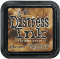
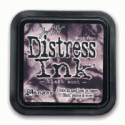
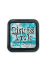
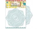
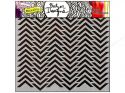
I started out with a #10 manila tag (4.5 x 8.5") and applied dictionary text paper from the Authentique Renew Collection to the tag. Another piece of dotted paper from the same paper pad was torn and adhered across the bottom after being inked with Vintage Photo Distress ink. Interest was added to these backgrounds by applying Peacock Feathers DI over Christy Tomlinson's Vintage Lace stencil and Black Soot over TCW's Min Chevron stencil. The edges of the text paper were inked with Peacock Feathers DI and Vintage Photo DI was scuffed here and there to grunge up the middle.


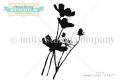
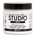
Donna Downey's Wild Poppy Silhouette stamp from Unity was stamped twice with Tuxedo Black Memento ink: once on the tag itself and once on another piece of the Renew paper focusing on the flower heads only. The second set of flowers was fussy cut and then sculpted with a large ball stylus to create dimension and shape. The bottom of each flower was glued directly to the stamped tag but the middle and ends of the petals were popped up on several layers of foam dots. White gesso was pounced through the TCW Mini Punchinella stencil with a scruffy brush over the background and onto the poppy silhouettes. White Gelato was used to highlight the tips of the petals.


Now this was one of those mixed media pieces that had to go through Seven Stages of Ugly before I started to like it...you know the ones where you keep eyeing the garbage can and nudging it a little closer with your foot after each step :) A Bo Bunny letter cancellation stamp was applied using Tuxedo Black ink. Blueberry, Cotton Candy, and Grape Gelatos were scuffed here and there and then spread with a wet finger or a wet brush. Black and Brown Big Brush pens were used to outline the edges of the tag and doodling was added with a black Micron pen. Brown shading was applied next to the flowers and stems with an Inktense pencil and then spread with a wet brush.


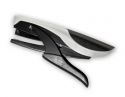
Not there yet! Hmmm, three short lengths of black and white dotty ribbon were stapled to the sides of the tag with a Tiny Attacher. Maya Road canvas butterflies were sprayed with fresh Lime and Vibrant Turquoise Dylusions inks, dotted with teal paint, and given key bodies. Glossy Accents was applied over each flower and allowed to dry. Getting closer... a black piece of cardstock was adhered to the back of the tag to frame it. A reinforcement was inked with Black Alcohol ink and applied around the hole. And finally, some wired turquoise ribbon was fed through the hole and tied with Idea-ology Tinsel Twine. Phew...I think I like it!


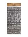
The final step was to add Idea-ology letters spelling out poppy. White paint pen dots were added to the letters both to continue the dot theme and to help them stand out. It also took away from the plain appearance. Cotton Candy Gelato was applied with a wet brush to the inside letter openings. This tag served as a good reminder to me to keep on going even when I wasn't thrilled with the results. Again, it's that ol' "Trust The Process" thing that often happens with mixed media.

Anyway, thanks for the company today. We love it when you visit!

Bonnie

To check out the products I used on this tag, click on the thumbnails below to arrive at the listing at the eclectic Paperie store.
Monday, May 20, 2013

Secret Garden Friendship Card

Hi! Annette Green here today with a 5 x 7 card made with the beautiful Secret Garden papers from Graphic 45 with the help of a few Alterations dies by Tim Holtz.

It seems that I cannot make cards any smaller than 5 x 7 inches anymore. The larger size allows for more space to embellish and it really makes the card seem extra special for the recipient. I started with a base cardstock from the Graphic 45 Signature Series - Lights. I am so fond of the Signature Series cardstock because it's textured and has a core that's a few shades lighter than the cardstock color, so when sanded it shows more depth and dimension. And, of course, the colors all match the famous Graphic 45 color scheme in their paper packs. Bonus! (The eP store currently carries the original Signature Series cardstock pack in the bolds but I'm betting Kim will get you what you need if you just e-mail her sweetly.)


For those of you not familiar with how the Alterations Movers & Shapers dies work, here is a good example. I started with the Cameo Frame die and set one of the Oval Movers & Shapers dies inside the metal area. The oval is magnetic, so it holds in place nicely. Of course you can use either of these dies independent of each other, but it's pretty cool how you can combine them.


I cut two from thick mat board and one from a piece of the Secret Garden paper in the 8 x 8 pack.


I adhered them together with strong glue stick then inked the paper's edges with Dusty Concord ink. I didn't worry too much about the sides and inside the oval...


...because I covered those areas with coordinating thin grosgrain ribbon. I used Tacky Glue for this.


The ribbon really finishes it off nicely.


For the inside of the oval, I cut an image of this sweet girl from the Secret Garden paper and layered it behind the opening. Some faux pearl strings dress up the inner oval for added embellishment.


This card is for a special friend of mine, so I chose this "Friends" chipboard piece as an accent. (Graphic 45 Secret Garden)  I inked the edges with Vintage Photo and flanked each end with some Graphic 45 metal brads over a strip of lace.


The flowers cut-outs are from the Secret Garden paper also. Hand-cut with love and inked with Vintage Photo. 


A big fluffy bow finishes off the top. It's weaved through a chipboard button.


This card came together pretty quickly and has such impact with those gorgeous papers and a few dies. My friend deserved a really special card and I thoroughly enjoyed making it for her. Thanks for stopping in today. Hope you enjoyed it!


Saturday, May 18, 2013

Wondering how...

Hello all!  It's Alison here, back with a step-by-step of how the background to my recent Think and Wonder tag was created.  There have been several questions about it, so I thought I'd spill the beans!  (If you want to see more of the whole tag, you'll find it here.)
The background uses a technique I fell over by accident.  I made a tag - Wonderful Journey - which was basically the result of Gelli printing leftovers.  After one printing, I laid down the reverse of the stencil I'd been using onto a tag so that I got a nice painty print.  Then I inked over it, and absolutely loved the result!
This time around, I thought I would just eliminate the "middle-man", and go straight to getting the stencil all painty, so I got out one of the Crafter's Workshop 6x6-ers and set to work.  Of course, when stencils are involved, there will always be a "reverse" leftover, so I taped it to a decent piece of paper - knowing I'd have another background-starter once I was done.
I used Distress Paints - Peeled Paint, Broken China, and Salty Ocean, as far as I remember - and dabbed them over the stencil.  Since the DPs are water-reactive, a little spritz of paint started them blending right there on the stencil.  It's the stencil I'm concentrating on, so the image beneath is more roughly covered than you might otherwise go for.  (Round the edge you can see where I've "cleaned" my Broken China after it got a bit Peeled Paint-y.)
Once I had full coverage, I flipped the stencil over onto my waiting tag and pressed down gently. Even though I used a jumbo tag, it was both longer and narrower than my painty stencil, so I was able to rotate the stencil and use the "unpressed" part to cover the top part of the tag.
And rather than waste anything on the craft mat, I made sure my blank piece of paper was lined up next to the tag to catch any spare paint.
You can either let that dry, or help it along with a heat tool, and there you've got your opaque, resistant, painty surface.
Next step is to add some of the translucent inks to this opaque patterning.  I used a blending tool to ink co-ordinating colours of Distress Inks over the surface of the tag.  The inks grab on to the spaces in between the paint, glowing with translucent colour next to the opacity of the resisting paint.
And the next step is sort of the real magic for me... simple spritz and flick technique à la Tim Holtz.  Because the paints, once dry, are completely fast, they don't respond to the water droplets, but the inks do... so you get a wonderful extra texture within your pattern.
The whole point of this blue-green extravaganza was to provide a counterpoint to the vivid oranges and pinks of the smaller tag... but I loved the results so much that it was hard to cover it up... I suspect you'll find similar creations turning up in my craftwork pretty soon!
Thanks so much for stopping by today, and don't forget our new challenge to use Gel Medium has just started.  Come and play right here.

Happy Crafting!
Alison xx

Ingredients used:

Friday, May 17, 2013

Travel Journal


Hi everyone, Toni here to share project I've been working on. The promise of summer holidays on the not too distant horizon, has got me thinking. I always like to take a sketch book with me when I go away and have a little dabble with my pens and paints. The variety of journals and 'smash' books with all their pockets and different papers has made my plain old sketch book seem a little uninspiring so I've decided to make myself  something a bit more interesting. I've used Tim Holtz's 'enamelled metals' technique for the cover and the pages are made from off cuts of paper. I've made it nice and thick with different weights of paper and card, so that can stick bits in, draw, paint or write to my heart's content. I started off by embossing some metal foil tape using the Compass embossing folder from the Alterations Airmail and Compass Set. I attached this to a piece of card, this is how it looked.
I then painted it with a variety of Distress Paints and left it to dry completely. It looks a bit messy at this stage, but fear not! The magic happens when you start to sand it.
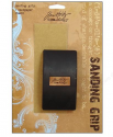
Using a sanding grip, I lightly sanded the surface removing some of the paint from the raised pattern. I really like this part, as it starts to come to life.
The next stage involves going over the surface with a blending tool and distress ink. I've used a mixture of Vintage Photo and Walnut stain. I then heat embossed it with clear embossing powder.
I cut a frame from a separate piece of card and used the same enamelled metal technique but this time using the 'ledger' Texture Fades embossing folder and just two colours. I treated the back cover in the same way.
 I've used my 'Bind it all' machine to assemble the journal and added a couple of embellishments. I particularly like the little wooden tag. Kim sent me these Maya Road tags in my DT package and I've been itching to use them. Although I've stamped the inside front and back covers, I want to do a bit of stamping and embellishing inside the journal before I use.
So roll on summer.......... now where did I put those holiday brochures..........x

Here's a list of supplies I've used available from the lovely eP store which you can find here.

>