Photobucket Photobucket Photobucket Photobucket Photobucket Photobucket

Thursday, April 11, 2013

Collect Happiness ~ Altered book pages


Hi all, it's Bonnie Irvine here today. Way back in February, the theme of the Get Altered challenge was books. At that time, I altered the front cover of a child's board book and have continued with the process of completing the rest of the pages. Today I'm excited to share the fifth and final double page spread in that same "Take Flight" altered book. All that remains is to complete the back cover, and this little baby is done like dinner :) I started out with the gessoed page having a bit of extra texture. Somehow, some kraft cardstock got stuck to the still wet gesso and when I tore it off, it left chunks behind. Rather than sand it off, I decided to embrace it and even expand upon it. I added some pieces of narrow washi tape and some drywall mesh tape to the background and gessoed over them. 


Next I took blobs of Fresco Finish paint in Mermaid, Beach Hut, and Baltic Blue and scraped the paint across the background with an old gift card, leaving it thicker in some places and very thin in others. To darken the edges and a few places in the middle, Blueberry and Cotton Candy gelatos were rubbed on and spread with water on my finger. Extra Blueberry was rubbed over the mesh tape and a brush was used to help work it inside the squares. I haven't bought the green gelatos yet (I will because I love gelatos!) so I sponged a little Avocado and Hey Pesto Fresco paint on the pages and then topped that up with Neocolor II crayons in order to bring the green tones I wanted into the background.


White Studio 490 Embossing paste was applied through a  The Crafter's Workshop harlequin stencil and once dry was shaded on the left side with a charcoal pencil using a blending stump to soften it.


The flowers were fussy cut (and I mean fussy) from Tim Coffey paper from K & Company and adhered to the background with gel medium. The petals were roughly doodled around with a Sepia Micron pen to lend more of a sketchy, hand drawn feel to them. Brown Big Brush pen was smudged on the flowers for shading. Tiny beads were glued to the centers with Glossy Accents and Icicle Glimmer Glaze was painted over the centers for shine.


The bees are Little Yellow Bicycle stickers coloured with Distress markers: Scattered Straw, Wild Honey, Black Soot, and a Gray Copic on the wings. A tiny dash of white paint pen highlighted the centers of their bodies.

Memento Bamboo ink was applied to the background randomly using a stamp from Paper Artsy JOFY 10 to make the crosshatched lines. White gesso was pounced through TCW's Mini Chevron Arrows stencil. Once dry, Pan Pastel and Distress marker altered the colour of the arrows before they were outlined.


The Idea-ology lettering for Collect Happiness (like bees collect pollen) was adhered over the flowers spanning the two pages to better connect them. Black Embossing paste also from Wendy Vecchi was spread through the Dylusions Letter Jumble stamp to spread the black around the page causing the eye to travel and take more in. Two fishtail banners were cut from beehive printed ribbon and adhered to the top of the left page. Vintage buttons (love how checked the smaller one has become over the years) were adhered over the ribbon.


At this point, I always leave the project where I can see it often and live with it for a while to determine if it's complete. I ended up going back and adding black cardstock semi-circles to the top right and bottom left corner again to move the eye through the piece and to add greater weight to the outside. Black Big Brush pen was added to the outside edge to darken the framing.

This book altering has been such fun that I'll have to start looking for another board book so I can play again. Thanks so much for stopping by and reading this marathon post. I so appreciate that. If you are interested in more detail about some of the products  I used, just click on the thumbnails below and you will arrive at the correct spot in the eP store. Hope you get a chance to get messy today!

Bonnie


Wednesday, April 10, 2013

Canvas Message Board

Hello eP friends!! It's Starla here again, sharing my second project that I've made as this month's guest DT.
What started out as one idea, turned into another.  And so, I present my version of a Canvas Message Board.


I began with an 8x8" stretched burlap canvas .  I randomly applied TenSecond Studio's Ver-Day paint in Bronze and Iron on the canvas and sprayed with the Verday patina spray. While the patina was working it's magic, I began to work on my canvas embellishments.

I pulled out Wendy Vecchi's Clearly for Art Whiteout modeling film.  Sigh.  I just have to say, I REALLY wish this stuff came in rolls!! Hello, Wendy?  Are you listening?!! It is SO much fun to work with!! **Warning:  blasting your heat gun while trying to hold and mold your piece can lead to singed fingers.  I would recommend use of crafting tweezers to help assist.  Unless you are uncoordinated (cough, cough....like someone who will remain nameless) in the fine motor skills it takes to hold the heat gun, tweezers and shape.  In that case, make sure that no young children are in the vicinity as inappropriate words may be uttered in the name of Art. ANYHOOS!! Using a retired sunflower die from Spellbinder's, I cut two sunflower layers.  Note that the thin Spellbinder's dies do NOT all the way through the modeling film, despite running it through my machine multiple times and turning the piece 90° after a couple of passes.  But, the thin dies will cut through the film enough that taking snips and finishing the job is not a huge deal.  I also cut two layers of the second largest flower from Tim Holtz's Tattered Florals Die.  By the way, the large Sizzix dies cut the film easily!

After cutting my flower layers, I painted the petals with Claudine Hellmuth's paints.  I didn't worry about perfect coverage of the petals as any white would give the impression of light hitting the petals.


The different layers were then heated and shaped with a heat gun. All the layers were then adhered together with a hot glue gun.  I cut the petals off the tattered floral flowers and glued them at the base of the larger flowers to add the center layer.  A piece of chocolate brown metal from TenSecond Studios was cut and embossed with the sunflower center die and adhered in the center.  I then pulled out my forgotten dew drops and used some Glass, Metal and More glue from Beacon to adhere them in the center. 


I then die cut the sunflower leaves from some Appletini Metal (also from TenSecond Studios).  Keeping the metal in the die, I placed the metal on a thin mat, with the back side of the metal facing up.  Using a decorative wheel, I traced along the edges to add some texture.


The small red flowers were die cut from TenSecond Studios Barn Red metal using the Tattered Florals smallest die.  I cut two layers for each flower, snipping the second one into "shreds" to make the center. 


The swirls are another Alteration Die , Elegant Flourishes, that were cut from Clearly for Art Whiteout  and painted again with Claudine's paints. 

The mini calendar template was found on Splitcoaststampers.  I then lightly sponged Distress Vintage Photo ink through a TCW stencil over the calendar and along the edges to add a little pizzazz.   


The calendar and the vintage photo (which is actually a photo tin) were adhered using some Idea-ology  mini clips.  I used fasteners (brads) to attach the clips to the canvas.  This way, I can rearrange the clips to a different area if I want to change out what is being held. 


I've considered adding hooks on the bottom of the canvas to hang keys from also!  

Thanks for allowing me to share some creativity again this week!!  Looking forward to next week!


Tuesday, April 9, 2013

Welcoming Back Rub-on's

Hi, Annette Green here today with a project utilizing lots of rub-ons. Rub-ons were a big deal back in the day, but I don't see as much of them now. Thank goodness for Tim Holtz and his two new sets! I love these vintage inspired collections of numbers, words and phrases. On the surface, they have a manly feel, but check out how I used them on this very feminine canvas display.


All supplies used to create this hinged canvas display are from our very own eclectic Paperie store, of course, and are listed at the bottom of the post. Just click on those linkies and they'll take you right to the store.


Here's a quick look at how the project came together.


It started with two 5 x 7 canvas panels. These are flat, not stretched on a frame like regular canvases.


I covered each panel with tissue wrap using Studio Multi-Medium as glue to hold it securely.


Next, a coat of paint. Here I mixed Broken China and Peeled Paint Distress Paints to get a greenish/teal color, although my photo doesn't portray it properly.


I gave it a wash of Picket Fence Distress Paint to tone it down a bit, then set it aside to dry.


I wanted to try something different with my photo, so I tried printing it directly onto Sticky-Back Canvas. Worked beautifully! Before printing, I went in to PhotoShop and desaturated the color so it had more of a muted feel.


Next I cut from a piece of cardboard from the new Postage Stamp Frame die, then painted it with Antique Linen and Vintage Photo Distress Paints, then cut out along the crease to use the frame only. You'll see that I eventually changed the color of this frame to Fired Brick to coordinate better with the other elements in my piece.


From the French Industrial paper pack, I cut the word Artist using the new Stacked Artful Words die. Underneath, I stamped the paintbrush images from the Artful Tools stamp set. A few leaves were stenciled on using embossing paste, and when dry were painted over using a waterbrush and Distress Stains of various colors.


Then come the rub-ons. Here are four words from the Remnant Rubs Words collection.


The number 15 is from the Remnant Rubs Numbers collection. It worked perfectly on the new Enameled Tag.


I love the small inspirational phrases in the Words collection. I simply rubbed a bunch of them along the edge as a border, adding a dot of permanent pen between each phrase by hand.


A final cluster of flowers, buttons, leaves and some metal and my piece is done. I affixed two hinges to the back side of the piece so I can stand it up as a table-top display.


Thanks for stopping by today. I hope this has inspired you to revisit rub-ons.

Monday, April 8, 2013

Distress Paint Games

Hello everyone, Alison here.  Hope you all had a great weekend, and are ready for whatever the new week brings.

I wanted to share some of what I've been getting up to with the Tim Holtz Distress Paints, so I'm offering up a step-by-step through the backgrounds of my set of tags "What We Hold On To", which you may have seen over at Words and Pictures.  If you'd like to see more details of the finished pieces, you'll find them here.

Warning: it's a process post, so there are lots of pictures - maybe a cup of tea to help you through?!

First, here's a reminder of the finished trio of tags:


They all started from using the paints to do Tim's wrinkle-free distress technique, and all three are from one painty splurge on the craft mat.  Here's the first one after the first swipe... just look at that marbleising (that's what Sir Tim calls it, so that's good enough for me!).


And here it is after several dabbings and daubings more.  You have to dry between each layer to set the effect you've achieved.  And, once dry, it's perfectly true: the paint doesn't react to moisture any longer, so you can do whatever you like over the top of it, without disturbing your work so far...


By the way, it's Seedless Preserves, Weathered Wood and Picket Fence I'm playing with here.  Sorry, my lovely photo of the paint on the mat itself came out all blurry - I was photographing in the evening, so some of the pictures are slightly suspect, I'm afraid!

Once you've added water, the paint goes a long way, so I was able to get three progressively paler versions out of the delicious smooshy mess on the table!


Next step was to try out stamping with Archival ink on top of the paint: it works brilliantly!  The dry surface is smooth, yet somehow toothy at the same time, and takes the ink beautifully for a really sharp image.


Next I had to try stamping with the paints themselves... I used a texture stamp (these are all Artistic Outpost stamps by the way) which is like tiny bubble wrap, and I love the effect of it bubbling all over the place like little clusters of grapes or wisteria!


Of course, you get a slightly different look on each colour combination... but I love how the layers are building up.


Even though the paints are so fluid, you can still get great added texture when you stamp with them.  


And of course you know if I'm anywhere near a tag, there's probably going to be some edging with Vintage Photo Distress Ink going on too... and wow, I love how this works.  There's sort of a resist effect from the paints - so again, they hold their own - but they also respond really well to the ink, warming up, and gaining great depth from it.  


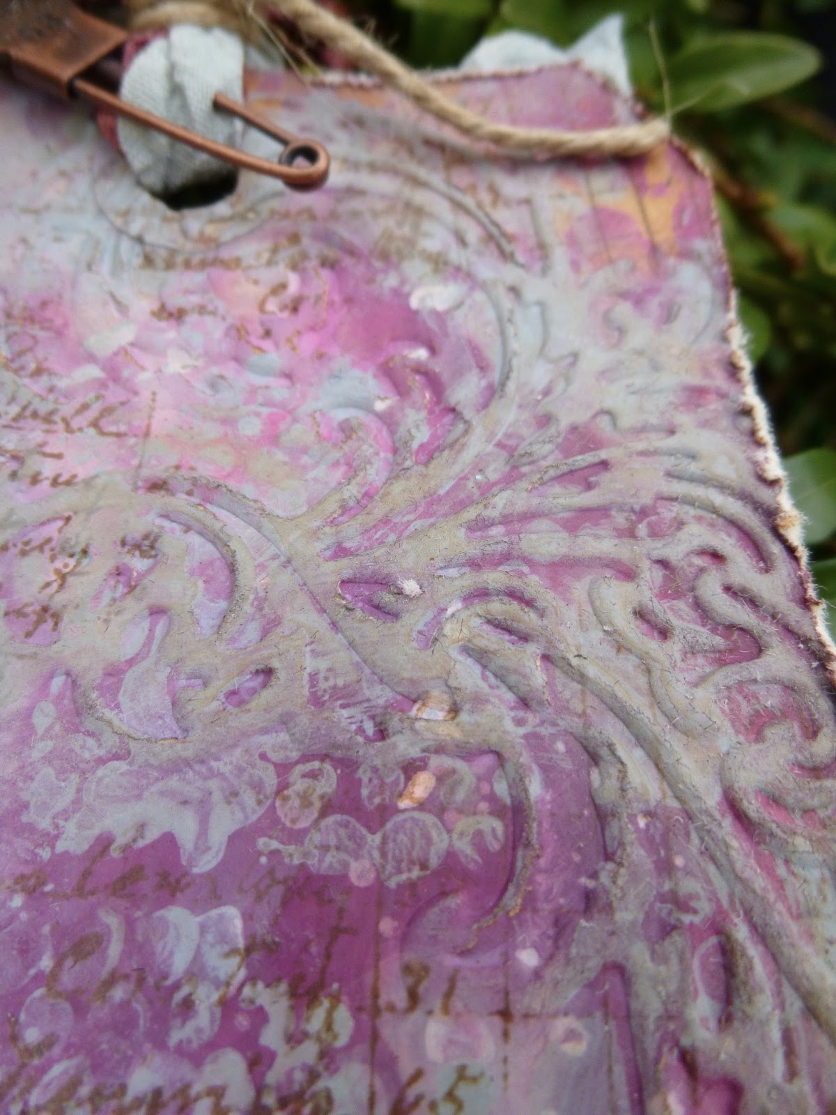
And I really enjoyed the next stage too... playing with the Flourish Texture Fade embossing folder to add some texture.  


Once embossed, I highlighted each of the flourishes with some Distress Paint, smoothed on with my fingertips - different colours for different tags.


Then, what else but a bit more Vintage Photo DI for added oomph!


The photographs of these are being done outside in daylight now, so the colours are slightly truer than some of the stages.


By now, I really didn't want to cover up my beautiful backgrounds, so the composition of the tags was dictated by making sure as much as possible could still be seen!


I love that you still have that clarity of all the layers still visible.


But that's not all the Distress Paints were involved in on these tags.  I also used the Weathered Wood to alter the embellishments - two Wendy Vecchi pieces, and a metal clock from my stash.


And they're also involved in dyeing the crinkle ribbon.  If you use solely DPs on the ribbon you get a very matte, opaque look; fabulously shabby, but not quite what I wanted for these tags.  So I had a little go at mixing Distress Paint and Distress Stains on the mat for the ribbons, and I love the result.  


Some of the matte effect of the paints, plus some of the brilliant translucent colour of the stains: adds up to pretty cool ribbons, I reckon!

I've got lots more DP experiments to share with you, but I think that's more than enough for now... it'll just have to wait for another day!  

Thanks so much for stopping by today, and I look forward to seeing you again soon, either here or elsewhere in Craftyblogland...

Designer: Alison Bomber
Click on the link to go straight to the product: