Photobucket Photobucket Photobucket Photobucket Photobucket Photobucket
Showing posts with label Texture Fades. Show all posts

Thursday, August 7, 2014

August ePlay Challenge ~ Embossing

Hi everyone! It's Bonnie here today to welcome you to our August ePlay Challenge. Our challenges are about encouraging you to explore your creative journey and inspiring you to step outside of your comfort zone. Following our chosen theme, we'd love for you submit your artwork, share a unique card, scrapbook or journal page, a canvas, home décor project, or anything that you’re excited to share!  One project will be chosen at the end of this month-long challenge and will be awarded a $25 shop voucher for the eclectic Paperie store. It just might be you! The theme that I have chosen as this month's host is Embossing...any kind: wet, dry, embossing paste.


I started out by spritzing an un-gessoed page in my 7x10 art journal page with Art Anthology Colour Sprays in Watermelon, Glorious, and Timeless...a lovely combination. While that was drying, I chose three different TH Alterations Texture Fades embossing folders: Riveted Metal, Diamond Plate; Gears. Three black #8 tags were embossed and the embossing highlighted with 4 colours of Inka Gold. The tags were overlapped and adhered to the sides using Scor tape.


Time for a little Studio 490 Black Embossing paste which was scraped across TCW's Mini Specimens and Tiny Circles stencils with a palette knife. Once the embossing paste was dry, white gesso was pounced through TCW's Sketch Grid with a scruffy brush.


The silhouette was cut from black cardstock using an image from the computer. Text was stamped randomly with Versamark and clear embossed. The butterfly wings were cut from a piece of designer paper which already has some glittery embossing on it. Once it was glued to the back of the silhouette, both were popped up on foam tape for added dimension.


The clock was a leftover from some Bo Bunny journalling tags from my stash which was  embossed with Wendy Vecchi's Mesh Background stamp, versamark and Black embossing powder. It was then matted in black cardstock. The clock hands were created with two of my favourite Idea-ology embellies, pen nibs. The other metal clocks came from my stash and were adhered to the page with Glossy Accents.
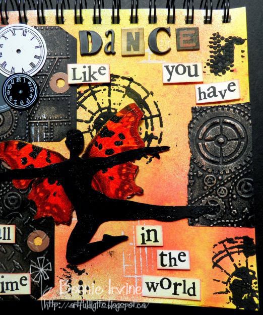


Most of the sentiment was computer generated and printed on white cardstock. To tone down the white and blend them with the background, they were stamped all over with Scattered Straw Distress ink and then edged with Worn Lipstick. They were then popped up on foam tape. The word, Dance, was created with Idea-ology Ransom Alpha parts as well as Alpha Tiles.

That's it for my foray into embossing for this August ePlay Challenge inspiration piece. I included wet embossing, dry embossing, Embossing Paste, and designer paper with embossing already there. You only have to include one type, although you are welcome to feature more if you want. Hope you'll join us for this challenge. To play along, simply add your project to the linky thingy below, linking back to your specific blog post. We are so excited to see your projects!

Bonnie

Links to the eP store for products I used:


Monday, April 8, 2013

Distress Paint Games

Hello everyone, Alison here.  Hope you all had a great weekend, and are ready for whatever the new week brings.

I wanted to share some of what I've been getting up to with the Tim Holtz Distress Paints, so I'm offering up a step-by-step through the backgrounds of my set of tags "What We Hold On To", which you may have seen over at Words and Pictures.  If you'd like to see more details of the finished pieces, you'll find them here.

Warning: it's a process post, so there are lots of pictures - maybe a cup of tea to help you through?!

First, here's a reminder of the finished trio of tags:


They all started from using the paints to do Tim's wrinkle-free distress technique, and all three are from one painty splurge on the craft mat.  Here's the first one after the first swipe... just look at that marbleising (that's what Sir Tim calls it, so that's good enough for me!).


And here it is after several dabbings and daubings more.  You have to dry between each layer to set the effect you've achieved.  And, once dry, it's perfectly true: the paint doesn't react to moisture any longer, so you can do whatever you like over the top of it, without disturbing your work so far...


By the way, it's Seedless Preserves, Weathered Wood and Picket Fence I'm playing with here.  Sorry, my lovely photo of the paint on the mat itself came out all blurry - I was photographing in the evening, so some of the pictures are slightly suspect, I'm afraid!

Once you've added water, the paint goes a long way, so I was able to get three progressively paler versions out of the delicious smooshy mess on the table!


Next step was to try out stamping with Archival ink on top of the paint: it works brilliantly!  The dry surface is smooth, yet somehow toothy at the same time, and takes the ink beautifully for a really sharp image.


Next I had to try stamping with the paints themselves... I used a texture stamp (these are all Artistic Outpost stamps by the way) which is like tiny bubble wrap, and I love the effect of it bubbling all over the place like little clusters of grapes or wisteria!


Of course, you get a slightly different look on each colour combination... but I love how the layers are building up.


Even though the paints are so fluid, you can still get great added texture when you stamp with them.  


And of course you know if I'm anywhere near a tag, there's probably going to be some edging with Vintage Photo Distress Ink going on too... and wow, I love how this works.  There's sort of a resist effect from the paints - so again, they hold their own - but they also respond really well to the ink, warming up, and gaining great depth from it.  


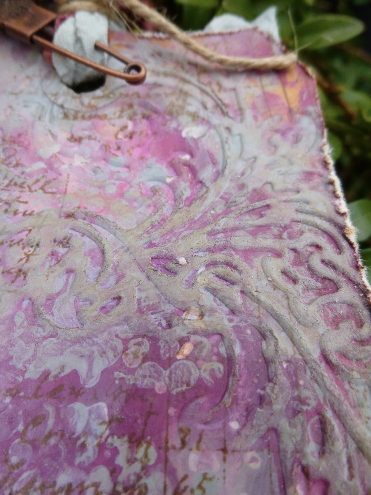
And I really enjoyed the next stage too... playing with the Flourish Texture Fade embossing folder to add some texture.  


Once embossed, I highlighted each of the flourishes with some Distress Paint, smoothed on with my fingertips - different colours for different tags.


Then, what else but a bit more Vintage Photo DI for added oomph!


The photographs of these are being done outside in daylight now, so the colours are slightly truer than some of the stages.


By now, I really didn't want to cover up my beautiful backgrounds, so the composition of the tags was dictated by making sure as much as possible could still be seen!


I love that you still have that clarity of all the layers still visible.


But that's not all the Distress Paints were involved in on these tags.  I also used the Weathered Wood to alter the embellishments - two Wendy Vecchi pieces, and a metal clock from my stash.


And they're also involved in dyeing the crinkle ribbon.  If you use solely DPs on the ribbon you get a very matte, opaque look; fabulously shabby, but not quite what I wanted for these tags.  So I had a little go at mixing Distress Paint and Distress Stains on the mat for the ribbons, and I love the result.  


Some of the matte effect of the paints, plus some of the brilliant translucent colour of the stains: adds up to pretty cool ribbons, I reckon!

I've got lots more DP experiments to share with you, but I think that's more than enough for now... it'll just have to wait for another day!  

Thanks so much for stopping by today, and I look forward to seeing you again soon, either here or elsewhere in Craftyblogland...

Designer: Alison Bomber
Click on the link to go straight to the product: