Tuesday, July 30, 2013

Greetings!
Today I've a new canvas to share with you. 
(click on photos to enlarge and enhance)
The blue background started with lots of Tim Holtz Distress Paint in "broken china" and "salty ocean" which I sprayed with water and just let it run all over and mix together till I was happy with the color. Then "picket fence" and "picked raspberry" Distress Paint were applied with random stamps. The brick wall is "vintage photo" and "fired brick" Distress Paint mixed with Golden extra heavy gel medium applied through the Wendy Vecchi Brick Wall stencil with Liquitex paint in "unbleached titanium" for the "grout". 
The tree is made from Glidden paint chips cut with a Sizzlits die called "branches with leaves". After die cutting I dipped them in melted Ultra Thick Embossing Enamel. The trunk is also paint chips - torn, painted with Distress Paint and then coated with Inkssentials Crackle Accents.
The die cut branches and leaves behaved just as I expected when I put them in the hot UTEE, curling and bending - look at the dimension - exactly what I was trying to achieve!
The birds are chipboard by FabScraps coated with gesso then painted with Silks Acrylic Glaze.  You can see the thick, shiny coating of enamel on the leaves pretty well in this picture too:
Many of the products I've used are available at the eclecticPaperie online shop, I've linked them for you for easy shopping. Be sure to poke around the store and the eclecticPaperie blog, you'll find lots of great ideas and cool things to buy!

Monday, July 29, 2013

Courage Journal Page

Hello ! It's Sue here with my second page in my journal. For some reason I've been putting off starting it but now that I've taken the plunge I'm loving it !


I started by using a stencil that was originally meant for furniture and also the Wendy Vecchi's Bricks stencil with Wendy Vecchi's Embossing Paste.


I then used acrylic paints to build up layers of colour. Working around the edge, just as you would if you were using Distress Inks with a darker colour.


I used the Crafters Workshop Diamonds stencil and kept the stencilling quite light, continuing with acrylic paint.


I then used the Wendy Vecchi Dots and Stripes stencil. For the dots I used the bumping technique which is where you stencil your image, once dry you move the stencil slightly and stencil again over the top. You're left with a shadow effect.


I carried on stencilling using the Bingo stencil and also the Wendy Vecchi Classic Words stencil. I then stamped the Dina Wakley Grungy Circles stamp with black Archival ink. I used some more acrylic paint around the edge in a rusty colour to warm everything up a little.


For the centre piece of my page I've used a small piece of cardboard, tore off little bits of the top layer then painted it with acrylic paint. I've used the background stamp from the Wendy Vecchi Heirloom Art set and stamped onto the cardboard with coffee Archival ink. I then used the flower from the Wendy Vecchi Daisy Art set and painted it with arcylic paint.


The sentiment is from the Wendy Vecchi Heirloom Art set and I've stamped onto watercolour paper. I then cut the sentiment into strips.


I sponged some more acrylic paint around the edge in a darker colour and then added some Treasure Gold to finish.


Here's a close up so you can see the texture a little better.

Hope you've enjoyed my second page !

Sue

Saturday, July 27, 2013

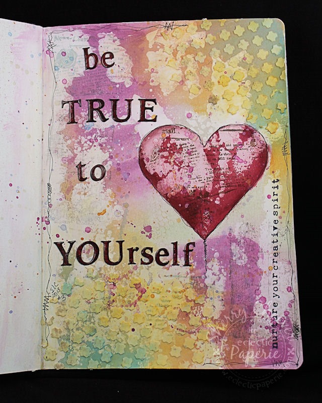
Be True Journal Page!


Good morning!  Sherry here with you today and it’s my turn to post another project for you.  I decided to try my hand at another journal page  . . . after seeing Micki’s yesterday, I wish I had done something else!  I loved her video . . .  if you missed it, you can find it here!

I guess when I first started working in my art journal, I made a subconscious decision to use it for inspirational quotes/phrases that would empower, inspire and motivate me.  Sometimes a girl needs a little help!

BeTrueJournalPage

I started out by painting gesso down the spine of the pages, brushing excess onto the left hand page.  On the right hand page, I used a credit card and scraped the excess across the page all the way to the right border.  Distress Paints in Bundled Sage, Seedless Preserves, Broken China and Wild Honey were used to color the page.

BeTrueJournalPageCloseUpHeart

The heart was applied using a stencil cut from chipboard and stippling in Fired Brick and Aged Mahogany Distress Inks.   With the stencil still in place, Unity Classified Newsprint was stamped in Archival Coffee.    The heart was then outlined with a black marker. 

Making sure there was room for my phrase, white embossing paste was applied to the corners of the page using another stencil die cut with a CrissCross pattern. 

BeTrueJournalPageCloseUpUpperTexture

Once the embossing paste had dried, more Wild Honey and Broken China paint was applied and rubbed around with my fingers.

BeTrueJournalPageCloseUpLowerTexture

The phrase was die cut from watercolor paper, painted with Aged Mahogany stain, and then over stamped in Archival Coffee with the Unity Classified Newsprint Stamp.  Each letter was then embossed with clear embossing powder.  There’s also a little over stamping through out with Unity Graffiti Art and Unity Tattered Chicken Wire.

BeTrueJournalPage

Well, that’s all for me today.  Thanks for stopping by and joining me!


eP Signature - Sherry Cheever


Project Supplies:


Friday, July 26, 2013

Art Journal Play ……Dina Style

Hi everyone! 
Micki here to share an art journal page which was inspired by the awesome Dina Wakley.   
Generally my art journals have just art, a couple of stamped words and maybe a short sentence, but no real journaling.  I’ve never been really good at putting my thoughts to paper and making it sound good.  Too worried about spelling, grammar and then there is the “not liking my handwriting” thing. 
I’m taking part in Life Book 2013 and Dina Wakley contributed a bonus lesson this week.  

After watching the lesson, I was so inspired to not worry about my handwriting, or my grammar or spelling because it basically gets covered up.  I learned all of this back in March when I took several of her classes in Oklahoma City, but like a good movie, I always pick up something that I missed the first time.  Anyway, so I put pen to paper and journaled my thoughts, not worrying about it making sense or sounding right, or spelling or even the handwriting.  I actually exaggerated my handwriting.   I video taped it and did my first video editing in iMovie so I know I have a lot to learn.  Especially about zooming in, but you can still see what I do.

I used lots of paints;  from Distress Paints, Distress Stain, Dylusions Ink Spray and Adirondack Paint Dabbers to Golden Fluid Acrylics and Faber-Castel Gelatos.  I also raided the kitchen and bathroom, looking for different sized bottle caps.  So much fun, and honestly after journaling and putting my troubles to paper, which hopefully no one can read (but I know what I wrote), I felt so much better. 

First I'll share the end result and then the video.


The page on the right was an earlier page which I'm not quite sure I'm finished with.  But girls, I had so much fun and my page was done in under an hour!  Really!  And that is a record for me.

 And now the video:  

Sure hope it works. And again, so sorry about not zooming in.  What can I say I got lost in the moment.
A couple of things in the video:
  • The page already had a thin coat of Claudine Hellmuth Gesso on it.  I actually prep several pages at a time, that way I'm always ready to go.  I had also used the page as my stencil-stamp-brush cleaner which is why you will see that the page already had some color/design on it.
  • Cleaning off the stencils (on the white copy paper) with a baby wipe turned out pretty cool.  I'm so keeping that.
  • I dabbed the Distress Paint in the upper corner and then picked up paint with my stamp from that puddle.
  • I added a light layer of paint to my stamp using my finger, slightly spritzed it with water and then stamped randomly. Gave a very faint impression. 
  • An old toothbrush cleans stamps fabulously.  Gets all the paint out of the crevices.  (The only time I am OCD about cleaning stamps is when using paint.)
  • At the end, you'll see me testing the gelato colors, I was trying to see which color would work best.
  • I went back and added stickles to the collar, which was a piece of white doily.
  • The title and date were added using watered down fluid acrylics and a fine line applicator.
I hope you were inspired to play.  Art is definitely cheaper than therapy :-).


Supplies Used: