Friday, May 31, 2013

Hello Distress Paints

Hi gang, Micki here and I have a confession to make.  I have held out – held out jumping on the Distress Paint wagon.  Gasp, I know, what was I thinking!

With a limited spending budget, I figured paint is paint and I have plenty of that.  No need to rush out and get them the moment the Distress Paints arrived at retail. But after seeing the awesome projects by the DT using these paints, I had to check them out.

First on the agenda was checking out some tutorials.  Marjie Kemper posted a wonderful tutorial HERE on the eP blog.   As well as  Alison Bomber.  You can find her Distress Paint Games post HERE.  Don't forget YouTube.  A search will bring up lots of tutorial videos, including several by Tim Holtz.

With the intend of doing several techniques, I only did one technique with the  Distress Paints and completely got lost in it.  It's the simple things and I was am in love because of this result:
Splatter - drip heaven!!!!!
I couldn't stop and was berating myself for NOT having every single color.  After forgetting about the time (dinner, dishes, etc.) and lots of splattered background card stock I decided to go for a simple card.  Let the awesome splatters take center court and came up with this: 
 Super simple card.  I added the sentiment using Idea-ology Alpha Parts Signmaker letters to spell out Hello.  I absolutely love it. And the letters add a little dimension, which I like.

I already started several other projects with these paints which I can't wait to finish.  And all I can say is..... run....don't walk..... to the eP shop and get 'em before they are gone!  


Supplies Used:

Thursday, May 30, 2013

Father's Day

Hi eP fans, it's Mary-Ann here with you today to share some of my very simple, fast Father's day cards. I need to make several cards for this holiday and I was determined after being late for Mother's Day, that I would NOT let that happen again. (shhhh, I still have two mother's day cards to be mailed!)

I LOVED the Strong collection from Authentique.  Here I used the 6x6 paper pad and embellishments. The papers in this collection allowed me to create three different cards that look like they are three different lines but they still all coordinate beautifully.


For the first card,  I layered several patterned papers and a couple Stamp Blocks and Circles.  I inked all my edges with Distress Ink Pad - Vintage Photo.  This helps soften the edges.  I added a FarmHouse Paper Company key and May Arts ribbon.  See that great big delicious brown button?  That gem came from an antique store in Maine.  I just love how rich it is.  Of course, I added some Scotch Foam Mounting Tape behind some elements to bring dimension to my card.


For my second card, I layered some of the beautiful blue papers.  Again, very simple but the layering makes it look richer and more detailed.  I added a couple tags and twine that I had on hand.   I again used foam tape for added volume. 


I needed this tag to add to my dad's present.  I used an Inkssentials Surface #5 Black tag an covered it with the newsprint paper.  Added a strip of the GORGEOUS woodgrain.  I added punched circles that but thought it needed something more.  I dug out my Idea-ology - Tim Holtz - Remnant Rubs chopped them up and added small pieces in different locations that helped embellish my tag, still keeping it simple.   Adding ribbon, Black Shine twine from The Twinery and foam tape finished off my tag.


With just a simple, gorgeous pad of paper, I made three completely different cards.  I hope you are inspired to start your cards a bit early.


Wednesday, May 29, 2013

Creative Chaos

Hi all!  I'm popping in with a quick project today...a tag featuring great projects from Ms. Wendy Vecchi (who I'm going to get to see in August - WooHoo!!) 

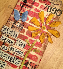
I'm part of the Everything Wendy Vecchi forum and they post challenges every month.  This challenge, posted a few months ago, was to use Distress Embossing Powder.  Can I share that I've really used this product but it was perfect for use with Wendy's Brick Wall stencil.  It feels like real brick!
Here's what I did to create my tag...

  • Lay the Brick Wall stencil over the tag and ink all over the stencil with VersaMark ink.  You'll really need to be careful to squish the pad down through the brick cut outs.
  • Remove the stencil and apply Distress Embossing Powder.  I used Fired Brick and Vintage Photo (two colors I just happened ot have had in my stash).  Note that I applied the Fired Brick to the majority of the tag and then sprinkly the Vintage Photo on the edges.
  • Set the embossing powder with a heat gun.  Distress Powder doesn't get shiny but you can see a change in the powder, which lets you know it's set.  Then you can rub off some of the powder to get that distressed look.
  • Add a few stamps and stenciling (from the Classic Words stencil) in Adirondack black to the tag.  Yes, overlap that embossing powder!
  • Add a piece of filmstrip ribbon and the sentiment.  On the sentiment...I tend to stamp longer sentiments on cardstock or manila paper and then cut the words apart.  You can fit longer sentiments in a smaller space and I think the look is way cool...
  • The little butterfly is from a Martha Stewart punch...it's my favorite!
  • On the flower...I put the Fresh Flowers stencil over a piece of heavy duty cardstock and then used the white embossing paste. 
  • Remove the stencil and let the paste dry.
  • Color the flower with Distress Markers....add little black dots because that's what I do!  (As my seven year old would say)
  • Carefully cut out all of the flower pieces and reassemble on the tag.
Be sure to check out the Wendy Vecchi forum and you can check out all of her fun products by following the links below!  Enjoy!!

White Embossing Paste
Fresh Flowers Stencil
Classic Words Stencil
Brick Wall Stencil
Original Art Stamp Set
Distress Markers

Tuesday, May 28, 2013

Be Yourself (Tag Tutorial)

Kempertag5282013

Marjie Kemper here with a tag using several Sizzix dies and loads of Ranger Distress Inks.  I started by adhering Ranger's Manila Cardstock to Grunge Paper using Glue 'N Seal, because I wanted this to be a fairly sturdy and really wanted the flourishes raised up for dimension.

I die-cut the parts I needed from the Tag & Bookplate, Elegant Flourishes, and Pediment Sizzix dies. Kim would be happy to special-order any she doesn't have in stock... just shoot her an email.

DSC03042

I chose the largest of the stamps from Tim's Way With Words set:


After inking up my stamp, pediments, and flourishes with Distress Inks using an Ink Blending tool, I stamped the sentiment onto the tag in Jet Black Archival Ink.  Then I laid my inked flourishes on top of scrap paper (where I'd already stamped the sentiment) and stamped the sentiment again on top of them:

DSC03043

I ran the Pediment pieces through my Vagabond using the Mini Rays Texture Fades embossing folder:
 DSC03047 

and attached them with redline tape and long fasteners:
  DSC03048 
 I used a toothpick to apply Matte Medium to the back of the flourishes:

DSC03049

and hammered the brads for a more distressed look:
DSC03051 
I really like the way this came out. I'd probably pick a stamp that doesn't have so many unique parts to line up if I did it again, but that may have helped in that it gave me a lot of different reference points to be sure it was on straight.  The Matte Medium was the perfect adhesive because it dries clear, so any excess is unseen. 

DSC03054

DSC03058

Kempertag5282013

I'd like to thank Kim for the opportunity to be on the eclectic Paperie design team for these last six months.  It's  been a delight!  Though I won't be continuing on as this term ends, I look forward to driving to New Hampshire in September to teach classes in person at Kim's new studio location.

All the details will be posted on the EP blog by June 15, but for now please save the date if you can join us there the weekend of September 21-22.  Thanks for visiting today!

Marjie

Monday, May 27, 2013

Class Project with Dina Wakley!

Good Morning and Happy Memorial Day!! It's my turn to post a little project today so I thought I'd share a few pics from a class Kim and I took last weekend with Dina Wakley.  First let me say that Dina was so fun!! She's a great teacher, she keeps you moving and on track (I often need this because I tend to freeze in classes and end up just watching everyone else - lol! Not this time, she moved us right along!).

This was her Graffiti of My Life class and it was full of inky, messy goodness - surprisingly none of it ended up on me!  We made all the pages and cover using the same technique and then made a large collage sheet to use as embellishments for the album.  I haven't finished the album yet but I did do the cover so at least I started! :)


I used pretty bright colors and we got to use lots of fun stencils and ink sprays and tags, oooh it was really a blast!


We're supposed to fill the little album with quotes, words, saying and things that are meaningful to us.  We used the collage sheet we made to cut shapes out of (the heart above) to add as embellishments on the page - fun stuff!!  I found the pretty button in my vintage button box!


This is an example of what the inside pages look like now - a glorious mess!  If you ever have a chance to take a class from Dina I highly recommend it!!  And perhaps, just maybe, if you live in the New England area, you'll get a chance in 2014 . . . *wink, wink*!!  That's all from me today!  I hope you all enjoy the day and a special thanks to all our veterans and their families on this Memorial Day!